
Before starting the analysis, we need to load the essential R libraries required for data manipulation, visualization, and performing differential gene expression (DEG) analysis.
	# Load necessary libraries for RNA-seq analysis and visualization
	library(GEOquery)        # Load the GEOquery package to access GEO datasets
	library(DESeq2)          # For differential expression analysis
	library(data.table)      # Efficient data manipulation
	library(umap)            # Dimensionality reduction for visualization
	library(ggplot2)         # General-purpose plotting
	library(clusterProfiler) # For functional enrichment analysis
	library(org.Hs.eg.db)    # Human genome annotations (the Human Genome Annotation package)
	library(VennDiagram)     # Venn diagram visualization
	library(knitr)           # Report generation and table formatting (for kable)
	library(tinytex)         # LaTeX support for report generation
Code Block 2.1. Retrieving Data from GEO
# ===================================================================
# Step 1. Download Supplementary Files for the Count Matrix
# ===================================================================
# Define the GEO accession ID
gse_id <- "GSE157194"
# Download the supplementary files for this GEO dataset
getGEOSuppFiles(gse_id)
# Check the list of files downloaded
list.files(gse_id)
# ================================
# Path to the downloaded file
supp_file_path <- paste0(gse_id, "/", "GSE157194_Raw_gene_counts_matrix.txt.gz")
# Unzip and load the file into R as a data frame (counts matrix)
counts_matrix <- read.table(gzfile(supp_file_path), header = TRUE, row.names = 1)
# ===================================================================
# Step 2. Download Phenotype Data
# ===================================================================
# Specify the GEO accession number
gse_id <- "GSE157194"
# Download the phenotype data (GEO series matrix)
gse_data <- getGEO(gse_id, GSEMatrix = TRUE, AnnotGPL = TRUE)
# If multiple series are available, choose the first one
gse_data <- gse_data[[1]]
# Extract metadata from the GEO dataset
# We access the metadata (also known as phenotype data) stored in the 'phenoData' slot of the GEO object.
metadata <- gse_data@phenoData@data
# ===================================================================
# Step 3. Print Summary Information about the Count Matrix and Metadata
# ===================================================================
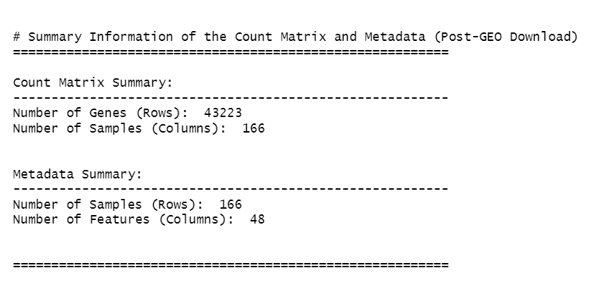
cat("\n\n# Summary Information of the Count Matrix and Metadata (Post-GEO Download)\n")
cat("=========================================================\n")
# Count matrix summary
cat("\nCount Matrix Summary:\n")
cat("---------------------------------------------------------\n")
cat("Number of Genes (Rows): ", nrow(counts_matrix), "\n")
cat("Number of Samples (Columns): ", ncol(counts_matrix), "\n\n")
# Metadata summary
cat("\nMetadata Summary:\n")
cat("---------------------------------------------------------\n")
cat("Number of Samples (Rows): ", nrow(metadata), "\n")
cat("Number of Features (Columns): ", ncol(metadata), "\n\n")
cat("\n=========================================================\n")
Code Block 2.2.1: Identifying and Removing Outlier Samples, and Visualizing the Impact
# ========================================================
# Load necessary libraries
# ========================================================
library(ggplot2)
library(gridExtra) # For arranging multiple plots in one figure
# ========================================================
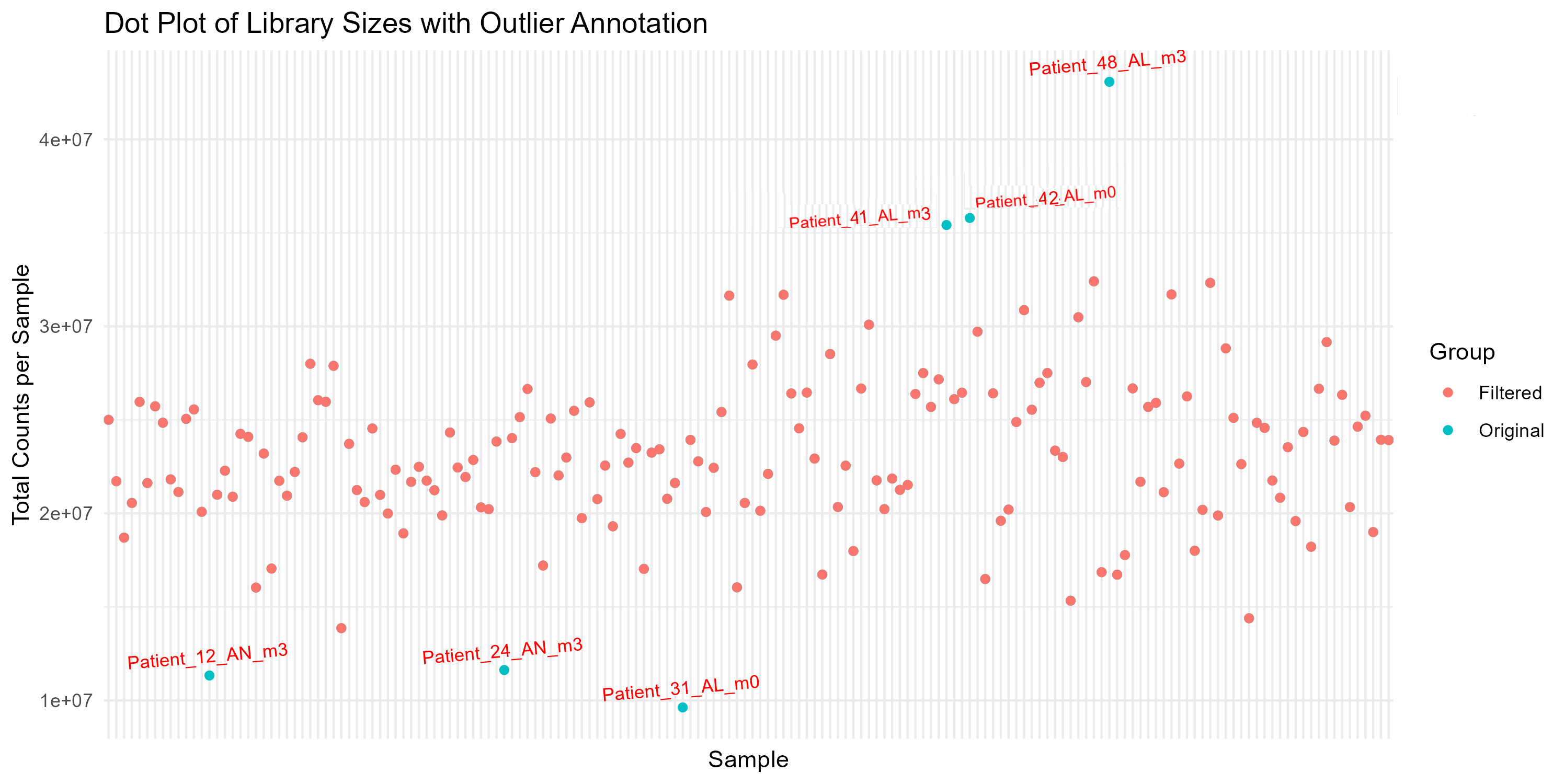
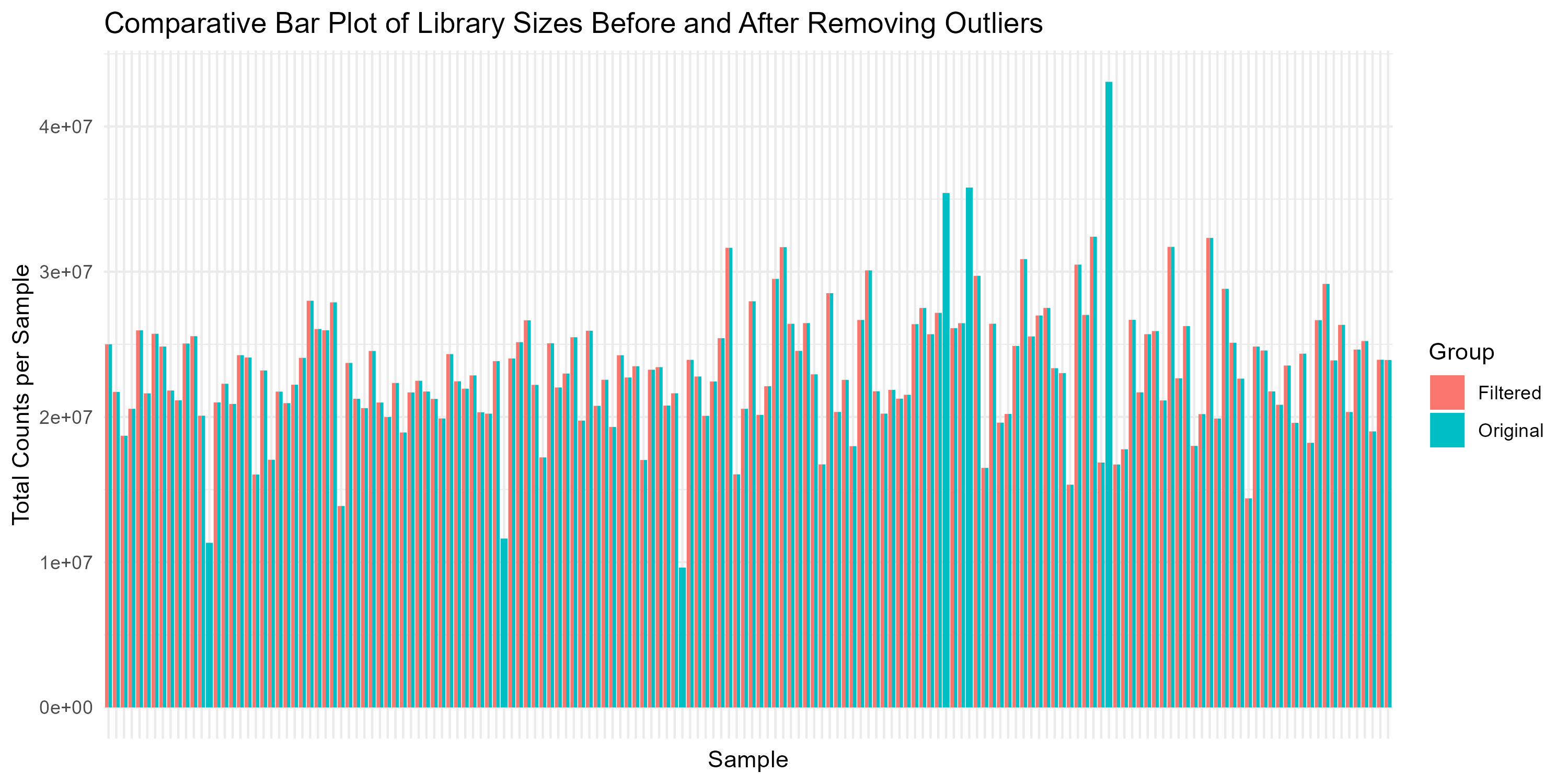
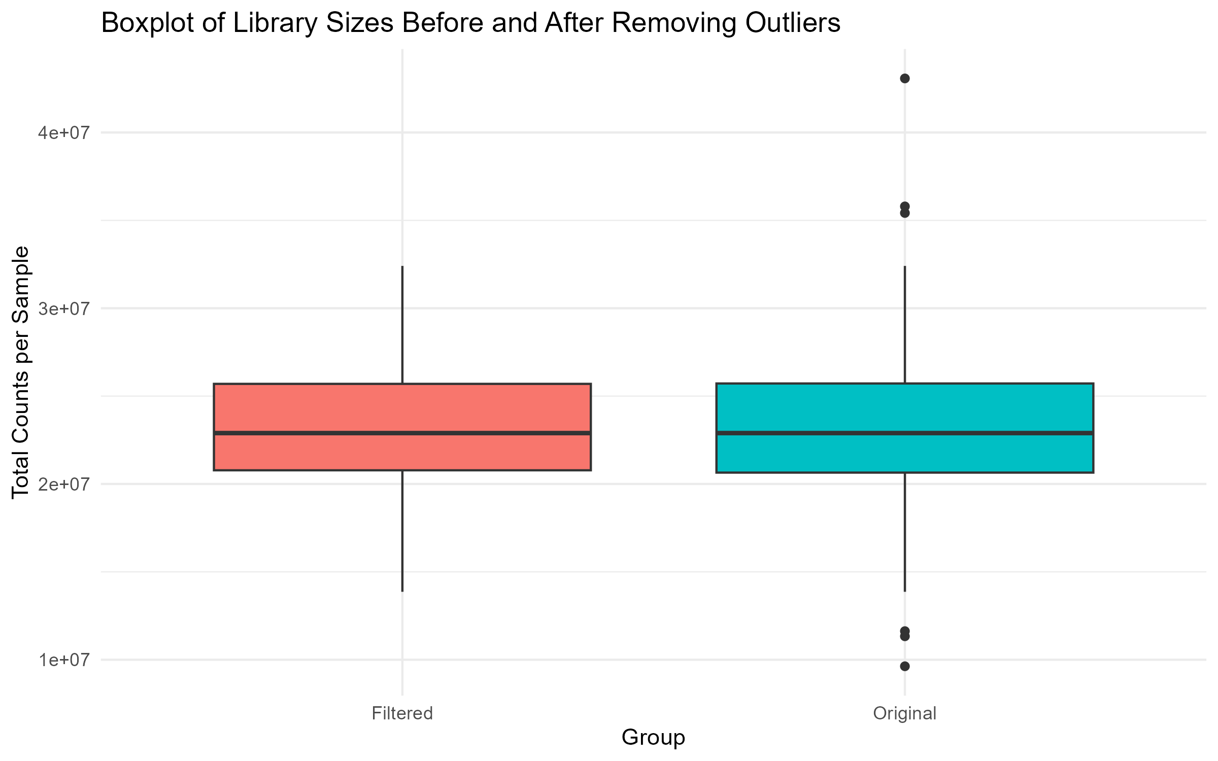
# Step 1: Calculate Library Size and Identify Outliers
# ========================================================
# Calculate library sizes
library_sizes <- colSums(counts_matrix)
# Optionally, print summary to check for anomalies
summary(library_sizes)
# Identify potential outlier samples based on library size
# Step 1.1: Set thresholds for outlier identification
# Set the lower threshold to identify samples with low counts
lower_threshold <- quantile(library_sizes, 0.25) - 1.5 * IQR(library_sizes)
# Set the upper threshold to identify samples with very high counts
upper_threshold <- quantile(library_sizes, 0.75) + 1.5 * IQR(library_sizes)
# Step 1.2: Find outlier samples
# Uncomment the corresponding line depending on whether you want to use:
# - Only the lower threshold
# - Only the upper threshold
# - Both lower and upper thresholds
# Use only the lower threshold:
# outlier_samples <- colnames(counts_matrix)[library_sizes < lower_threshold]
# Use both lower and upper thresholds:
outlier_samples <- colnames(counts_matrix)[library_sizes < lower_threshold | library_sizes > upper_threshold]
# ========================================================
# Step 2: Store Original Dimensions Before Filtering (First part for Plotting Dimensions of Count Matrix and Metadata)
# ========================================================
# Store original dimensions before filtering
counts_matrix_before <- dim(counts_matrix) # [number of genes, number of samples]
metadata_before <- dim(metadata) # [number of samples, number of features]
# ========================================================
# Step 3: Remove Outlier Samples from Data
# ========================================================
# Step 3.1: Remove outlier samples from counts matrix
counts_matrix_filtered <- counts_matrix[, !(colnames(counts_matrix) %in% outlier_samples)]
# Step 3.2: Remove outlier samples from metadata
metadata_filtered <- metadata[colnames(counts_matrix_filtered), ]
# Step 3.3: Store dimensions after filtering (Second part for Plotting Dimensions of Count Matrix and Metadata)
counts_matrix_after <- dim(counts_matrix_filtered)
metadata_after <- dim(metadata_filtered)
# Step 3.4: Calculate filtered library sizes
filtered_library_sizes <- colSums(counts_matrix_filtered)
# ========================================================
# Step 4: Plot the Filtered Library Sizes (Box, Violin, Dot, Bar, Density plots)
# ========================================================
# Step 4.1: Prepare Data for Plotting:
# Combine original and filtered library sizes into a data frame for comparison
comparison_df <- data.frame(
Sample = c(names(library_sizes), names(filtered_library_sizes)),
Library_Size = c(library_sizes, filtered_library_sizes),
Group = c(rep("Original", length(library_sizes)), rep("Filtered", length(filtered_library_sizes)))
)
# Step 4.2: Boxplot of Library Sizes Before and After Filtering
box_plot <- ggplot(comparison_df, aes(x = Group, y = Library_Size, fill = Group)) +
geom_boxplot() +
theme_minimal() +
labs(title = "Boxplot of Library Sizes Before and After Removing Outliers",
x = "Group", y = "Total Counts per Sample") +
theme(legend.position = "none")
ggsave("Figures/2.2.1.Outlier_Samples/Figure2.2.1.3.Box_Plot_Library_Sizes.png", plot = box_plot, width = 8, height = 5, bg = "white")
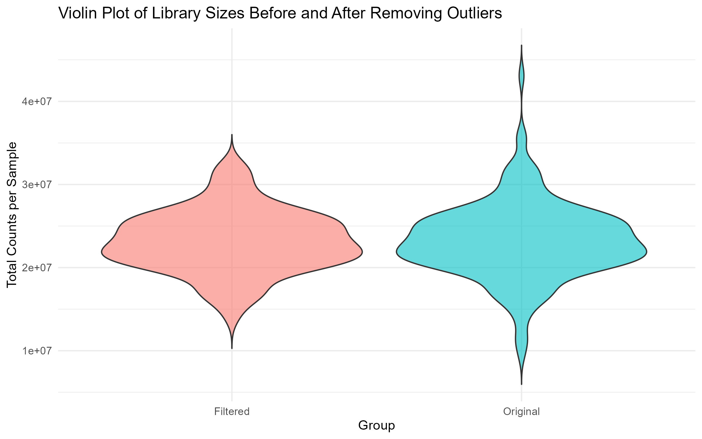
# Step 4.3: Violin Plot of Library Sizes Before and After Filtering
violin_plot <- ggplot(comparison_df, aes(x = Group, y = Library_Size, fill = Group)) +
geom_violin(trim = FALSE, alpha = 0.6) +
theme_minimal() +
labs(title = "Violin Plot of Library Sizes Before and After Removing Outliers",
x = "Group", y = "Total Counts per Sample") +
theme(legend.position = "none")
ggsave("Figures/2.2.1.Outlier_Samples/Figure2.2.1.5.Violin_Plot_Library_Sizes.png", plot = violin_plot, width = 8, height = 5, bg = "white")
# Step 4.4: Dot Plot with Annotation of Outliers
dot_plot <- ggplot(comparison_df, aes(x = Sample, y = Library_Size, color = Group)) +
geom_point() +
theme_minimal() +
labs(title = "Dot Plot of Library Sizes with Outlier Annotation",
x = "Sample", y = "Total Counts per Sample") +
theme(axis.text.x = element_blank(), axis.ticks.x = element_blank()) +
geom_text(data = subset(comparison_df, Group == "Original" & Sample %in% outlier_samples),
aes(label = Sample), vjust = -1, size = 3, color = "red", angle = 5)
ggsave("Figures/2.2.1.Outlier_Samples/Figure2.2.1.1.Dot_Plot_Library_Sizes.png", plot = dot_plot, width = 10, height = 5, bg = "white")
# Step 4.5: Comparative Bar Plot Before and After Filtering
bar_plot <- ggplot(comparison_df, aes(x = Sample, y = Library_Size, fill = Group)) +
geom_bar(stat = "identity", position = "dodge") +
theme_minimal() +
labs(title = "Comparative Bar Plot of Library Sizes Before and After Removing Outliers",
x = "Sample", y = "Total Counts per Sample") +
theme(axis.text.x = element_blank(), axis.ticks.x = element_blank())
ggsave("Figures/2.2.1.Outlier_Samples/Figure2.2.1.2.Bar_Plot_Library_Sizes.png", plot = bar_plot, width = 10, height = 5, bg = "white")
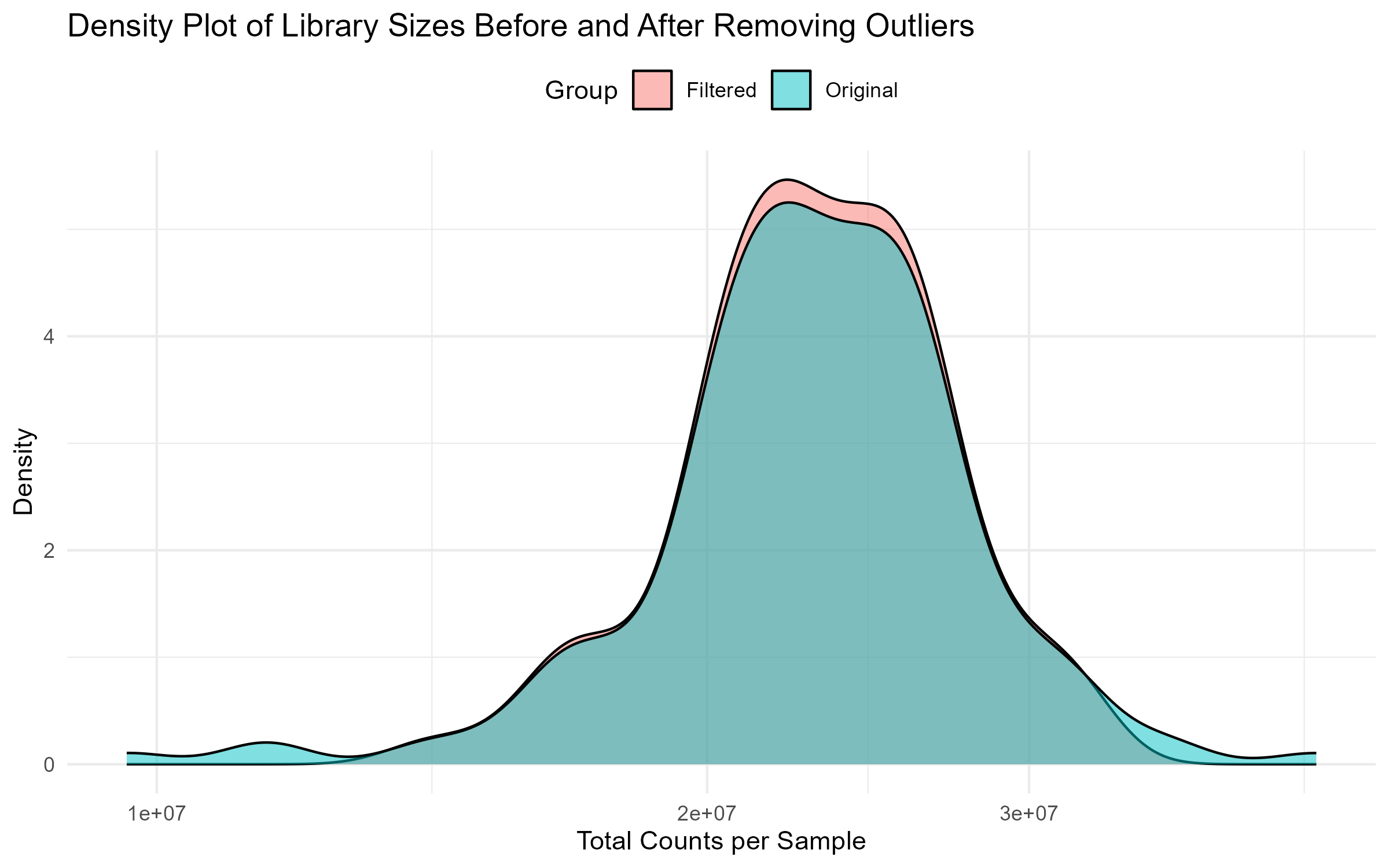
# Step 4.6: Side-by-Side Density Plot Before and After Filtering
density_plot <- ggplot(comparison_df, aes(x = Library_Size, fill = Group)) +
geom_density(alpha = 0.5) +
theme_minimal() +
labs(title = "Density Plot of Library Sizes Before and After Removing Outliers",
x = "Total Counts per Sample", y = "Density") +
scale_x_log10() +
theme(legend.position = "top")
ggsave("Figures/2.2.1.Outlier_Samples/Figure2.2.1.4.Density_Plot_Library_Sizes.png", plot = density_plot, width = 8, height = 5, bg = "white")
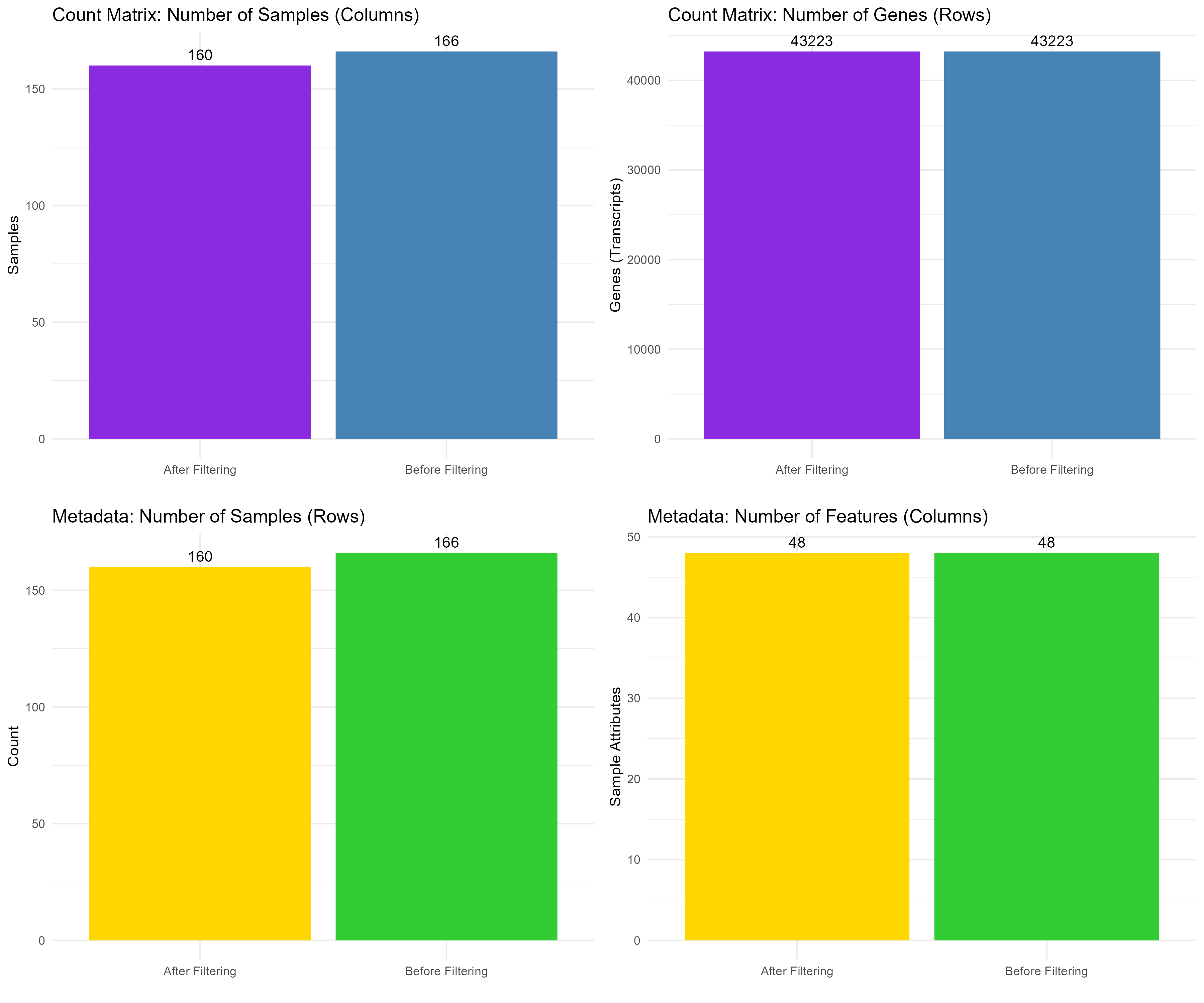
# ========================================================
# Step 5: Plot Dimensions of Count Matrix and Metadata (Third part for Plotting Dimensions of Count Matrix and Metadata)
# ========================================================
# Step 5.1: Create Data Frames for Count Matrix Dimensions
counts_matrix_dims <- data.frame(
Measure = rep(c("Samples", "Genes"), each = 2),
Stage = rep(c("Before Filtering", "After Filtering"), 2),
Count = c(counts_matrix_before[2], counts_matrix_after[2],
counts_matrix_before[1], counts_matrix_after[1])
)
# Step 5.2: Create Data Frames for Count Matrix and Metadata Dimensions
metadata_dims <- data.frame(
Measure = rep(c("Samples", "Features"), each = 2),
Stage = rep(c("Before Filtering", "After Filtering"), 2),
Count = c(metadata_before[1], metadata_after[1],
metadata_before[2], metadata_after[2])
)
# Step 5.3: Generate and Combine Plots for Dimensions
# Plot for count matrix samples before and after filtering
count_samples_plot <- ggplot(subset(counts_matrix_dims, Measure == "Samples"), aes(x = Stage, y = Count, fill = Stage)) +
geom_bar(stat = "identity") +
geom_text(aes(label = Count), vjust = -0.5) + # Add count labels on top of bars
theme_minimal() +
labs(title = "Count Matrix: Number of Samples (Columns)", y = "Samples", x = "") +
theme(legend.position = "none") +
scale_fill_manual(values = c("Before Filtering" = "#4682B4", "After Filtering" = "#8A2BE2")) # Change colors
# Plot for count matrix genes (transcripts) before and after filtering
count_genes_plot <- ggplot(subset(counts_matrix_dims, Measure == "Genes"), aes(x = Stage, y = Count, fill = Stage)) +
geom_bar(stat = "identity") +
geom_text(aes(label = Count), vjust = -0.5) + # Add count labels on top of bars
theme_minimal() +
labs(title = "Count Matrix: Number of Genes (Rows)", y = "Genes (Transcripts)", x = "") +
theme(legend.position = "none") +
scale_fill_manual(values = c("Before Filtering" = "#4682B4", "After Filtering" = "#8A2BE2")) # Change colors
# Plot for metadata samples before and after filtering
metadata_samples_plot <- ggplot(subset(metadata_dims, Measure == "Samples"), aes(x = Stage, y = Count, fill = Stage)) +
geom_bar(stat = "identity") +
geom_text(aes(label = Count), vjust = -0.5) + # Add count labels on top of bars
theme_minimal() +
labs(title = "Metadata: Number of Samples (Rows)", y = "Count", x = "") +
theme(legend.position = "none") +
scale_fill_manual(values = c("Before Filtering" = "#32CD32", "After Filtering" = "#FFD700")) # Change colors
# Plot for metadata features before and after filtering
metadata_features_plot <- ggplot(subset(metadata_dims, Measure == "Features"), aes(x = Stage, y = Count, fill = Stage)) +
geom_bar(stat = "identity") +
geom_text(aes(label = Count), vjust = -0.5) + # Add count labels on top of bars
theme_minimal() +
labs(title = "Metadata: Number of Features (Columns)", y = "Sample Attributes", x = "") +
theme(legend.position = "none") +
scale_fill_manual(values = c("Before Filtering" = "#32CD32", "After Filtering" = "#FFD700")) # Change colors
# Arrange the four plots in a grid
combined_plot <- grid.arrange(count_samples_plot, count_genes_plot,
metadata_samples_plot, metadata_features_plot,
ncol = 2)
# Save the combined plot
ggsave("Figures/2.2.1.Outlier_Samples/Figure2.2.1.6.Dimensions_Comparison.png", plot = combined_plot, width = 12, height = 10, bg = "white")
# ========================================================
# Step 6: Reassign Filtered Data
# ========================================================
# Reassign filtered versions back to counts_matrix and metadata
counts_matrix <- counts_matrix_filtered
metadata <- metadata_filtered
# ======================================
# Step 7. Print Summary Information about the Count Matrix and Metadata
# ======================================
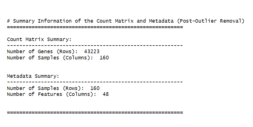
cat("\n\n# Summary Information of the Count Matrix and Metadata (Post-Outlier Removal)\n")
cat("=========================================================\n")
# Count matrix summary
cat("\nCount Matrix Summary:\n")
cat("---------------------------------------------------------\n")
cat("Number of Genes (Rows): ", nrow(counts_matrix), "\n")
cat("Number of Samples (Columns): ", ncol(counts_matrix), "\n\n")
# Metadata summary
cat("\nMetadata Summary:\n")
cat("---------------------------------------------------------\n")
cat("Number of Samples (Rows): ", nrow(metadata), "\n")
cat("Number of Features (Columns): ", ncol(metadata), "\n\n")
cat("\n=========================================================\n")
ncol(counts_matrix) / 2). This step ensures that the filtered dataset retains genes with meaningful levels of expression across a significant number of samples. After identifying the genes to keep, we filter the counts_matrix to retain only those genes, reassign the filtered matrix back to counts_matrix (Step 2), and then check the dimensions of the filtered dataset (Step 3) to confirm the number of genes and samples that remain (Figure 2.2.2).Code Block 2.2.2: Pre-filtering Low-Count Genes to Improve Data Quality
# ========================================================
# Step 1: Pre-filter low-count genes
# ========================================================
# Step 1: Create a logical matrix to check if each value in counts_matrix is >= 10 (sufficient expression).
# Step 2: Retain genes that have counts >= 10 in at least half of the samples (ncol(counts_matrix) / 2).
keep_genes <- rowSums(counts_matrix >= 10) >= (ncol(counts_matrix) / 2)
# Filter the counts matrix to retain only the genes that meet the filtering criteria
filtered_counts_matrix <- counts_matrix[keep_genes, ]
# ========================================================
# Step 2: Reassign filtered matrix to counts_matrix
# ========================================================
# Assign the filtered counts matrix back to counts_matrix for consistency in later steps
counts_matrix <- filtered_counts_matrix
# ======================================
# Step 3. Check dimensions of the filtered matrix (Summary Information after Low-Count Filtering)
# ======================================
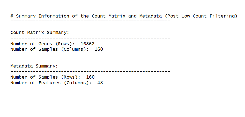
cat("\n\n# Summary Information of the Count Matrix and Metadata (Post-Low-Count Filtering)\n")
cat("=========================================================\n")
# Count matrix summary
cat("\nCount Matrix Summary:\n")
cat("---------------------------------------------------------\n")
cat("Number of Genes (Rows): ", nrow(counts_matrix), "\n")
cat("Number of Samples (Columns): ", ncol(counts_matrix), "\n\n")
# Metadata summary
cat("\nMetadata Summary:\n")
cat("---------------------------------------------------------\n")
cat("Number of Samples (Rows): ", nrow(metadata), "\n")
cat("Number of Features (Columns): ", ncol(metadata), "\n\n")
cat("\n=========================================================\n")
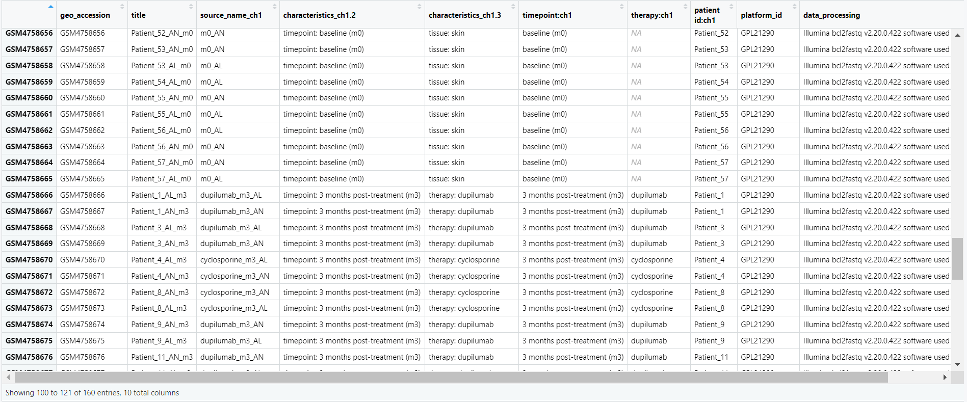
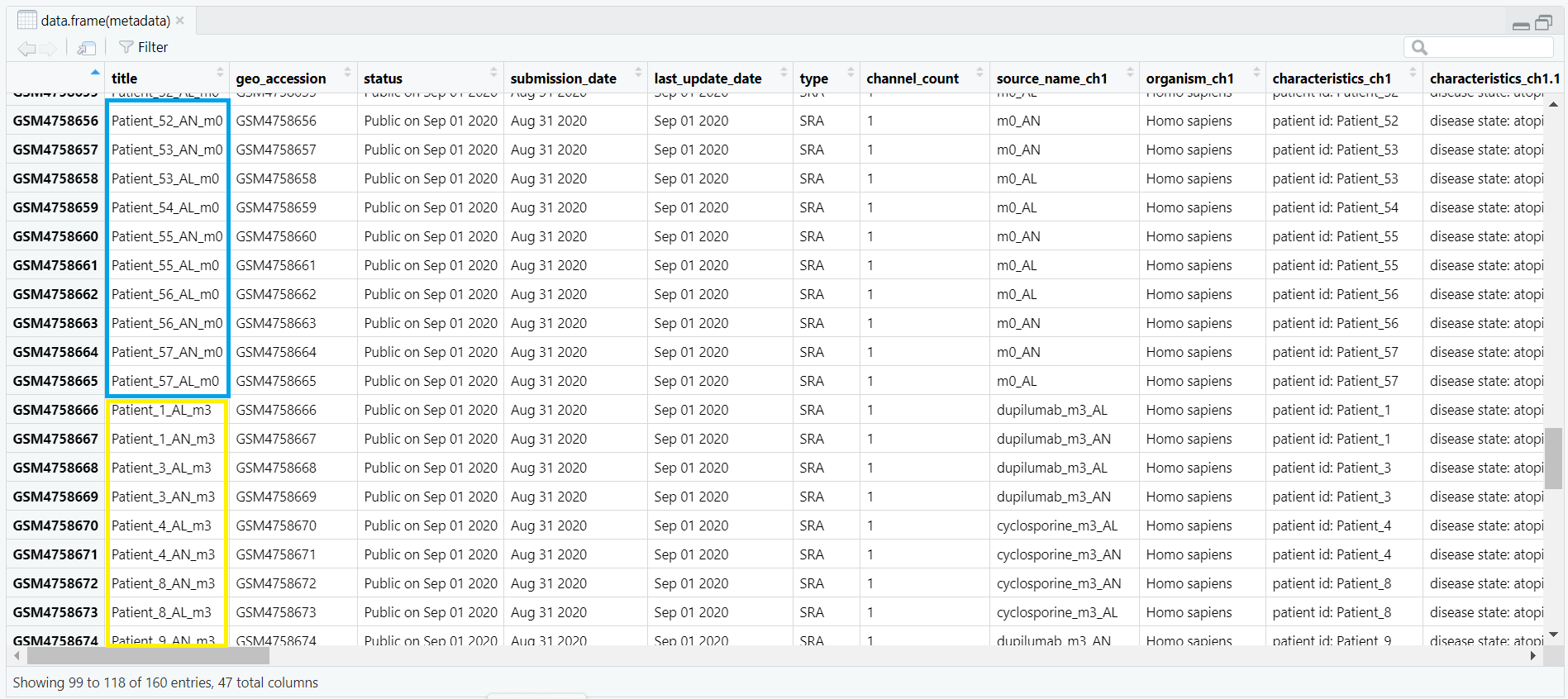
Code Block 3.1.1. Metadata Exploration
		# View all column names in the metadata to select relevant columns for analysis
		# This step helps us to explore the structure of the metadata and understand which columns are available.
		colnames(metadata)

		# Select relevant columns for analysis based on the experiment
		selected_metadata <- metadata[, c("geo_accession", "title", "source_name_ch1", "characteristics_ch1.2", "characteristics_ch1.3", "timepoint:ch1", "therapy:ch1", "patient id:ch1", "platform_id", "data_processing")]

		# Open the selected metadata in a viewer for further exploration
		View(selected_metadata)
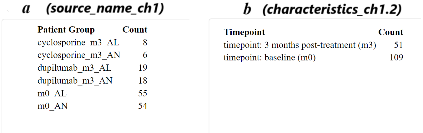
Code Block 3.1.2.1: Sample Distribution Table Generation
# Table of samples by patient group (e.g., lesional vs non-lesional)
group_table <- table(metadata$source_name_ch1)
kable(group_table, format = "html", col.names = c("Patient Group", "Count"))

# Table of samples by timepoints (e.g., baseline vs post-treatment)
timepoint_table <- table(metadata$characteristics_ch1.2)
kable(timepoint_table, format = "html", col.names = c("Timepoint", "Count"))
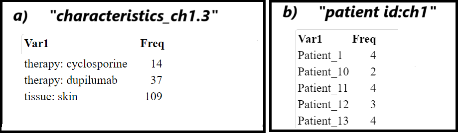
Code Block 3.1.2.2. Assessing Sample Characteristics for Experimental Design
# ======================
# List of all relevant columns
# These columns are selected based on the characteristics of the experiment,
# including metadata features like source names, patient IDs, and data processing details.
columns <- c("source_name_ch1",              # Source of the sample
             "characteristics_ch1.2",        # Experimental characteristic 1
             "characteristics_ch1.3",        # Experimental characteristic 2
             "therapy:ch1",                  # Therapy information
             "patient id:ch1",               # Patient ID
             "platform_id",                  # Platform used for data generation
             "extract_protocol_ch1",         # Sample extraction protocol 1
             "extract_protocol_ch1.1",       # Sample extraction protocol 2
             "data_processing",              # Data processing detail 1
             "data_processing.1",            # Data processing detail 2
             "data_processing.2",            # Data processing detail 3
             "data_processing.3",            # Data processing detail 4
             "data_processing.4",            # Data processing detail 5
             "data_processing.5",            # Data processing detail 6
             "data_processing.6"             # Data processing detail 7
)

# ==========
# Loop through each column and generate a summary table for each
# The loop checks if each column exists in the 'metadata' dataframe and prints a table of its unique values and frequencies.
for (col in columns) {
  if (col %in% colnames(metadata)) {  # Ensure the column exists in the metadata dataframe
    group_table <- table(metadata[[col]])  # Access and count the occurrences of each unique value in the column
    print(kable(group_table))              # Display the table using kable for a nicely formatted output
  } else {
    print(paste("Column", col, "does not exist in the metadata"))  # Handle cases where the column doesn't exist
  }
}
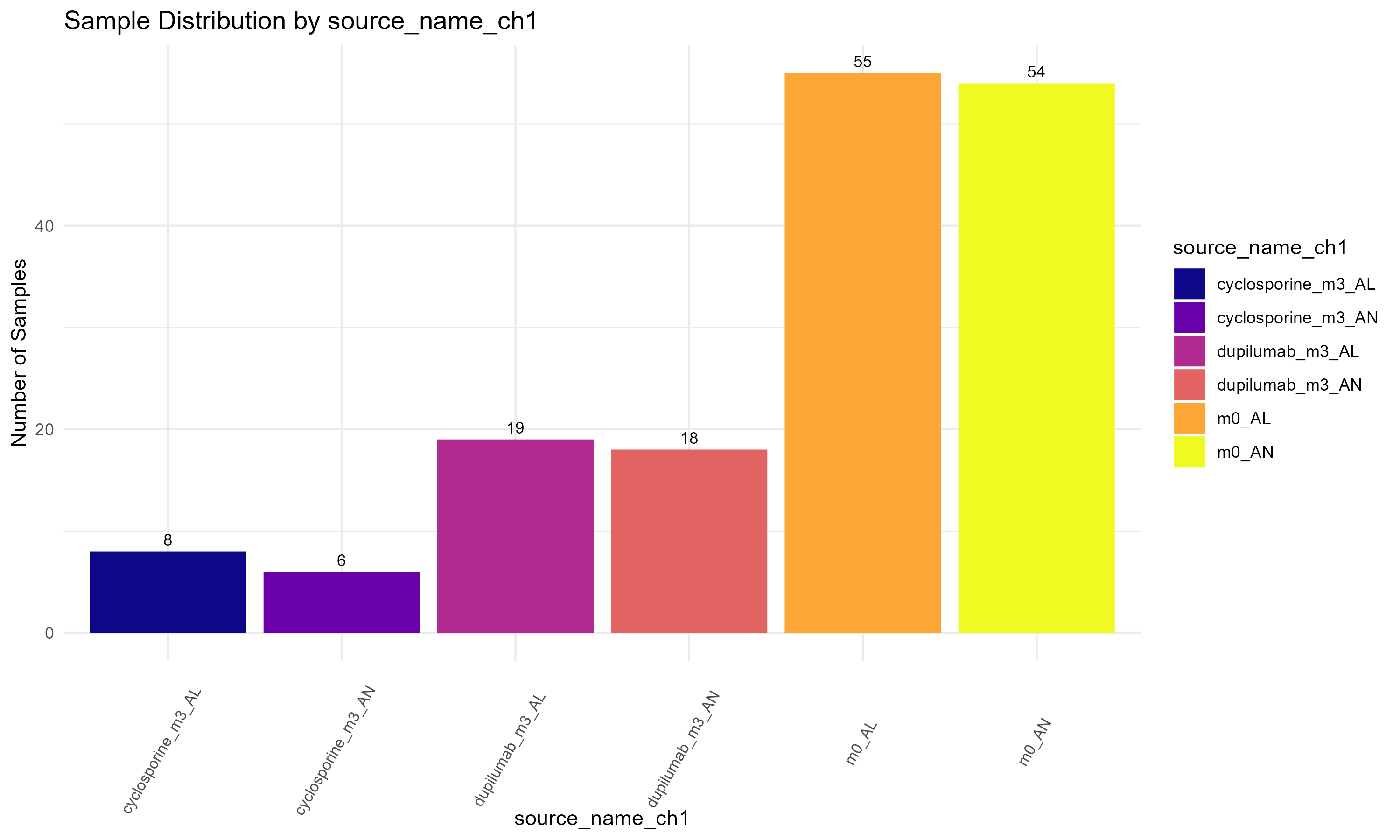
source_name_ch1, to display the sample distribution by experimental condition (Figure 3.1.3.1). However, the variable can be easily substituted with others if needed. (Step 1): The ggplot2 library is loaded for creating the plot. (Step 2): A bar plot is constructed using geom_bar() to create the bars and geom_text() to add count labels, where ..count.. refers to the computed count statistic. The plot is styled using theme_minimal() and color is applied with scale_fill_brewer(). (Step 3): Finally, the ggsave() function saves the plot to a specified location.
Code Block 3.1.3.1. Visualizing Sample Distribution by Experimental Condition
# ====================================
# Step 1: Load the necessary library
# ====================================
library(ggplot2)

# ============================================
# Step 2: Create a bar plot for sample counts
# ============================================
p <- ggplot(metadata, aes(x = `source_name_ch1`, fill = `source_name_ch1`)) +
  geom_bar() +  # Add bars representing sample counts
  geom_text(stat = "count", aes(label = ..count..), vjust = -0.5, size = 3) +  # Add count labels above bars
  theme_minimal() +  # Apply a minimal theme for better readability
  labs(title = "Sample Distribution by Experimental Condition",
       x = "Source Name",
       y = "Number of Samples") +
  theme(axis.text.x = element_text(angle = 60, vjust = 0.5, hjust = 0.6, size = 8)) +  # Adjust axis label size and angle
  scale_fill_brewer(palette = "Set3")  # Apply a color palette for the bars

# The variable "source_name_ch1" in this code can be manually replaced by other variables
# such as "characteristics_ch1.2", "characteristics_ch1.3", or "patient id:ch1" to visualize their distributions.

# ==================================
# Step 3: Save the plot to a file
# ==================================
ggsave("Figures/3.1.3.1.Bar_Chart_Metadata_Variables/3.1.3.1.Sample_Distribution_by_Condition.png",
       plot = p, width = 10, height = 6, dpi = 300, bg = "white")
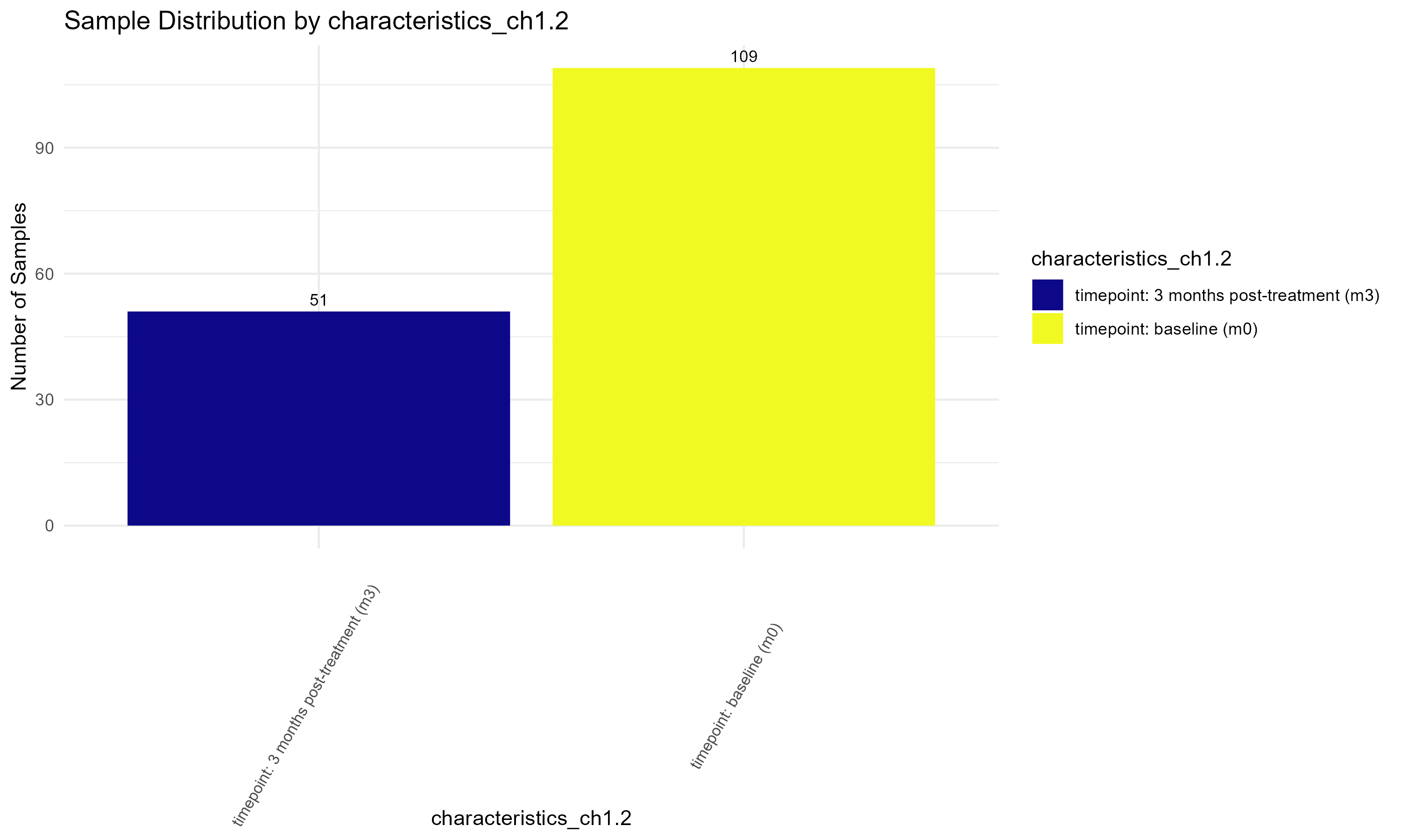
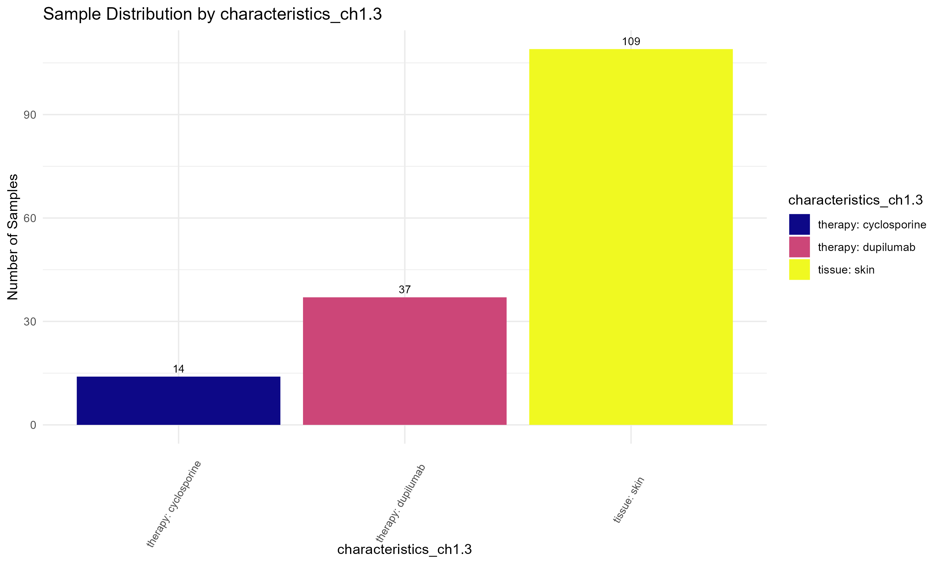
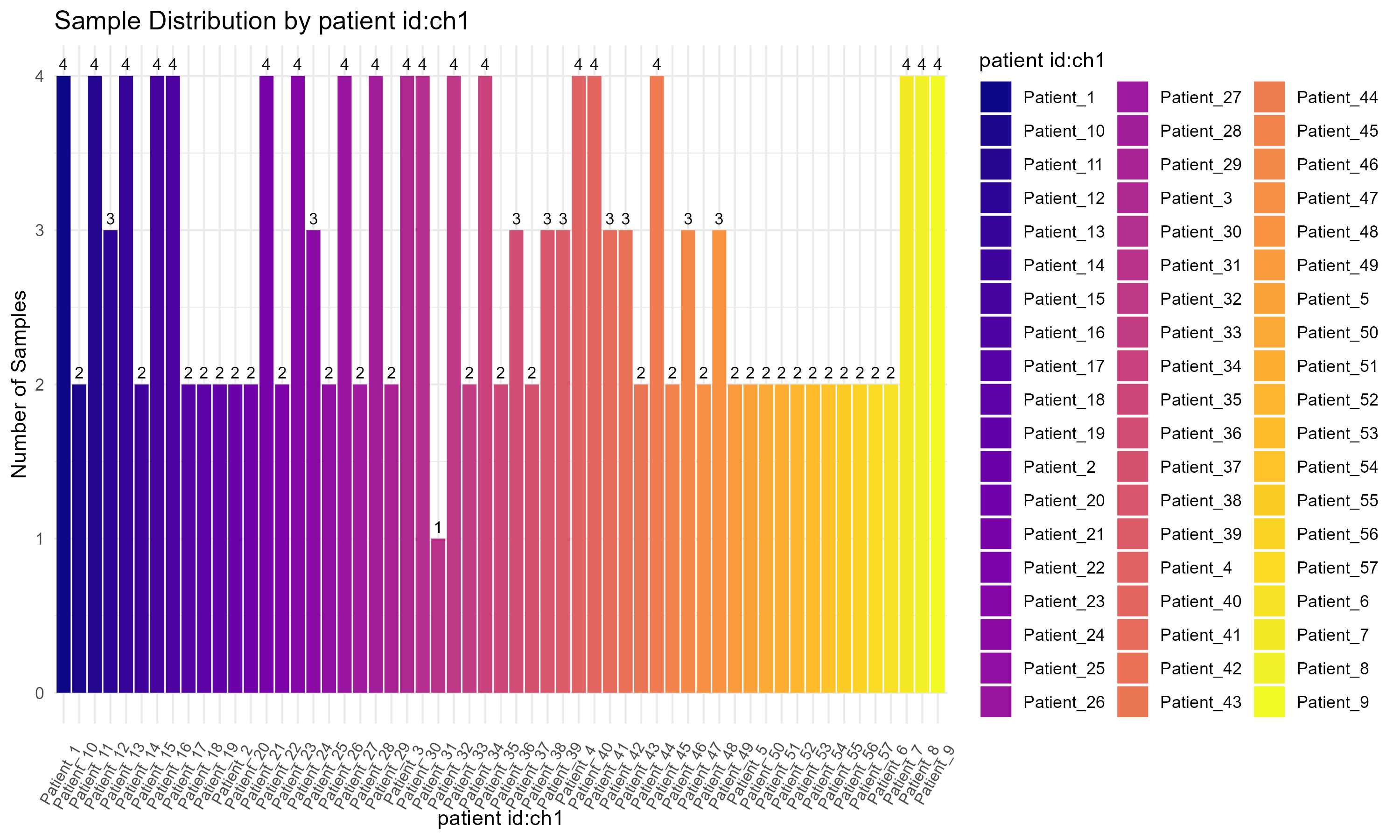
Code Block 3.1.3.2. Visualizing Sample Distribution for Multiple Metadata Variables Using Automated Bar Charts
# =========================== Step 1: Install and Load Necessary Packages =========================== #
# Load the required packages for plotting
library(ggplot2)  # For creating the bar plots
library(viridis)  # For using a color palette that supports many unique colors

# =========================== Step 2: Define Columns to Visualize =========================== #
# List of columns to visualize (these correspond to the metadata columns you want to plot)
columns_to_plot <- c("source_name_ch1", "characteristics_ch1.2", "characteristics_ch1.3", "patient id:ch1")

# =========================== Step 3: Loop Through Each Column and Create Plots =========================== #
# Loop through each column and create a bar plot for sample distribution
for (col in columns_to_plot) {

  # --------------------- Convert Column Name for Tidy Evaluation --------------------- #
  # Convert the column name (a string) to a symbol that ggplot can interpret within aes()
  col_sym <- sym(col)

  # --------------------- Sanitize Column Name for Saving Files --------------------- #
  # Replace ":" with "_" to create a valid filename (since ":" is not allowed in filenames)
  sanitized_col <- gsub("[:]", "_", col)

  # =========================== Step 4: Create Bar Plot =========================== #
  # Create the bar plot for the current column
  p <- ggplot(metadata, aes(x = !!col_sym, fill = !!col_sym)) +  # Fill colors based on the column
    geom_bar() +  # Create the bar chart
    geom_text(stat = "count", aes(label = ..count..), vjust = -0.5, size = 3) +  # Add text labels above bars to show the count
    theme_minimal() +  # Use a minimal theme for a clean appearance
    labs(title = paste("Sample Distribution by", col), x = col, y = "Number of Samples") +  # Add title and axis labels
    theme(axis.text.x = element_text(angle = 60, vjust = 0.5, hjust = 0.6, size = 8)) +  # Rotate x-axis labels and adjust their size
    scale_fill_viridis_d(option = "C")  # Use the "viridis" color palette to ensure enough distinct colors for each category

  # --------------------- Display the Plot --------------------- #
  # Print the plot so it displays in the R console or notebook
  print(p)

  # =========================== Step 5: Save the Plot as PNG =========================== #
  # Save the plot to a file in the specified directory with a relevant name
  ggsave(filename = paste0("Figures/3.1.3.2.Bar_Chart_Metadata_Variables/Figure3.1.3.2_", sanitized_col, "_Sample_Distribution.png"),
         plot = p, width = 10, height = 6, dpi = 300, bg = "white")
}
Code Block 3.2.1. Viewing the count matrix to inspect the gene expression data for each sample.
	# View the first few rows of the count matrix
	# This allows us to inspect the raw gene expression data for each sample.
	View(counts_matrix)
Code Block 3.2.2.1. Boxplot of Raw Counts (Uncolored)
# ============================
# Step 1: Load necessary library
# ============================
library(ggplot2)

# ============================
# Step 2: Prepare Data for Plotting
# ============================
# Convert counts_matrix to a data frame and log-transform it
df <- as.data.frame(log2(counts_matrix + 1))  # Log2 transform the counts matrix

# Add a sample column (rownames will become a new column for plotting)
df$Sample <- rownames(df)

# Reshape the data for ggplot2 (long format)
df_long <- reshape2::melt(df, id.vars = "Sample")

# ============================
# Step 3: Create Boxplot
# ============================
p <- ggplot(df_long, aes(x = variable, y = value)) +
  geom_boxplot() +  # Create boxplot
  theme_minimal() +  # Apply a minimal theme for better readability
  labs(title = "Log2 Raw Counts Across Samples", x = "Samples", y = "Log2 Counts") +
  theme(axis.text.x = element_text(angle = 45, hjust = 1, size = 4),
        plot.background = element_rect(fill = "white", colour = NA),  # Set white background
        panel.background = element_rect(fill = "white", colour = NA))  # Set white background for the panel

# ============================
# Step 4: Save the Plot 3.2.2.1.Uncolored_Boxplot_Raw_Counts
# ============================
ggsave("Figures/3.2.2.Boxplot_Raw_Counts/3.2.2.1.Uncolored_Boxplot_Raw_Counts.png"",
       plot = p, width = 13, height = 4)
Code Block 3.2.2.2. Boxplot of Raw Counts Colored by Experimental Condition
# ============================
# Load necessary libraries
# ============================
library(ggplot2)
library(reshape2)

# ============================
# Step 1: Align Sample IDs and Metadata
# ============================

# Set the row names of metadata to the sample names (stored in metadata$title)
rownames(metadata) <- metadata$title

# Extract the sample IDs from counts_matrix (columns represent samples)
sample_ids <- colnames(counts_matrix)

# Filter metadata to contain only rows that match the sample IDs in the count matrix
metadata_filtered <- metadata[metadata$title %in% sample_ids, ]

# Reorder metadata to match the order of sample IDs in the count matrix
metadata_filtered <- metadata_filtered[match(sample_ids, rownames(metadata_filtered)), ]


# ============================
# Step 2: Prepare Data for Plotting
# ============================

# Transpose the counts matrix to make samples the rows
counts_matrix_t <- t(counts_matrix)

# Convert the transposed counts matrix to a data frame and log-transform the counts
# Add 1 to avoid log(0), which is undefined
df <- as.data.frame(log2(counts_matrix_t + 1))

# Add a sample column (rownames will become a new column for plotting)
df$Sample <- rownames(df)

# Add the group information from metadata (e.g., source_name_ch1)
df$group <- metadata_filtered$source_name_ch1[match(df$Sample, rownames(metadata_filtered))]

# Ensure `group` is a factor for proper grouping in the plot
df$group <- as.factor(df$group)


# ============================
# Step 3: Reshape the Data for ggplot2 (Long Format)
# ============================

# Melt the data frame to create a long format for ggplot2
df_long <- melt(df, id.vars = c("Sample", "group"))


# ============================
# Step 4: Define Colors for Each Unique Group and Add Sample Counts to the Labels
# ============================

# Calculate the number of samples for each group
group_counts <- table(df$group)

# Calculate the total number of samples
total_samples <- sum(group_counts)

# Create the color palette for the unique groups
unique_groups <- unique(df$group)
color_palette <- c("#FF6347", "#4682B4", "#32CD32", "#FFD700", "#8A2BE2", "#00CED1")

# Ensure the color palette has enough colors for all groups
group_colors <- setNames(color_palette[1:length(unique_groups)], unique_groups)

# ============================
# Step 5: Create the Plot with Updated Group Labels
# ============================

p <- ggplot(df_long, aes(x = factor(Sample, levels = sample_ids), y = value, fill = group)) +
  geom_boxplot() +
  theme_minimal() +
  labs(title = "Log2 Raw Counts Across Samples by Source Name", x = "Samples", y = "Log2 Counts",
       fill = paste0("group (Total n=", total_samples, ")")) +  # Add total number to the legend title
  theme(axis.text.x = element_text(angle = 30, hjust = 1, size = 4), # Rotate and adjust x-axis labels
        plot.background = element_rect(fill = "white", colour = NA),  # Set white background
        panel.background = element_rect(fill = "white", colour = NA)) + # Set white background for the panel
  scale_fill_manual(values = group_colors, labels = paste0(levels(df$group), " (n=", group_counts[levels(df$group)], ")"))  # Use the custom color vector and add counts in the legend

# ============================
# Step 6: Save the Plot
# ============================

ggsave("Figures/3.2.2.Boxplot_Raw_Counts/3.2.2.2.Colored_Boxplot_Raw_Counts.png",
       plot = p, width = 20, height = 6)
hist() function. (Step 4): To enhance the visualization, the gene count values are added as labels above each bar. Finally, (Step 5): The PNG device is closed, and the plot is saved.
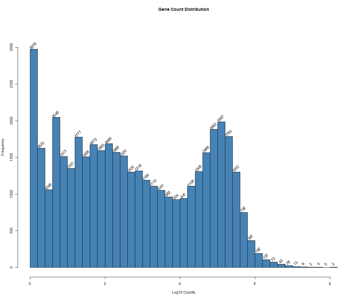
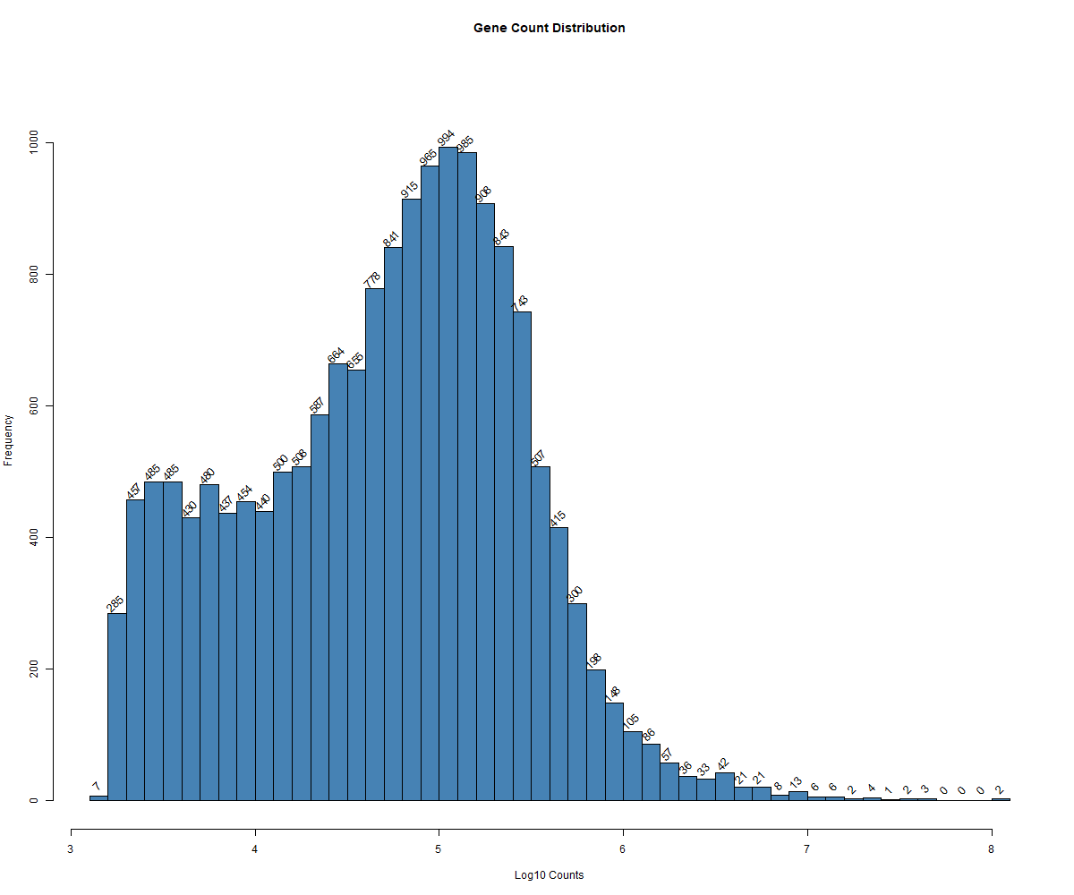
Code Block 3.2.3. Histogram of Total Gene Counts Per Sample
# ============================
# Step 1: Define Output File Path
# ============================

# Define the file path where you want to save the image
output_file <- "C:/Users/Desktop/RNA_Seq_Task1/3/3_Count_Matrix_Exploration/3.2.3.a.histogram_Of_total_GeneCounts_Per_Sample_Before_Removing_LowCountGenes_AND_Outlier_Samples.png"

# ============================
# Step 2: Open PNG Device
# ============================

# Open the PNG device to save the plot
png(filename = output_file, width = 1200, height = 1000)

# ============================
# Step 3: Create Histogram of Log-Transformed Gene Counts
# ============================

# Calculate log10 of total counts per gene
log_gene_counts <- log10(rowSums(counts_matrix))

# Create the histogram and get the counts for each bin
hist_data <- hist(log_gene_counts,
                  breaks = 50,  # Specify number of bins in the histogram
                  main = "Gene Count Distribution",  # Title of the plot
                  xlab = "Log10 Counts",  # Label for the x-axis
                  col = "steelblue")  # Add color to the bars

# Update the y-axis limit to make room for labels
ylim <- c(0, max(hist_data$counts) * 1.1)
plot(hist_data, col = "steelblue", main = "Gene Count Distribution", xlab = "Log10 Counts", ylim = ylim) # cex: to change the font size of the labels on the bars

# ============================
# Step 4: Add Numbers Above Bars
# ============================

# Add the text labels above the histogram bars
text(hist_data$mids, hist_data$counts, labels = hist_data$counts, pos = 3, cex = 1, srt = 45)

# ============================
# Step 5: Close the PNG Device
# ============================

# Close the PNG device
dev.off()
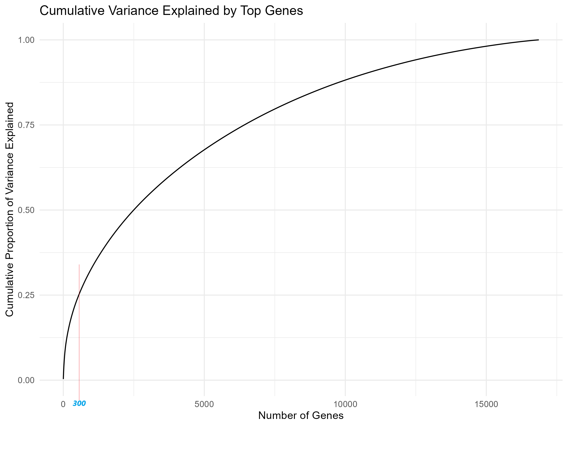
matrixStats and ggplot2 are loaded for variance calculations and plotting. (Step 2): The gene expression data in counts_matrix is log2-transformed to reduce its dynamic range, making it easier to interpret. (Step 3): Using the rowVars() function, the variance of each gene across all samples is calculated, identifying highly variable genes for further analysis. (Step 4): The cumulative variance is computed by sorting these variances and calculating their cumulative sum, which helps assess how much variability is captured by the top genes. (Step 5): Finally, a line plot is generated (Figure 3.2.4) using ggplot2 to visualize the cumulative variance explained by an increasing number of genes, aiding in the selection of the optimal number of genes for further analysis.
Code Block 3.2.4. Cumulative Variance Plot to Determine Optimal Gene Count for Heatmap
# =========== Step 1: Load Required Libraries =============
library(matrixStats)  # Or DelayedMatrixStats for variance calculations
library(ggplot2)      # For enhanced plotting capabilities

# =========== Step 2: Log2 Transformation =============
# Convert counts_matrix to a matrix and apply log2 transformation
# Log transformation reduces the dynamic range of the data, making it easier to interpret
counts_matrix_log <- log2(as.matrix(counts_matrix) + 1)

# =========== Step 3: Calculate Gene Variances =============
# Use the rowVars() function to calculate the variance for each gene across samples
# Gene variance is used to identify the most variable genes for further analysis
gene_variances <- rowVars(counts_matrix_log)

# =========== Step 4: Calculate Cumulative Variance =============
# Sort the variances in descending order and calculate the cumulative sum
cum_variance <- cumsum(sort(gene_variances, decreasing = TRUE)) / sum(gene_variances)

# =========== Step 5: Plot Cumulative Variance using ggplot2 for enhanced plotting =============
# Plot the cumulative proportion of variance explained as the number of genes increases
# This plot will help visualize how many top genes are needed to explain a high proportion of variance
ggplot(data.frame(Genes = 1:length(cum_variance), CumulativeVariance = cum_variance), aes(x = Genes, y = CumulativeVariance)) +
  geom_line() +
  labs(title = "Cumulative Variance Explained by Top Genes",
       x = "Number of Genes",
       y = "Cumulative Proportion of Variance Explained") +
  theme_minimal()
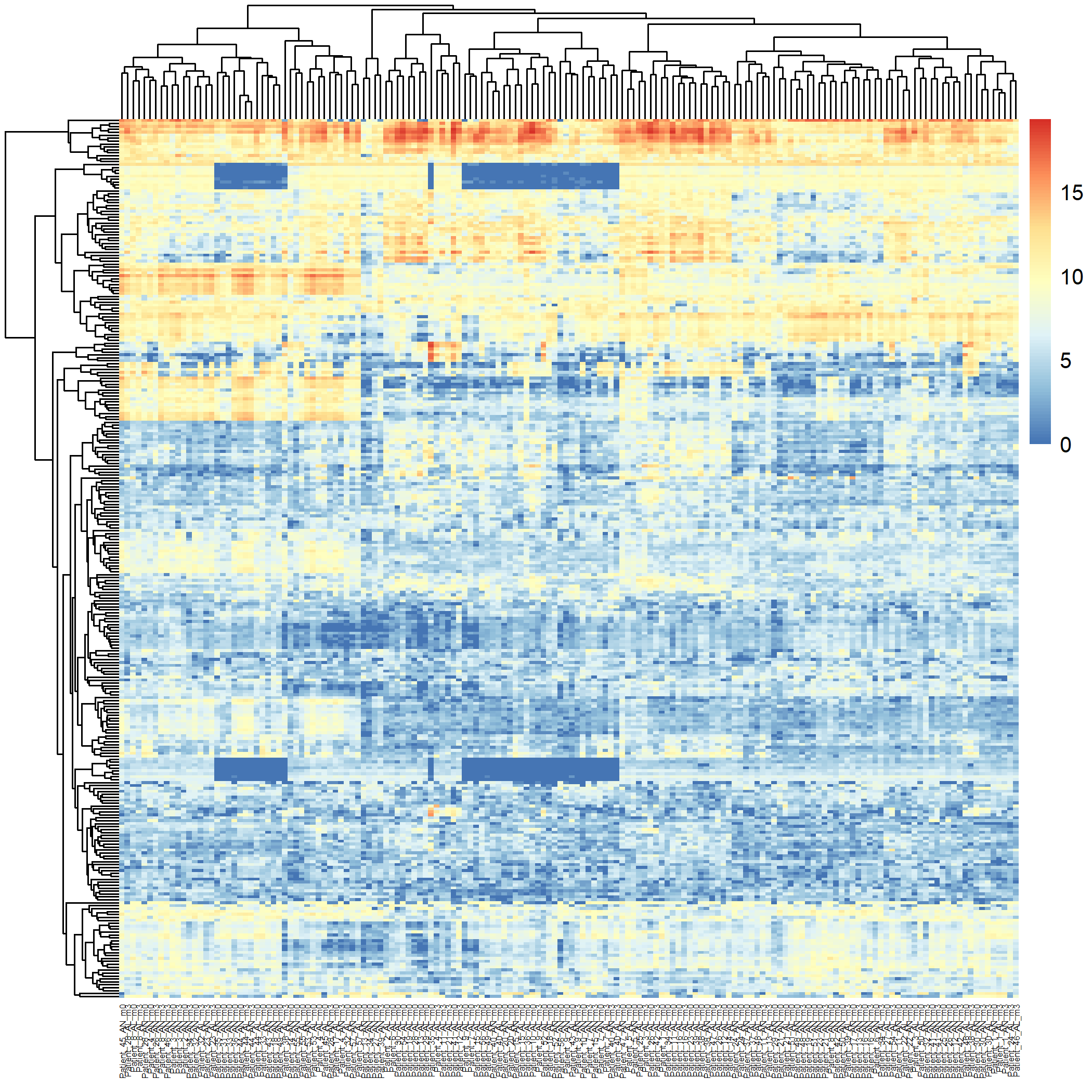
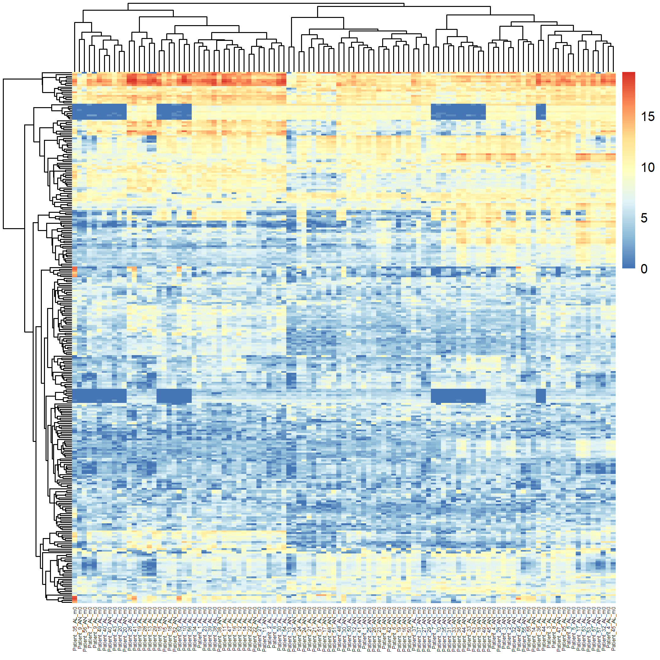
Code Block 3.2.5.1. Unsupervised Heatmap for All Samples (160 samples)
# ============ Load Required Libraries ============
# Load the required libraries for matrix operations and heatmap generation
library(matrixStats)  # Ensure matrixStats is loaded for row variance calculation
library(pheatmap)     # For generating heatmaps

# ============ Step 1: Convert counts_matrix to Matrix ============
# Convert counts_matrix to a matrix if it is currently a data frame
counts_matrix <- as.matrix(counts_matrix)  # Ensures compatibility with downstream functions

# ============ Step 2: Log2 Transformation of Counts ============
# Apply a log2 transformation to reduce the dynamic range of the count data
counts_matrix_log <- log2(counts_matrix + 1)  # Adding 1 to avoid log(0) issues

# ============ Step 3: Identify Top Variable Genes ============
# Recalculate the most variable genes based on the log-transformed counts
# We select the top 300 most variable genes using row variance
top_var_genes_log <- head(order(rowVars(counts_matrix_log), decreasing = TRUE), 300)

# ============ Step 4: Generate Heatmap and Save ============
# Create the heatmap for all 166 samples based on the top 300 most variable genes
# Adjust clustering and visual parameters such as label angles and font sizes
pheatmap(counts_matrix_log[top_var_genes_log, ],
         cluster_rows = TRUE, cluster_cols = TRUE,
         show_rownames = FALSE, show_colnames = TRUE,
         angle_col = 90,  # Rotate x-axis labels for better readability
         fontsize_col = 4,  # Reduce font size for the column labels
         filename = "Figures/3.2.5.Exploratory_Heatmaps/3.2.5.1.Unsupervised_Heatmap_160_Samples.png")  # Save the heatmap as an image
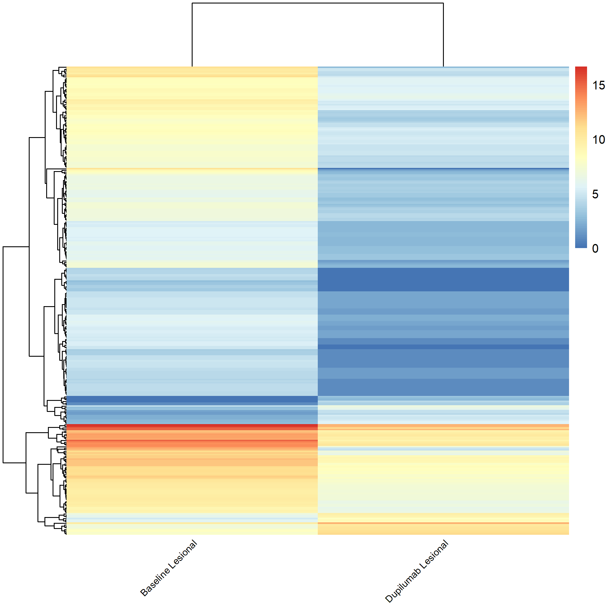
matrixStats and pheatmap libraries are loaded for matrix operations and heatmap generation. (Step 1): The metadata is subset to include only the baseline lesional (AL_m0) and non-lesional (AN_m0) samples by filtering based on metadata$title. These subsets are combined into one dataset for comparison. (Step 2): The counts_matrix is filtered to include only the lesional and non-lesional samples based on the sample names in metadata$title. (Step 3): A log2 transformation is applied to the filtered count matrix using log2() to reduce the dynamic range. (Step 4): The top 300 most variable genes are identified based on variance using rowVars(). (Step 5): A heatmap is generated (Figure 3.2.5.2) using pheatmap, with rows and columns clustered to visualize the relationship between samples and gene expression. Adjustments are made for label angles and font size, and the heatmap is saved as an image file.
Code Block 3.2.5.2. Unsupervised Heatmap for Baseline Lesional and Non-lesional Samples (109 samples)
# ============ Load Required Libraries ============
# Load the required libraries for matrix operations and heatmap generation
library(matrixStats)  # Ensure matrixStats is loaded for row variance calculation
library(pheatmap)     # For generating heatmaps

# ============ Step 1: Subset Metadata for Lesional and Non-lesional Samples ============
# Subset the metadata to include only the baseline lesional (AL_m0) and non-lesional (AN_m0) samples
lesional_samples <- metadata[grepl("AL_m0", metadata$title), ]  # Filter metadata for lesional samples
non_lesional_samples <- metadata[grepl("AN_m0", metadata$title), ]  # Filter metadata for non-lesional samples

# Combine lesional and non-lesional samples into one dataset for comparison
selected_samples <- rbind(lesional_samples, non_lesional_samples)

# ============ Step 2: Subset the Count Matrix ============
# Subset the count matrix to include only the lesional and non-lesional samples
# Assuming the sample names (columns) in counts_matrix match those in metadata$title
selected_sample_names <- selected_samples$title
counts_matrix_filtered <- counts_matrix[, selected_sample_names]  # Filter the count matrix for the selected samples

# ============ Step 3: Log2 Transformation of Filtered Counts ============
# Apply a log2 transformation to the filtered count matrix to reduce the dynamic range
counts_matrix_log <- log2(as.matrix(counts_matrix_filtered) + 1)  # Adding 1 to avoid log(0) issues

# ============ Step 4: Identify Top Variable Genes ============
# Recalculate the most variable genes based on the log-transformed counts
# Select the top 300 most variable genes
top_var_genes_log <- head(order(rowVars(counts_matrix_log), decreasing = TRUE), 300)

# ============ Step 5: Generate Heatmap and Save ============
# Create a heatmap for the lesional and non-lesional samples based on the top 300 most variable genes
# Adjust clustering and visual parameters such as label angles and font sizes
pheatmap(counts_matrix_log[top_var_genes_log, ],
         cluster_rows = TRUE, cluster_cols = TRUE,
         show_rownames = FALSE, show_colnames = TRUE,
         angle_col = 90,  # Rotate x-axis labels for better readability
         fontsize_col = 4,  # Reduce font size for the column labels
         filename = "Figures/3.2.5.Exploratory_Heatmaps/3.2.5.2.Unsupervised_Heatmap_Baseline_Samples.png")  # Save the heatmap as an image
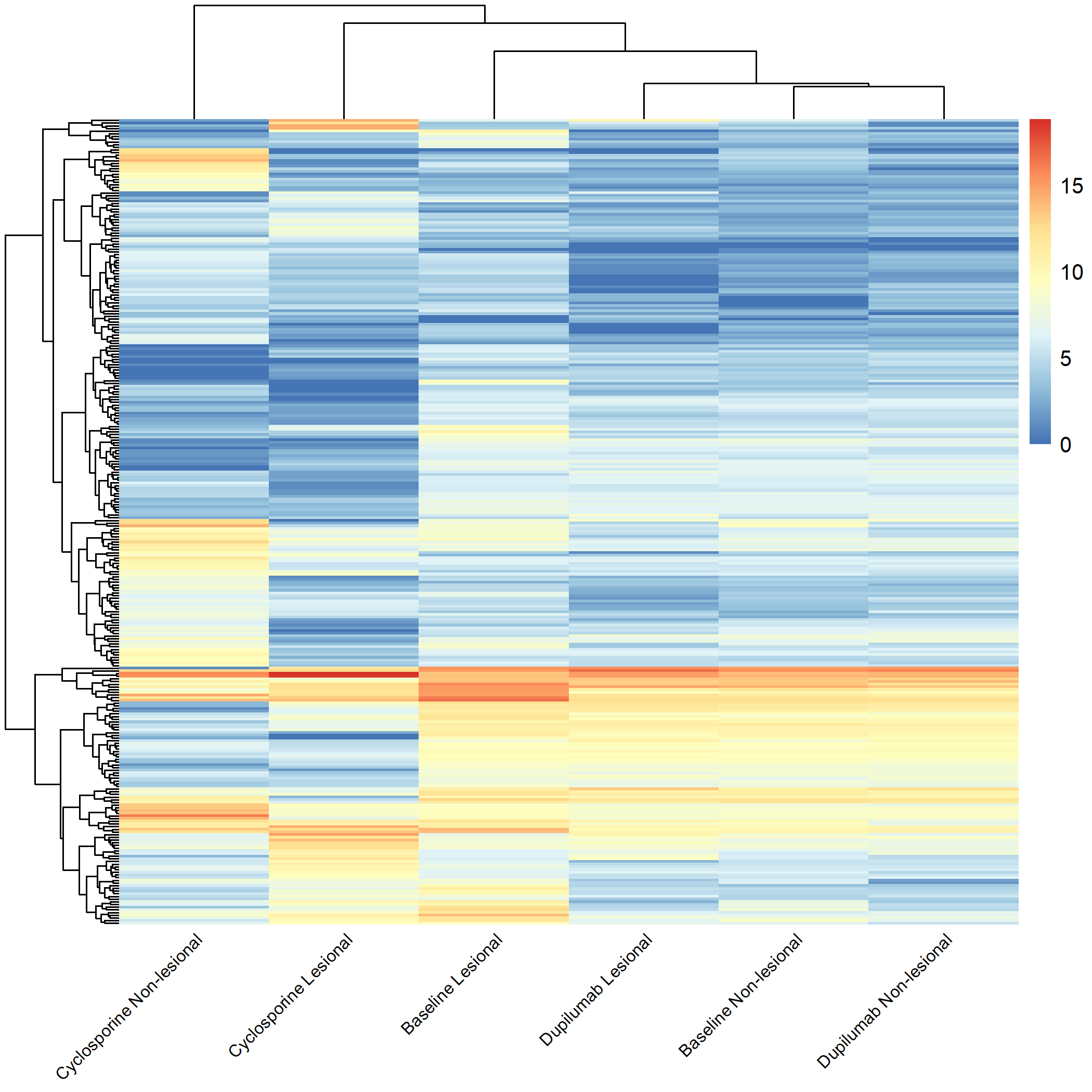
Code Block 3.2.5.3. Grouped Heatmap for All Groups
# =========== Load Required Libraries ===========
library(matrixStats)
library(pheatmap)
# =========== Step 1: Apply Log2 Transformation ===========
counts_matrix_log <- log2(as.matrix(counts_matrix) + 1)
# =========== Step 2: Extract Sample Grouping Information ===========
sample_groups <- metadata$source_name_ch1
# =========== Step 3: Define Descriptive Labels ===========
new_labels <- c(
"m0_AN" = "Baseline Non-lesional",
"cyclosporine_m3_AN" = "Cyclosporine Non-lesional",
"dupilumab_m3_AN" = "Dupilumab Non-lesional",
"m0_AL" = "Baseline Lesional",
"cyclosporine_m3_AL" = "Cyclosporine Lesional",
"dupilumab_m3_AL" = "Dupilumab Lesional"
)
# =================================================================================
# =========== Step 3.1: Select Groups for Analysis ===========
selected_groups <- c("m0_AN", "cyclosporine_m3_AN", "dupilumab_m3_AN", "m0_AL", "cyclosporine_m3_AL", "dupilumab_m3_AL")
# ===== we can replace the above selected_groups with one of the bellow =====
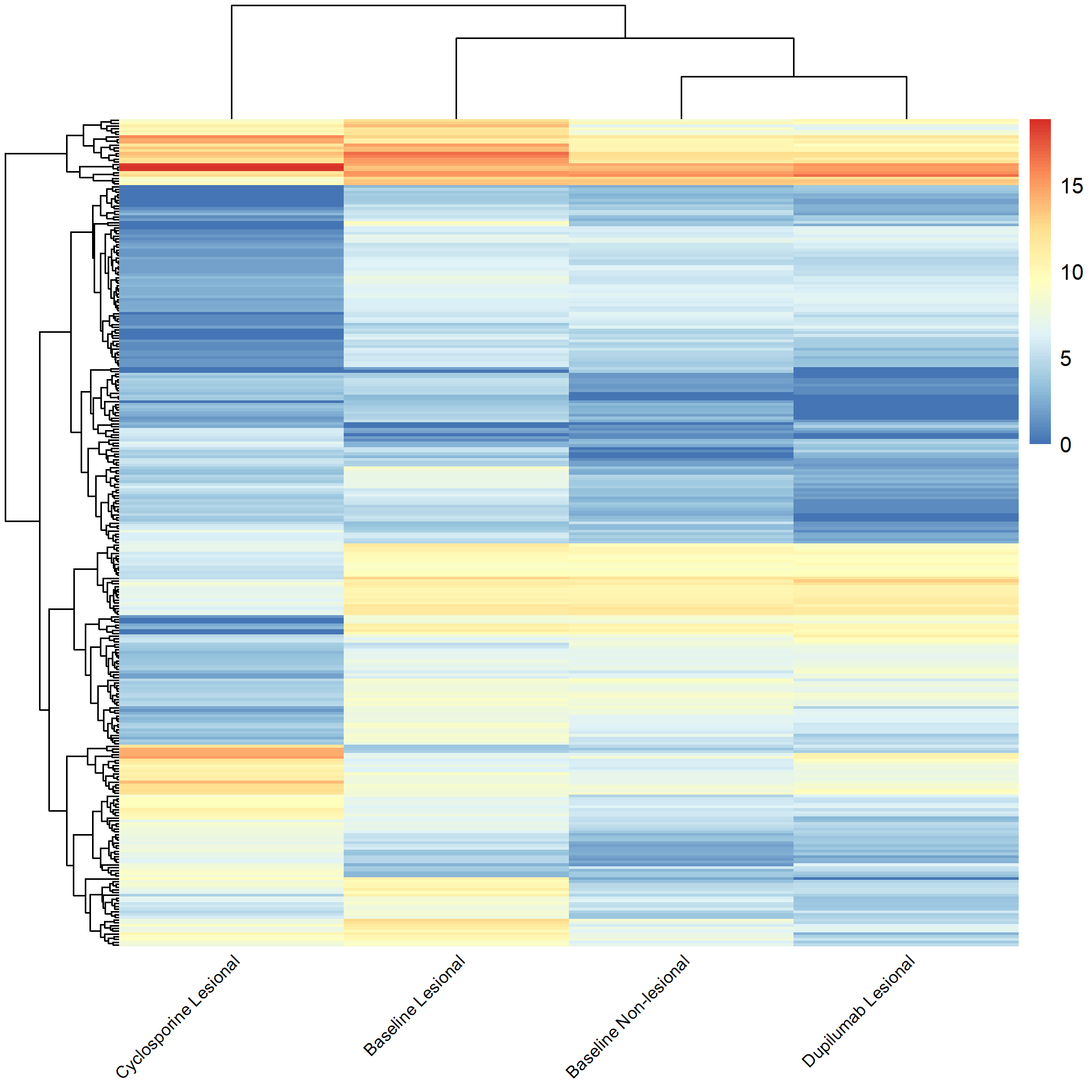
# 1. Heatmap for all groups:
# c("m0_AN", "cyclosporine_m3_AN", "dupilumab_m3_AN", "m0_AL", "cyclosporine_m3_AL", "dupilumab_m3_AL")
# 2. (Lesional vs. Non-lesional) Compare "Baseline Lesional" with "Baseline Non-lesional":
# c("m0_AN", "m0_AL")
# 3. (Lesional vs. Non-lesional) Compare Cyclosporine Lesional with Cyclosporine Non-lesional:
# c("cyclosporine_m3_AN", "cyclosporine_m3_AL")
# 4. (Lesional vs. Non-lesional) Compare Dupilumab Lesional with Dupilumab Non-lesional:
# c("dupilumab_m3_AN", "dupilumab_m3_AL")
# 5. (Therapy Comparisons) Compare Baseline Lesional, Cyclosporine Lesional, and Dupilumab Lesional (compared to Baseline Non-Lesional).
# c("m0_AN", "m0_AL", "cyclosporine_m3_AL", "dupilumab_m3_AL")
# 6. (Therapy Comparisons) Compare Dupilumab Lesional and Cyclosporine Lesional.
# c("dupilumab_m3_AL", "cyclosporine_m3_AL")
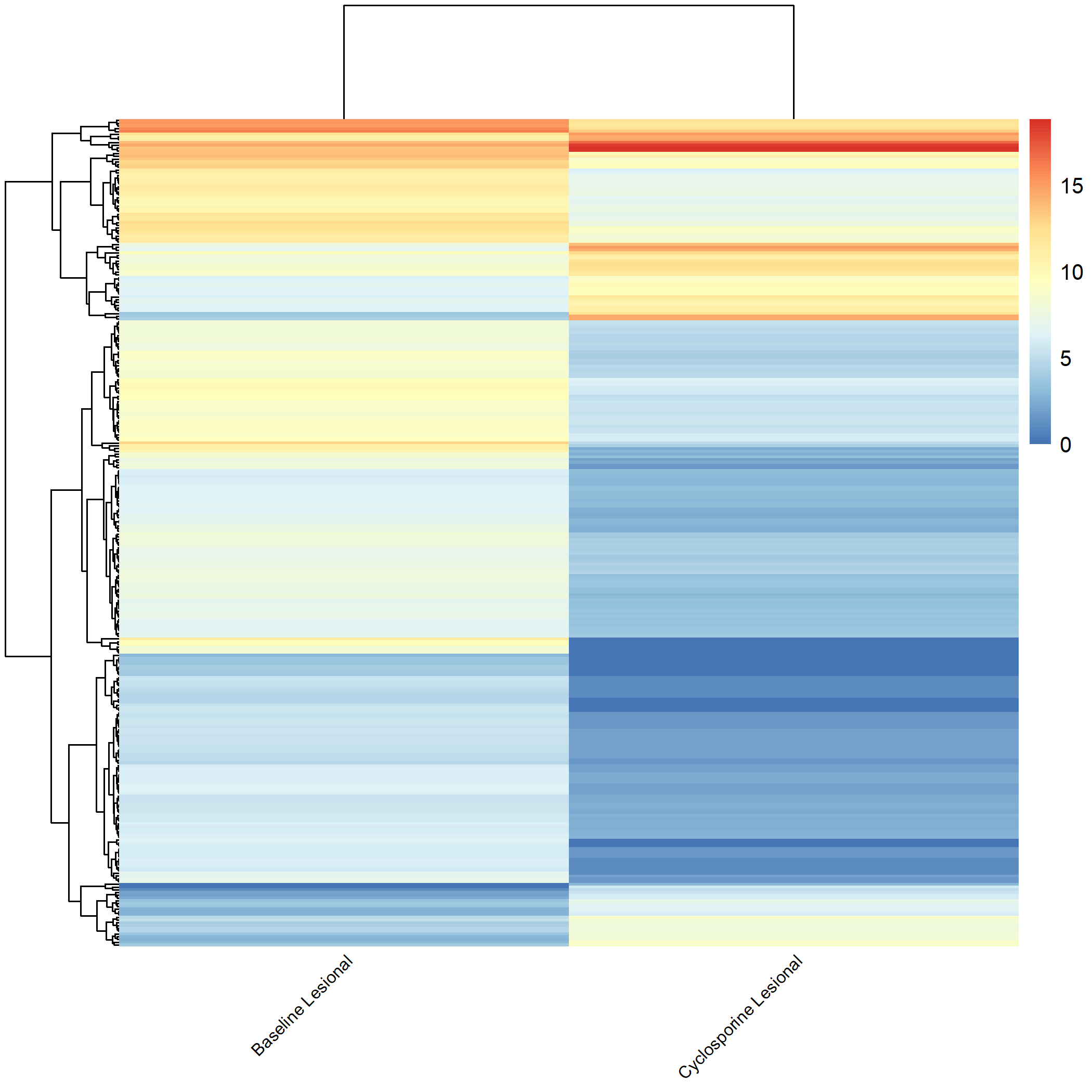
# 7. (Pre-treatment vs. Post-treatment) Compare Baseline Lesional & Cyclosporine Lesional.
# c("m0_AL", "cyclosporine_m3_AL")
# 8. (Pre-treatment vs. Post-treatment) Compare Baseline Lesional & Dupilumab Lesional.
# c("m0_AL", "dupilumab_m3_AL")
# =================================================================================
# =========== Step 4: Reorder Columns Based on Group Selection ===========
desired_order <- selected_groups
reordered_columns <- match(desired_order, sample_groups)
counts_matrix_log <- counts_matrix_log[, reordered_columns]
colnames(counts_matrix_log) <- new_labels[sample_groups[reordered_columns]]
# =========== Step 5: Calculate Top Variable Genes ===========
top_var_genes_log <- head(order(rowVars(counts_matrix_log), decreasing = TRUE), 300)
# =========== Step 6: Generate the Heatmap ===========
pheatmap(counts_matrix_log[top_var_genes_log, ],
cluster_rows = TRUE, cluster_cols = TRUE,
show_rownames = FALSE, show_colnames = TRUE,
angle = 45, vjust = 0.5, hjust = 0.6,
fontsize_col = 8,
filename = "Figures/3.2.5.Exploratory_Heatmaps/3.2.5.3.Grouped_Heatmap_All_Groups.png")
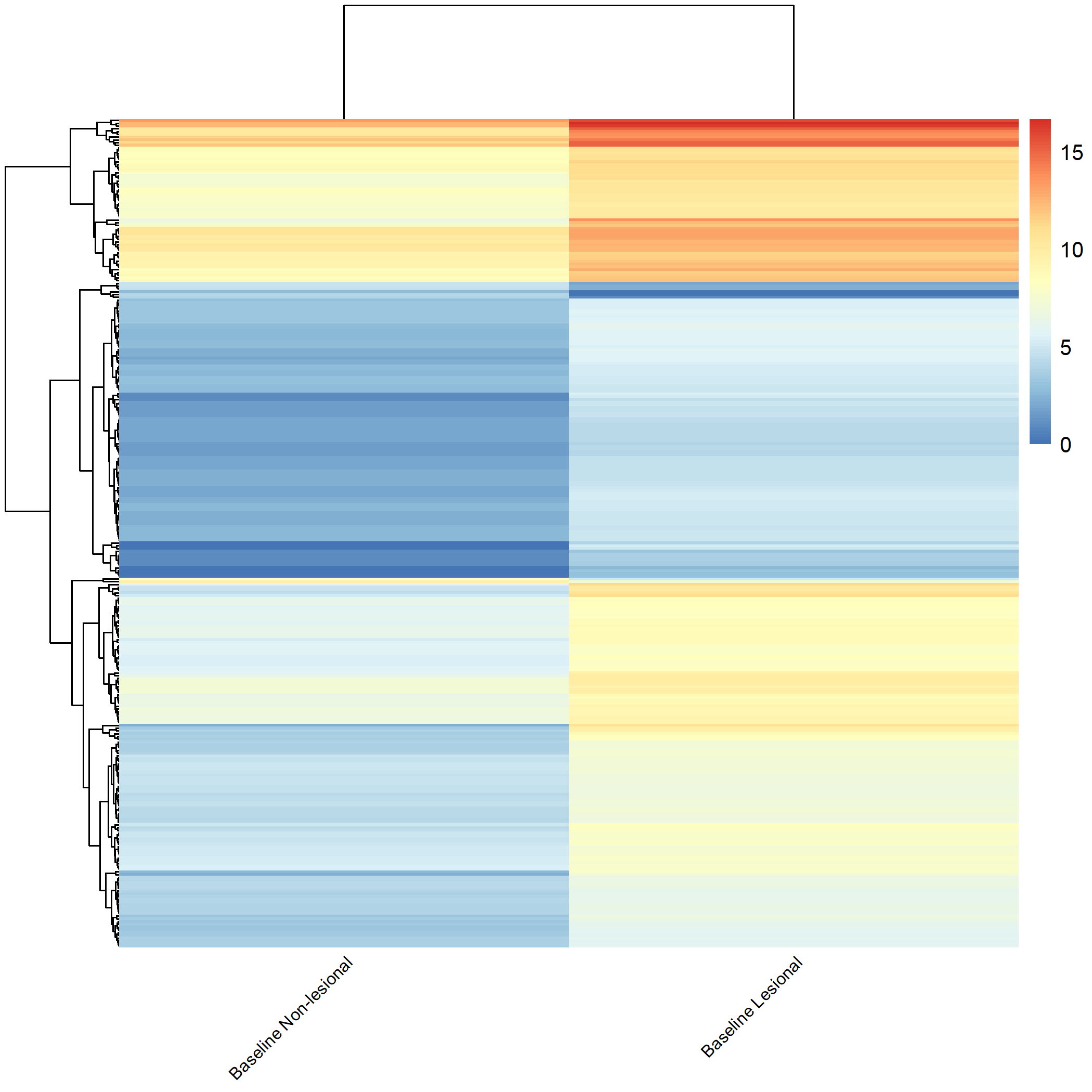
Code Block 3.2.5.4. Grouped Heatmap: Compare Baseline Lesional with Baseline Non-lesional
# ============================
selected_groups <- c("m0_AN", "m0_AL")
# ============================
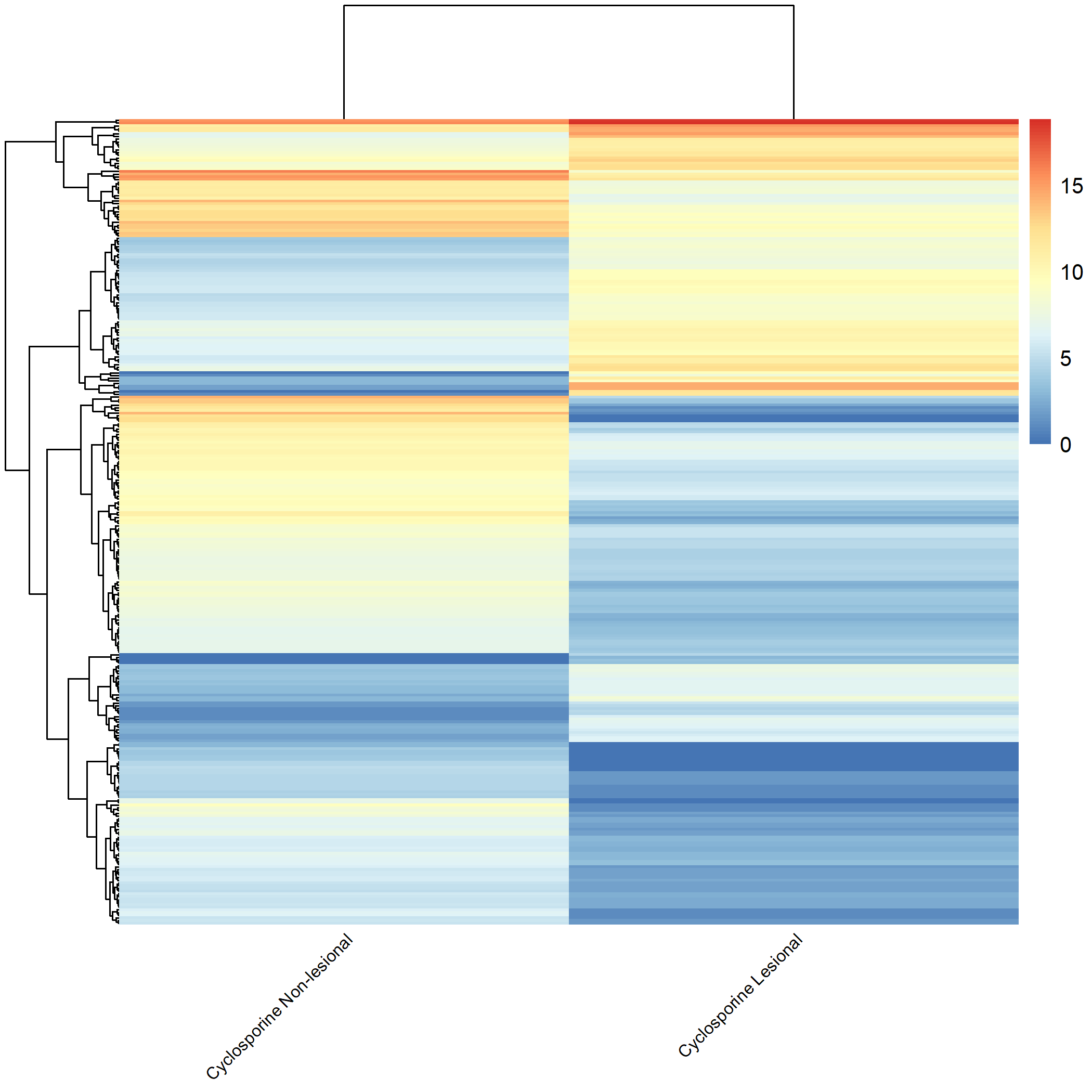
Code Block 3.2.5.5. Grouped Heatmap: Compare Cyclosporine Lesional vs. Non-lesional
# ============================
selected_groups <- c("cyclosporine_m3_AN", "cyclosporine_m3_AL")
# ============================
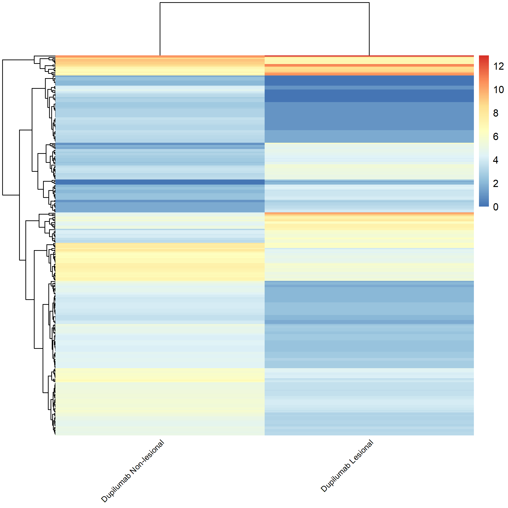
Code Block 3.2.5.6. Grouped Heatmap: Compare Dupilumab Lesional vs. Dupilumab Non-lesional
# ============================
selected_groups <- c("dupilumab_m3_AN", "dupilumab_m3_AL")
# ============================
Code Block 3.2.5.7. Grouped Heatmap: Compare Baseline Non-Lesional vs. Baseline Lesional, Cyclosporine Lesional, and Dupilumab Lesional
# ============================
selected_groups <- c("m0_AN", "m0_AL", "cyclosporine_m3_AL", "dupilumab_m3_AL")
# ============================
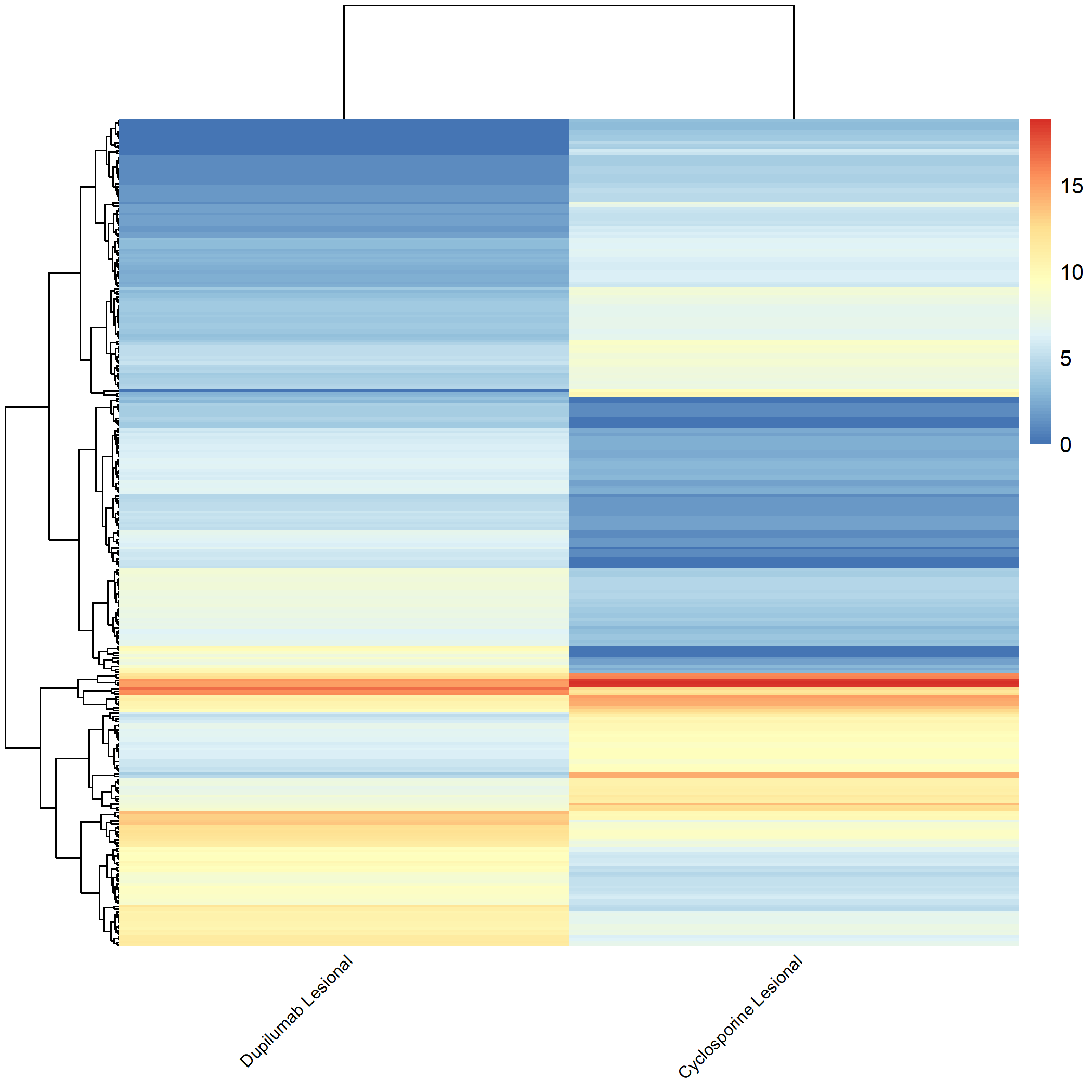
Code Block 3.2.5.8. Grouped Heatmap: Compare Dupilumab Lesional vs. Cyclosporine Lesional
# ============================
selected_groups <- c("dupilumab_m3_AL", "cyclosporine_m3_AL")
# ============================
Code Block 3.2.5.9. Grouped Heatmap: Compare Pre-treatment vs. Post-treatment (Baseline Lesional & Cyclosporine Lesional)
# ============================
selected_groups <- c("m0_AL", "cyclosporine_m3_AL")
# ============================
Code Block 3.2.5.10. Grouped Heatmap: Compare Pre-treatment vs. Post-treatment (Baseline Lesional & Dupilumab Lesional)
	# ============================
	selected_groups <- c("m0_AL", "dupilumab_m3_AL")
	# ============================
metadata data frame, keeping only rows where the value in the source_name_ch1 column is either "m0_AL" (lesional) or "m0_AN" (non-lesional). This ensures that only baseline samples are retained for analysis. metadata_subset <- metadata[metadata$source_name_ch1 %in% c("m0_AL", "m0_AN"), ] 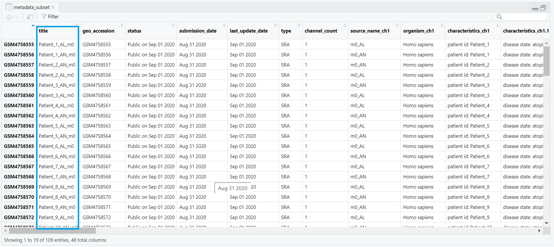
counts_matrix) is filtered to keep only those columns whose names match the title values from metadata_subset. This ensures that the count data corresponds exactly to the subsetted metadata. keep <- intersect(colnames(counts_matrix), metadata_subset$title) counts_subset <- counts_matrix[, keep, drop = FALSE] metadata_subset so that its rows match the exact order of the columns in counts_subset. This step prevents potential mismatches during DESeq2 object creation. metadata_subset <- metadata_subset[match(colnames(counts_subset), metadata_subset$title), ] condition is created based on the source_name_ch1 values. Samples labeled m0_AL are assigned as "lesional", while m0_AN samples are labeled as "non_lesional". The condition is then converted into a factor with "non_lesional" set as the reference level for downstream DESeq2 differential expression analysis. metadata_subset$condition <- ifelse(metadata_subset$source_name_ch1 == "m0_AL", "lesional", "non_lesional") metadata_subset$condition <- factor(metadata_subset$condition, levels = c("non_lesional", "lesional")) condition, which classifies each sample as either lesional or non-lesional, as shown in Figure 4.3.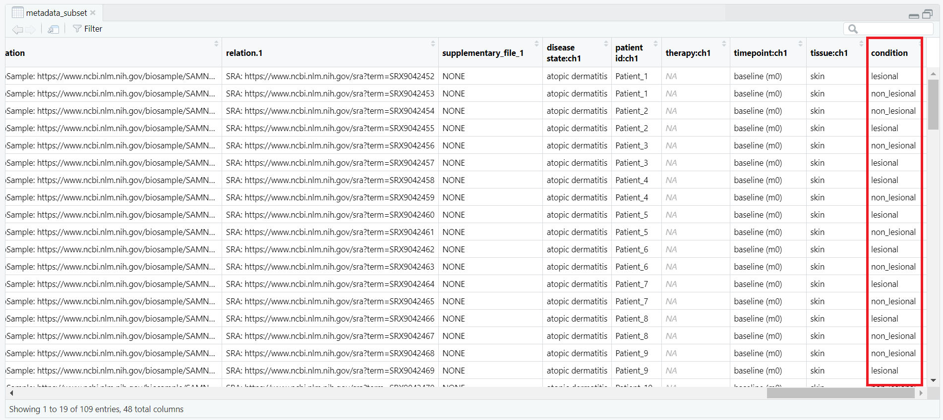
condition column, showing classification of each sample as lesional or non-lesional.
all(colnames(counts_subset) == metadata_subset$title) TRUE, the data are properly aligned and ready for DESeq2 object creation. Code Block 4. Filtering and Subsetting Samples for DESeq2 Analysis
# Step 4: Subset baseline lesional/non‑lesional (m0) and align with counts

# 4.1 keep only m0_AL / m0_AN
metadata_subset <- metadata[metadata$source_name_ch1 %in% c("m0_AL", "m0_AN"), ]

# 4.2 subset counts by titles (your counts colnames are titles)
keep <- intersect(colnames(counts_matrix), metadata_subset$title)
counts_subset <- counts_matrix[, keep, drop = FALSE]

# 4.3 reorder metadata to match counts columns
metadata_subset <- metadata_subset[match(colnames(counts_subset), metadata_subset$title), ]

# 4.4 condition factor
metadata_subset$condition <- ifelse(metadata_subset$source_name_ch1 == "m0_AL", "lesional", "non_lesional")
metadata_subset$condition <- factor(metadata_subset$condition, levels = c("non_lesional", "lesional"))
DESeqDataSet (dds). The following steps create this dataset object (dds) and verify that all required inputs are properly formatted.
rownames(metadata_subset) <- metadata_subset$title then sets the row names of the metadata to the corresponding sample titles.
DESeq2 requires that each row of the metadata has a unique identifier matching the column names of the count matrix.
After this step, the metadata is correctly indexed by sample titles, as illustrated in Figure 5.2.
rownames(metadata_subset) <- metadata_subset$title
as.matrix() function converts the data frame to a base matrix, and storage.mode() explicitly sets the data type to integer. The resulting count matrix, now ready for DESeq2 input, is illustrated in Figure 5.2.
counts_subset <- as.matrix(counts_subset)
storage.mode(counts_subset) <- "integer"
DESeqDataSetFromMatrix() constructs the DESeq2 dataset. It takes three arguments:
countData — the integer matrix of gene counts (rows = genes, columns = samples) (Figure 5.3);colData — the metadata table containing sample information, including our condition variable; anddesign — a formula describing the experimental design, here ~ condition, which tells DESeq2 to model expression changes based on the lesional vs. non-lesional grouping.dds. The resulting DESeq2 dataset object contains multiple components such as the design formula, row ranges, assays, and sample metadata (colData), as illustrated in Figure 5.4.
dds <- DESeqDataSetFromMatrix(
  countData = counts_subset,
  colData   = metadata_subset,
  design    = ~ condition
)
dds object created using DESeqDataSetFromMatrix(), showing key components such as the design formula, dispersion function, row ranges, assay data, and sample metadata (colData).
dds is an S4 object of class DESeqDataSet. It integrates gene-level counts and sample-level metadata into a single container. The main internal components include:
assays(dds) — the raw (and later normalized) count matrices;colData(dds) — sample annotations such as condition;rowRanges(dds) — genomic feature information for each gene; anddesign(dds) — the model formula ~ condition used in downstream analysis.Code Block 5.1.1. Creating the DESeq2 Dataset Object (dds)
# Step 5 – Create DESeq2 Dataset Object

# Step 5.1 — Assign row names to metadata
rownames(metadata_subset) <- metadata_subset$title

# Step 5.2 — Convert count matrix to integer mode
counts_subset <- as.matrix(counts_subset)
storage.mode(counts_subset) <- "integer"

# Step 5.3 — Create the DESeq2 dataset object
dds <- DESeqDataSetFromMatrix(
  countData = counts_subset,
  colData   = metadata_subset,
  design    = ~ condition
)
DESeqDataSet object (dds). Earlier, in Section 3 (Exploratory Data Analysis — Before dds), we explored all samples to understand metadata structure, sample distributions, and the raw count matrix prior to modelling. Here, we shift focus to the selected analysis subset (baseline lesional and non-lesional samples) and perform post-dds quality checks to ensure the data are biologically consistent and free from technical artefacts or outliers before running DESeq().Code Block 6.1. Variance Stabilizing Transformation (VST) Applied to DESeq2 Dataset
# Apply variance stabilizing transformation (VST) to the DESeq2 dataset for downstream visualization
vsd <- vst(dds, blind=TRUE)
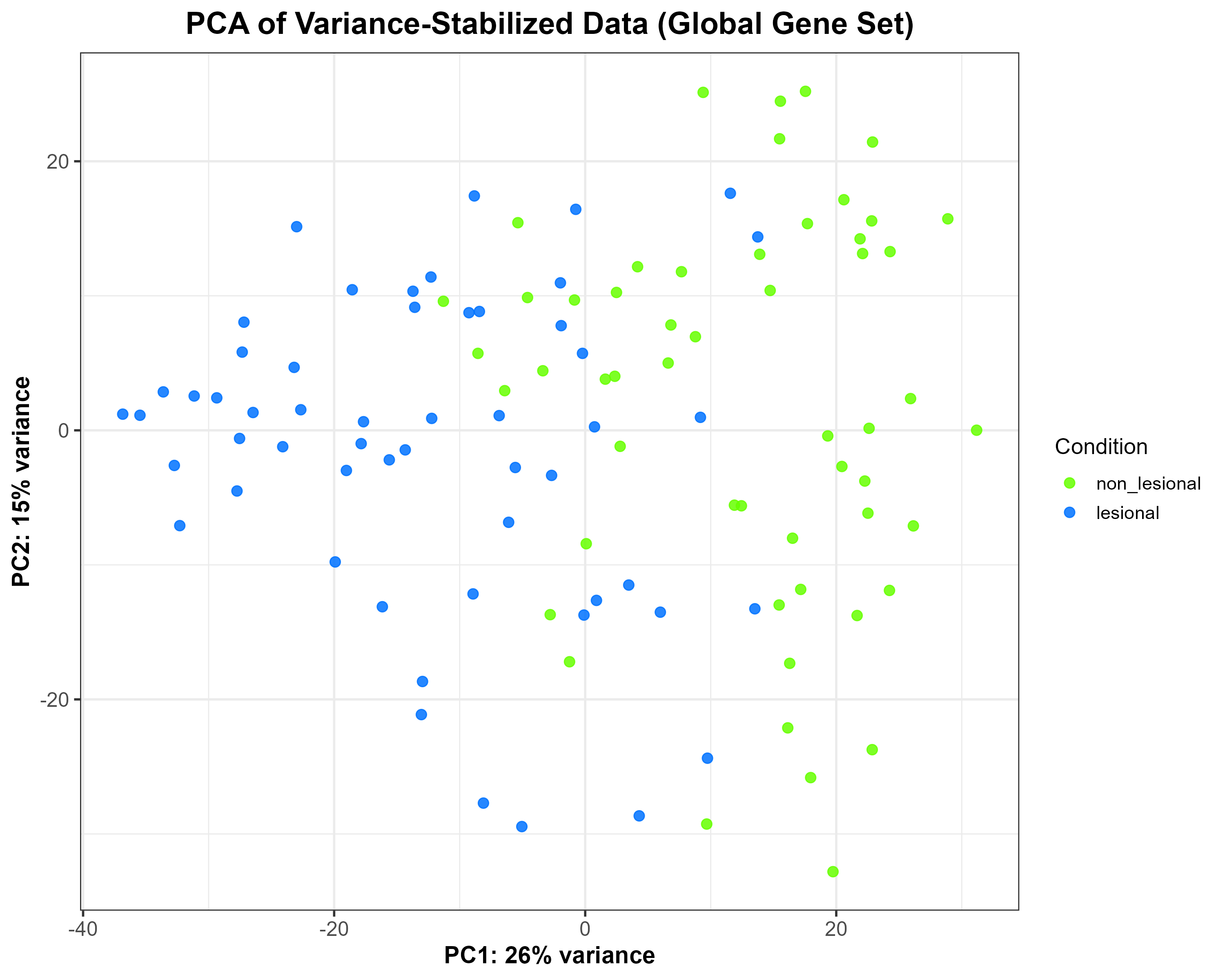
vsd), showing moderate separation between lesional and non-lesional samples along PC1 (26% variance) and PC2 (15% variance). Each point represents one sample, coloured according to condition.
Code Block 6.2. PCA Plot of Variance-Stabilized Data Grouped by Condition
 # ==============================================================
# 6.2. PCA of Variance-Stabilized Data (Global Overview)
# ==============================================================

library(ggplot2)
library(DESeq2)

# Extract PCA data from the variance-stabilized matrix (vsd)
pca_df <- plotPCA(vsd, intgroup = "condition", returnData = TRUE)
percentVar <- round(100 * attr(pca_df, "percentVar"))

# Build PCA plot manually for full control over aesthetics
p_pca_global <- ggplot(pca_df, aes(x = PC1, y = PC2, colour = condition)) +
  geom_point(size = 2.5, alpha = 0.85) +
  scale_colour_manual(values = c("lesional" = "#0072FF",
                                 "non_lesional" = "#66FF00")) +
  xlab(paste0("PC1: ", percentVar[1], "% variance")) +
  ylab(paste0("PC2: ", percentVar[2], "% variance")) +
  labs(title = "PCA of Variance-Stabilized Data (Global Gene Set)",
       colour = "Condition") +
  theme_bw(base_size = 14) +
  theme(
    plot.title = element_text(size = 18, face = "bold", hjust = 0.5),
    axis.title = element_text(size = 14, face = "bold"),
    axis.text = element_text(size = 12),
    legend.title = element_text(size = 13),
    legend.text = element_text(size = 11)
  )

# Save as high-resolution PNG
ggsave("C:/Users/YOUR/PATH/Figure_6.2.png",
       plot = p_pca_global, width = 10, height = 8, dpi = 300)
~ patient + condition) to control for within-patient variability. 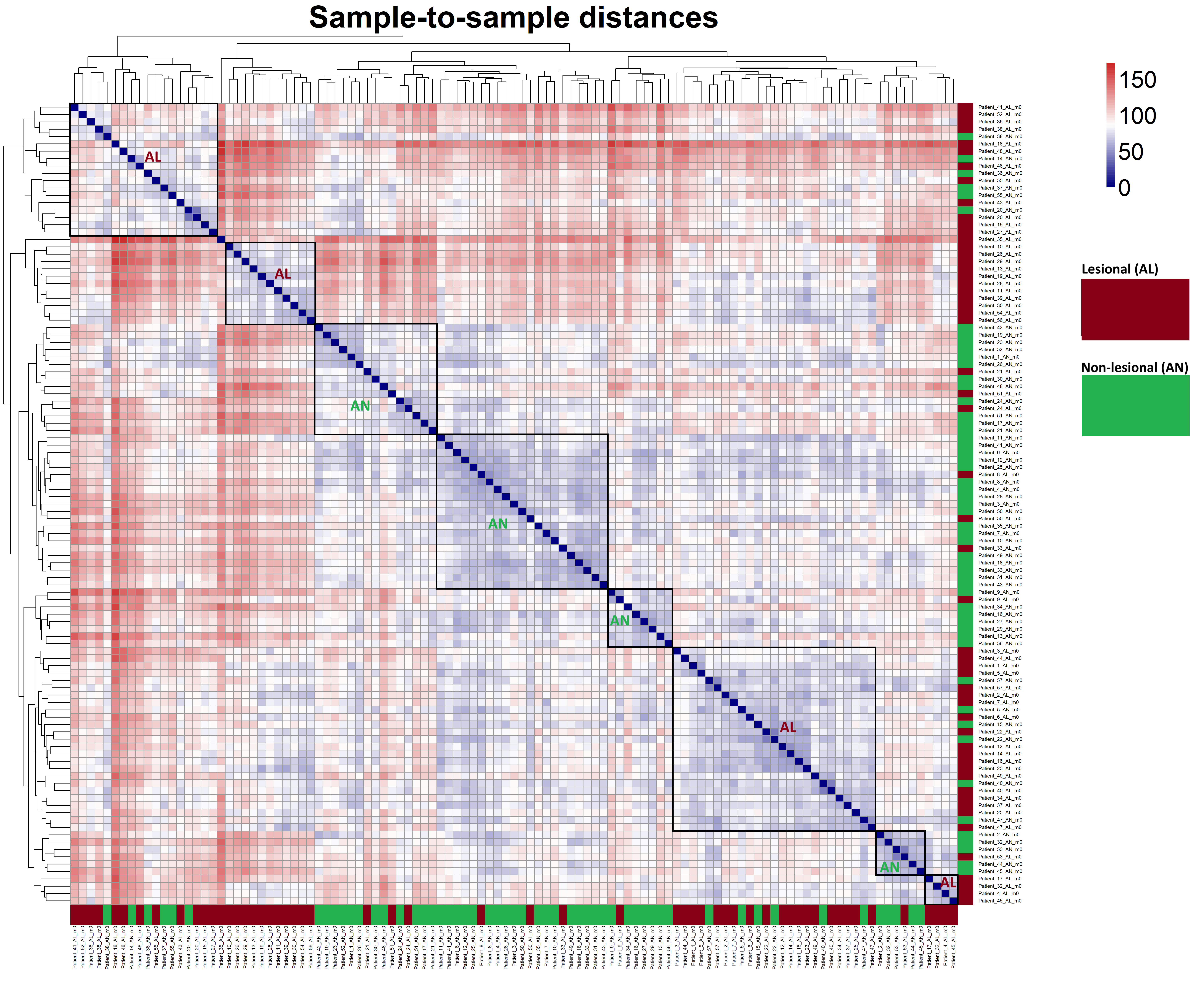
Code Block 6.4. Generate and Visualize Sample-to-Sample Distance Heatmap Using VST-Transformed Counts
# ==============================================================
# 6.4. Sample-to-Sample Distance Heatmap
# ==============================================================

# ========= Load Required Package =========
library(pheatmap)

# ========= Compute Pairwise Sample Distances =========
# Calculate distances between samples using VST-transformed counts.
# Transpose the assay matrix so that distance is computed across samples.
dists <- dist(t(assay(vsd)))

# Convert distance object to a full matrix for visualization
mat <- as.matrix(dists)

# ========= Generate and Save Heatmap =========
# Create a sample-to-sample distance heatmap and save as a high-resolution PNG.
# This heatmap helps visualize overall similarity patterns between samples.
pheatmap(
  mat,
  clustering_distance_rows = dists,  # hierarchical clustering for rows
  clustering_distance_cols = dists,  # hierarchical clustering for columns
  main = "Sample-to-sample distances",  # heatmap title
  color = colorRampPalette(c("navy", "white", "firebrick3"))(50),  # blue-white-red color scale

  # ========= Font and Label Settings =========
  fontsize = 28,       # controls general font size (including title)
  fontsize_row = 6,    # smaller font for row names
  fontsize_col = 6,    # smaller font for column names
  angle_col = 90,      # rotate column labels for better visibility

  # ========= Dendrogram and Legend Settings =========
  treeheight_row = 80, # row dendrogram height
  treeheight_col = 80, # column dendrogram height
  legend = TRUE,       # display color legend

  # ========= Display and Output Settings =========
  show_rownames = TRUE,  # show sample names on rows
  show_colnames = TRUE,  # show sample names on columns
  filename = "C:/Users/omidm/OneDrive/Desktop/RNA_Seq_Task1/6.EDA/Figure_6.4.png",  # output path
  width = 18, height = 16  # figure size in inches for crisp rendering
)
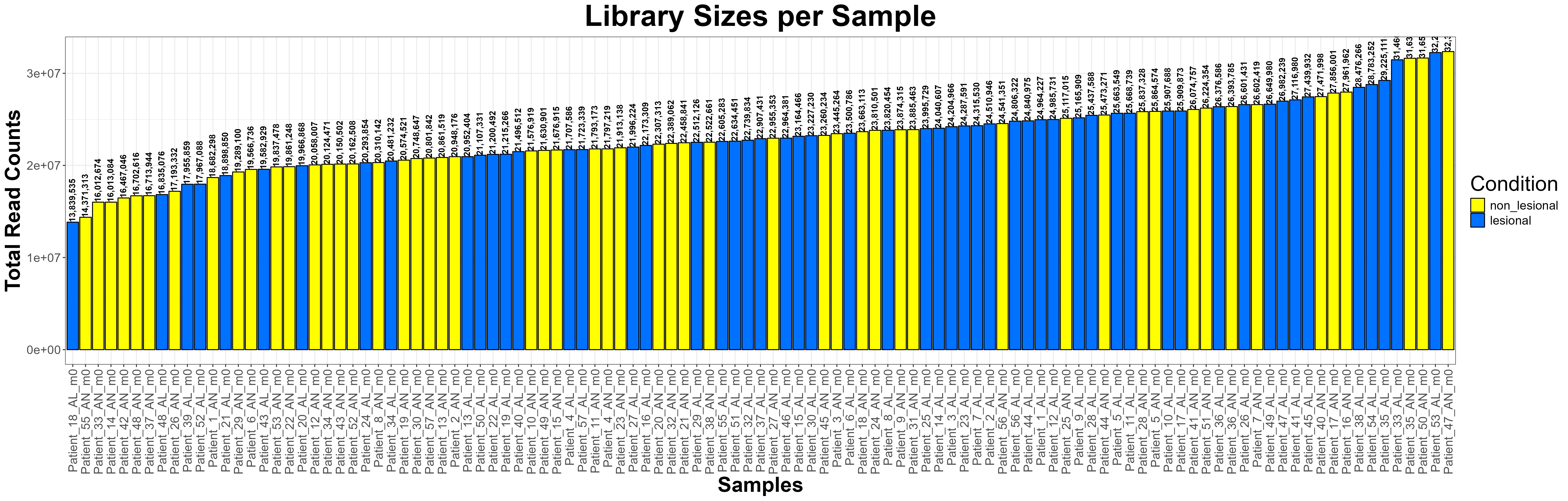
Code Block 6.5. Visualizing Library Sizes Across Samples Using ggplot2
# ==============================================================
# 6.5. Library Size Check (Enhanced Visualization)
# ==============================================================

library(ggplot2)

# Extract library sizes (total read counts per sample)
library_sizes <- colSums(counts(dds))

# Create a data frame for plotting
library_df <- data.frame(
  Sample = names(library_sizes),
  LibrarySize = library_sizes,
  Condition = colData(dds)$condition  # assumes condition column exists
)

# Order samples by library size for visual clarity
library_df$Sample <- factor(library_df$Sample, levels = library_df$Sample[order(library_df$LibrarySize)])

# Generate the bar plot
ggplot(library_df, aes(x = Sample, y = LibrarySize, fill = Condition)) +
  geom_bar(stat = "identity", color = "black", width = 0.9) +
   geom_text(aes(label = scales::comma(LibrarySize)),
            vjust = 0.4, hjust= 0,size = 3.5, angle = 90, fontface = "bold") +  # add labels
  scale_fill_manual(values = c("lesional" = "#0072FF", "non_lesional" = "#FFFF00")) +
  theme_bw() +
  theme(
    axis.text.x = element_text(angle = 90, vjust = 0.5, hjust = 1, size = 14),
    axis.text.y = element_text(size = 14),
    axis.title = element_text(size = 24, face = "bold"),
    plot.title = element_text(size = 34, face = "bold", hjust = 0.5),
    legend.title = element_text(size = 24),
    legend.text = element_text(size = 14)
  ) +
  labs(
    title = "Library Sizes per Sample",
    x = "Samples",
    y = "Total Read Counts",
    fill = "Condition"
  )

# Optional: Save as a high-resolution PNG
ggsave("C:/Users/omidm/OneDrive/Desktop/RNA_Seq_Task1/6.EDA/Figure_6.5.png",
       width = 25, height = 8, dpi = 300)
log2(counts(dds) + 1). Boxes reflect per-sample distributions of log-transformed raw counts. Modest shifts in medians and box widths indicate residual technical variation prior to normalisation. 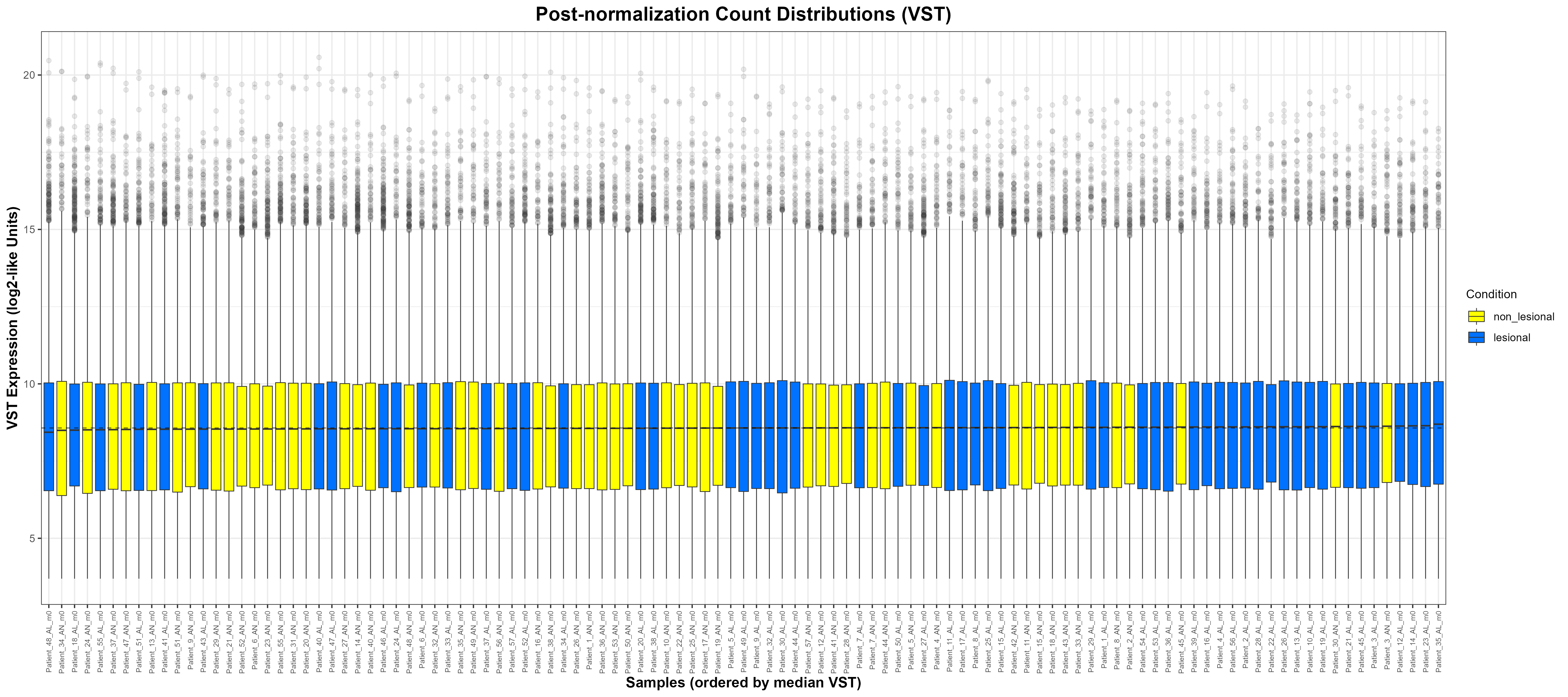
assay(vsd)). Boxes align closely across samples, demonstrating successful removal of mean–variance dependence and effective size-factor normalisation. The dashed line marks the global median VST value. ggplot2 for building publication-quality figures and reshape2 for converting matrices/data frames into a long format that ggplot understands. This keeps the plotting pipeline tidy and consistent across both approaches.
library(ggplot2)
library(reshape2)
DESeqDataSet. At this stage nothing is normalised; the values reflect the number of reads assigned to each gene per sample.
raw_counts <- counts(dds)
log_counts <- log2(raw_counts + 1)
log_counts_df <- as.data.frame(log_counts)
log_counts_df$Gene <- rownames(log_counts_df)
log_counts_long <- melt(
  log_counts_df,
  id.vars = "Gene",
  variable.name = "Sample",
  value.name = "Log2Counts"
)
log_counts_long$Condition <- colData(dds)$condition[
  match(log_counts_long$Sample, rownames(colData(dds)))
]
log₂(counts + 1): We plot the log₂ counts per sample with boxes coloured by condition. Outliers are shown lightly to reduce clutter on wide plots. Labels and theme choices aim for legibility with many samples.
p1 <- ggplot(log_counts_long, aes(x = Sample, y = Log2Counts, fill = Condition)) +
  geom_boxplot(outlier.alpha = 0.1, lwd = 0.3) +
  scale_fill_manual(values = c("lesional" = "#0072FF", "non_lesional" = "#FFFF00")) +
  labs(
    title = "Pre-normalization Count Distributions (log2(counts + 1))",
    x = "Samples",
    y = "Log2 Expression (Raw Counts)",
    fill = "Condition"
  ) +
  theme_bw() +
  theme(
    plot.title  = element_text(size = 16, face = "bold", hjust = 0.5),
    axis.text.x = element_text(angle = 90, vjust = 0.5, hjust = 1, size = 6),
    axis.title  = element_text(size = 12, face = "bold"),
    legend.title= element_text(size = 10),
    legend.text = element_text(size = 9)
  )
ggsave("C:/Users/YOUR/PATH/Figure_6.6.1.png",
       plot = p1, width = 18, height = 8, dpi = 300)
vsd with vst(dds, blind = TRUE), we pull the variance-stabilised matrix. VST removes library-size effects and stabilises variance across the mean, making samples comparable.
vst_mat <- assay(vsd)
vst_df <- as.data.frame(vst_mat)
vst_df$Gene <- rownames(vst_df)
vst_long <- melt(
  vst_df,
  id.vars = "Gene",
  variable.name = "Sample",
  value.name = "VST"
)
vst_long$Condition <- colData(dds)$condition[
  match(vst_long$Sample, rownames(colData(dds)))
]
sample_order <- aggregate(VST ~ Sample, data = vst_long, median)
vst_long$Sample <- factor(vst_long$Sample,
                          levels = sample_order$Sample[order(sample_order$VST)])
global_median <- median(vst_long$VST, na.rm = TRUE)
p2 <- ggplot(vst_long, aes(x = Sample, y = VST, fill = Condition)) +
  geom_boxplot(outlier.alpha = 0.1, lwd = 0.3) +
  geom_hline(yintercept = global_median, linetype = "dashed", linewidth = 0.4, alpha = 0.6) +
  scale_fill_manual(values = c("lesional" = "#0072FF", "non_lesional" = "#FFFF00")) +
  labs(
    title = "Post-normalization Count Distributions (VST)",
    x = "Samples (ordered by median VST)",
    y = "VST Expression (log2-like Units)",
    fill = "Condition"
  ) +
  theme_bw() +
  theme(
    plot.title  = element_text(size = 16, face = "bold", hjust = 0.5),
    axis.text.x = element_text(angle = 90, vjust = 0.5, hjust = 1, size = 6),
    axis.title  = element_text(size = 12, face = "bold"),
    legend.title= element_text(size = 10),
    legend.text = element_text(size = 9)
  )
ggsave("C:/Users/YOUR/PATH/Figure_6.6.2.png",
       plot = p2, width = 18, height = 8, dpi = 300)
Code Block 6.6.Inspecting Count Distributions — Comparing Raw and VST-Transformed Data
# ==============================================================
# 6.6. Count Distribution — Pre- and Post-Normalization Comparison
# ==============================================================

library(ggplot2)
library(reshape2)

# -------------------------
# Step 1: Raw log2(counts + 1)
# -------------------------

# Extract raw counts from DESeqDataSet
raw_counts <- counts(dds)

# Log2 transform with +1 to avoid log(0)
log_counts <- log2(raw_counts + 1)

# Convert to data frame (samples as columns)
log_counts_df <- as.data.frame(log_counts)
log_counts_df$Gene <- rownames(log_counts_df)

# Melt to long format for ggplot2
log_counts_long <- melt(log_counts_df, id.vars = "Gene",
                        variable.name = "Sample", value.name = "Log2Counts")

# Add condition information
log_counts_long$Condition <- colData(dds)$condition[match(log_counts_long$Sample, rownames(colData(dds)))]

# Create pre-normalization boxplot
p1 <- ggplot(log_counts_long, aes(x = Sample, y = Log2Counts, fill = Condition)) +
  geom_boxplot(outlier.alpha = 0.1, lwd = 0.3) +
  scale_fill_manual(values = c("lesional" = "#0072FF", "non_lesional" = "#FFFF00")) +
  labs(
    title = "Pre-normalization Count Distributions (log2(counts + 1))",
    x = "Samples",
    y = "Log2 Expression (Raw Counts)",
    fill = "Condition"
  ) +
  theme_bw() +
  theme(
    plot.title  = element_text(size = 16, face = "bold", hjust = 0.5),
    axis.text.x = element_text(angle = 90, vjust = 0.5, hjust = 1, size = 6),
    axis.title  = element_text(size = 12, face = "bold"),
    legend.title= element_text(size = 10),
    legend.text = element_text(size = 9)
  )

# Save pre-normalization plot
ggsave("C:/Users/YOUR/PATH/ / / /Figure_6.6.1_PreNormalization.png",
       plot = p1, width = 18, height = 8, dpi = 300)


# -------------------------
# Step 2: Post-normalization (VST)
# -------------------------

# Compute variance-stabilized data if not already done
# vsd <- vst(dds, blind = TRUE)

vst_mat <- assay(vsd)

# Convert to data frame for ggplot2
vst_df <- as.data.frame(vst_mat)
vst_df$Gene <- rownames(vst_df)

# Melt to long format
vst_long <- melt(vst_df, id.vars = "Gene",
                 variable.name = "Sample", value.name = "VST")

# Add condition info
vst_long$Condition <- colData(dds)$condition[match(vst_long$Sample, rownames(colData(dds)))]

# Compute median per sample for ordering
sample_order <- aggregate(VST ~ Sample, data = vst_long, median)
vst_long$Sample <- factor(vst_long$Sample, levels = sample_order$Sample[order(sample_order$VST)])

# Global median line
global_median <- median(vst_long$VST, na.rm = TRUE)

# Create post-normalization boxplot
p2 <- ggplot(vst_long, aes(x = Sample, y = VST, fill = Condition)) +
  geom_boxplot(outlier.alpha = 0.1, lwd = 0.3) +
  geom_hline(yintercept = global_median, linetype = "dashed", linewidth = 0.4, alpha = 0.6) +
  scale_fill_manual(values = c("lesional" = "#0072FF", "non_lesional" = "#FFFF00")) +
  labs(
    title = "Post-normalization Count Distributions (VST)",
    x = "Samples (ordered by median VST)",
    y = "VST Expression (log2-like Units)",
    fill = "Condition"
  ) +
  theme_bw() +
  theme(
    plot.title  = element_text(size = 16, face = "bold", hjust = 0.5),
    axis.text.x = element_text(angle = 90, vjust = 0.5, hjust = 1, size = 6),
    axis.title  = element_text(size = 12, face = "bold"),
    legend.title= element_text(size = 10),
    legend.text = element_text(size = 9)
  )

# Save post-normalization plot
ggsave("C:/Users/YOUR/PATHS/Figure_6.6.2_PostNormalization.png",
       plot = p2, width = 18, height = 8, dpi = 300)
DESeq() on the prepared dds object. DESeq2 estimates size factors, dispersions, and fits a negative binomial GLM per gene based on the design (~ condition). The fitted model is then used for statistical testing in the next steps. Code Block 7.1. Run DESeq to estimate size factors, dispersions, and fit the GLM
# ==============================================================
# 7.1. Fit the DESeq2 model
# ==============================================================

# The DESeq() function performs:
# - normalization (size factors)
# - dispersion estimation per gene
# - negative binomial GLM fitting
dds <- DESeq(dds)
Code Block 7.2. Get results for the target contrast and select significant DEGs
# ==============================================================
# 7.2. Results extraction and significance filtering
# ==============================================================

# Contrast definition: log2(lesional / non_lesional)
res <- results(dds, contrast = c("condition", "lesional", "non_lesional"))

# Define thresholds
alpha   <- 0.05  # adjusted p-value cutoff
lfc_cut <- 1     # absolute log2FC threshold

# Filter significant genes
res_sig <- res[
  !is.na(res$padj) &
  res$padj < alpha &
  abs(res$log2FoldChange) >= lfc_cut,
]

# Summarize and print number of DEGs
summary(res)
cat("Significant genes (padj <", alpha, ", |log2FC| >=", lfc_cut, "):",
    nrow(res_sig), "\n")

#======================== Output: ==================
out of 16862 with nonzero total read count
adjusted p-value < 0.1
LFC > 0 (up)       : 5085, 30%
LFC < 0 (down)     : 4924, 29%
outliers [1]       : 0, 0%
low counts [2]     : 0, 0%
(mean count < 9)
[1] see 'cooksCutoff' argument of ?results
[2] see 'independentFiltering' argument of ?results

Significant genes (padj < 0.05 , |log2FC| >= 1 ): 515
apeglm shrinkage stabilizes effect sizes while keeping direction and relative ranking useful for interpretation and plotting. We identify the correct coefficient name from resultsNames(dds), apply lfcShrink(), then reapply the same significance thresholds to obtain a shrunk set of DEGs. Code Block 7.3. LFC shrinkage with apeglm and re-filter significant DEGs
# ==============================================================
# 7.3. LFC shrinkage with apeglm
# ==============================================================

# Load required library
library(apeglm)

# Check available coefficients to locate the target contrast
resultsNames(dds)

# Identify coefficient for "lesional vs non_lesional"
coef_name <- resultsNames(dds)[
  grep("condition_lesional_vs_non_lesional", resultsNames(dds))
]

# Perform DE analysis (non-shrunk)
res <- results(dds, contrast = c("condition", "lesional", "non_lesional"))

# Apply shrinkage
res_shrunk <- lfcShrink(dds, coef = coef_name, type = "apeglm")

# Filter significant genes using the same thresholds
alpha   <- 0.05
lfc_cut <- 1
res_sig <- res_shrunk[
  !is.na(res_shrunk$padj) &
  res_shrunk$padj < alpha &
  abs(res_shrunk$log2FoldChange) >= lfc_cut,
]

# Summary
summary(res)
cat("Significant genes after shrinkage:",
    nrow(res_sig), "\n")


# ----------------- Output --------------------
out of 16862 with nonzero total read count
adjusted p-value < 0.1
LFC > 0 (up)       : 5085, 30%
LFC < 0 (down)     : 4924, 29%
outliers [1]       : 0, 0%
low counts [2]     : 0, 0%
(mean count < 9)
[1] see 'cooksCutoff' argument of ?results
[2] see 'independentFiltering' argument of ?results

Significant genes: 515
adjusted P value and |log2FC|); constructs a tidy results data frame from the shrunken DESeq2 results; brings the VST expression matrix into scope for plotting; and prepares helper functions to map Ensembl gene IDs to human gene symbols. Keeping these shared pieces at the top prevents duplication and makes it easy to change a setting (for example, the colour for “lesional” or the |log2FC| cut-off) without chasing it through multiple blocks.suppressPackageStartupMessages({ ... }) to keep the console clean. DESeq2 supplies assay(vsd) and the shrunken results object we created in Section 7. ggplot2 is used for the PCA, volcano, and density figures. pheatmap builds the heatmaps; RColorBrewer provides palettes for them. reshape2 contributes melt() when we reshape matrices to long format for ggplot. dplyr powers the data-wrangling verbs (mutate(), filter(), case_when(), relocate()). readr writes the CSVs. Finally, AnnotationDbi + org.Hs.eg.db perform the Ensembl→HGNC symbol mapping used in plot labels and exported tables.out_dir defines where Section-8 outputs are saved and is created if missing; cond_cols fixes a single, consistent mapping from condition values to colours. The shared thresholds alpha (adjusted P value) and lfc_cut (absolute log2 fold change) are declared once and reused everywhere so filtering logic is consistent across the section.res_df is the tidy data frame most plots read from. We start by coercing the shrunken DESeq2 results (res_shrunk) to a data frame, then add a gene column from the row names (mutate(gene = rownames(...))). We remove rows without an adjusted P value (filter(!is.na(padj))). Next, case_when() creates a simple categorical status: “Up” if padj < alpha and log2FoldChange >= lfc_cut; “Down” if padj < alpha and log2FoldChange <= -lfc_cut; otherwise “NS” (not significant). This three-way label drives the volcano plot colouring and helps with quick summaries.vsd_mat <- assay(vsd) pulls in the variance-stabilised expression matrix (rows = genes, columns = samples) prepared earlier; it’s the common input for the DEG-focused PCA, distance heatmaps, and expression density panels. For human-readable labels, the mapping helpers strip Ensembl version suffixes (strip_ver() turns ENSG000001234.5 into ENSG000001234) and then look up symbols with AnnotationDbi::mapIds() from org.Hs.eg.db. The wrapper ens_to_symbol() converts any vector of Ensembl IDs to symbols, falling back to the original Ensembl ID if a symbol is unavailable. Finally, we append a gene_symbol column to res_df so symbols are available to every downstream plot and export without repeating the mapping step.Code Block 8.0. Setup & Common Helpers — libraries, thresholds, results frame, VST matrix, and ID mapping
# ==================================================================
# 8.0 Setup & Common Helpers
# ==================================================================
suppressPackageStartupMessages({
  library(DESeq2)
  library(ggplot2)
  library(pheatmap)
  library(RColorBrewer)
  library(reshape2)
  library(dplyr)
  library(readr)
  library(AnnotationDbi)  # mapping
  library(org.Hs.eg.db)   # human gene symbols
})

# ============= Output & Colors =============
out_dir <- "C:/Users/omidm/OneDrive/Desktop/RNA_Seq_Task1/8.DEG_Visualization"
if (!dir.exists(out_dir)) dir.create(out_dir, recursive = TRUE)

# Use one consistent palette everywhere
cond_cols <- c("lesional" = "#0072FF", "non_lesional" = "#66ff00")

# ============= Shared thresholds =============
alpha   <- 0.05
lfc_cut <- 1

# ============= Results frame from Section 7 (with shrinkage) =============
# Expects 'res_shrunk' from Section 7.
res_df <- as.data.frame(res_shrunk) %>%
  mutate(gene = rownames(res_shrunk)) %>%
  filter(!is.na(padj)) %>%
  mutate(
    sig = case_when(
      padj < alpha & log2FoldChange >=  lfc_cut ~ "Up",
      padj < alpha & log2FoldChange <= -lfc_cut ~ "Down",
      TRUE                                      ~ "NS"
    )
  )

# ============= VST matrix from Section 6 =============
vsd_mat <- assay(vsd)

# ============= Ensembl -> HGNC mapping helpers =============
strip_ver <- function(x) sub("\\..*$", "", x)  # remove version suffixes
all_ens <- unique(c(rownames(vsd_mat), res_df$gene))
sym_map <- AnnotationDbi::mapIds(
  org.Hs.eg.db,
  keys      = unique(strip_ver(all_ens)),
  column    = "SYMBOL",
  keytype   = "ENSEMBL",
  multiVals = "first"
)
ens_to_symbol <- function(ids) {
  ids_stripped <- strip_ver(ids)
  syms <- unname(sym_map[ids_stripped])
  syms[is.na(syms) | syms == ""] <- ids[is.na(syms) | syms == ""]
  syms
}

# Also store symbols on the results frame for later plots/tables
res_df <- res_df %>% mutate(gene_symbol = ens_to_symbol(gene))
res_df, the processed results data frame created earlier. Using sum() in combination with logical conditions, it computes: deg_total – the total number of significant DEGs (res_df$sig != "NS").deg_up – the number of up-regulated genes (res_df$sig == "Up").deg_down – the number of down-regulated genes (res_df$sig == "Down").cat() command then prints this summary directly to the console, providing a quick textual check of the number of DEGs before moving to graphical representation.deg_df that stores the directions (“Up-regulated” and “Down-regulated”) along with their respective counts. The ggplot2 function geom_col() is used to generate vertical bars whose heights correspond to the number of genes in each category. The scale_fill_manual() line assigns fixed colours to the two groups—pink (#EF476F) for up-regulated and blue (#118AB2) for down-regulated genes—ensuring visual consistency across all figures.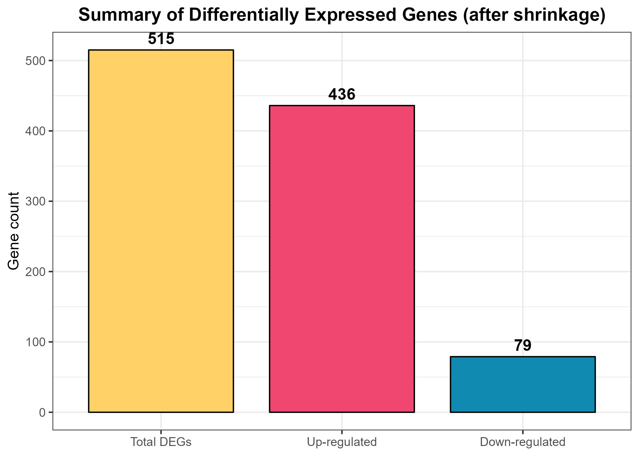
theme_bw() function applies a clean white background for clarity, and the theme() call centers the title while adjusting font sizes for readability. The resulting plot, titled “Significant DEGs (after shrinkage)”, provides a quick visual impression of the dataset’s directionality—whether up-regulation dominates, down-regulation dominates, or the balance is roughly equal. Finally, ggsave() exports the figure as a high-resolution PNG file (Figure_8.1_DEG_Summary_Bar.png) to the designated out_dir folder for documentation and reporting.Code Block 8.1. Overview & Summary of DEG Results
# ==================================================================
# 8.1 Overview & Summary of DEG Results
# ==================================================================

# ============= Counts & Console Summary =============
deg_total <- sum(res_df$sig != "NS")
deg_up    <- sum(res_df$sig == "Up")
deg_down  <- sum(res_df$sig == "Down")

cat("DEG summary (shrinkage applied):\n",
    "  Total significant:", deg_total, "\n",
    "  Up-regulated     :", deg_up, "\n",
    "  Down-regulated   :", deg_down, "\n")

# ============= Bar Plot Summary (Figure 8.1) =============
deg_df <- data.frame(
  Category = factor(c("Total DEGs", "Up-regulated", "Down-regulated"),
                    levels = c("Total DEGs", "Up-regulated", "Down-regulated")),
  Count = c(deg_total, deg_up, deg_down)
)

p_deg_bar <- ggplot(deg_df, aes(Category, Count, fill = Category)) +
  geom_col(color = "black", width = 0.8) +
  geom_text(aes(label = Count),
            vjust = -0.5, size = 4.5, fontface = "bold") +  # display numbers above bars
  scale_fill_manual(values = c(
    "Total DEGs" = "#FFD166",       # golden yellow
    "Up-regulated" = "#EF476F",     # pink/red
    "Down-regulated" = "#118AB2"    # blue
  )) +
  theme_bw(base_size = 12) +
  labs(
    title = "Summary of Differentially Expressed Genes (after shrinkage)",
    x = NULL,
    y = "Gene count"
  ) +
  theme(
    plot.title = element_text(hjust = 0.5, face = "bold"),
    legend.position = "none"  # hide redundant legend
  )

ggsave(file.path(out_dir, "Figure_8.1_DEG_Summary_Bar.png"),
       p_deg_bar, width = 7, height = 5, dpi = 300)
Code Block 8.2. DEG-Focused Diagnostic Visualizations (QC & Data Patterns)
# ==================================================================
# 8.2. DEG-Focused Diagnostic Visualizations (QC & Data Patterns)
#      (PCA and sample–sample distances using top DEGs)
# ==================================================================

# ============= Select Top DEGs by padj =============
top_k <- 500
top_deg_ids <- as.data.frame(res_shrunk) %>%
  mutate(gene = rownames(res_shrunk)) %>%
  filter(!is.na(padj)) %>%
  arrange(padj) %>%
  slice(1:min(top_k, n())) %>%
  pull(gene)

# VST expression restricted to top DEGs
vst_top <- vsd_mat[top_deg_ids, , drop = FALSE]
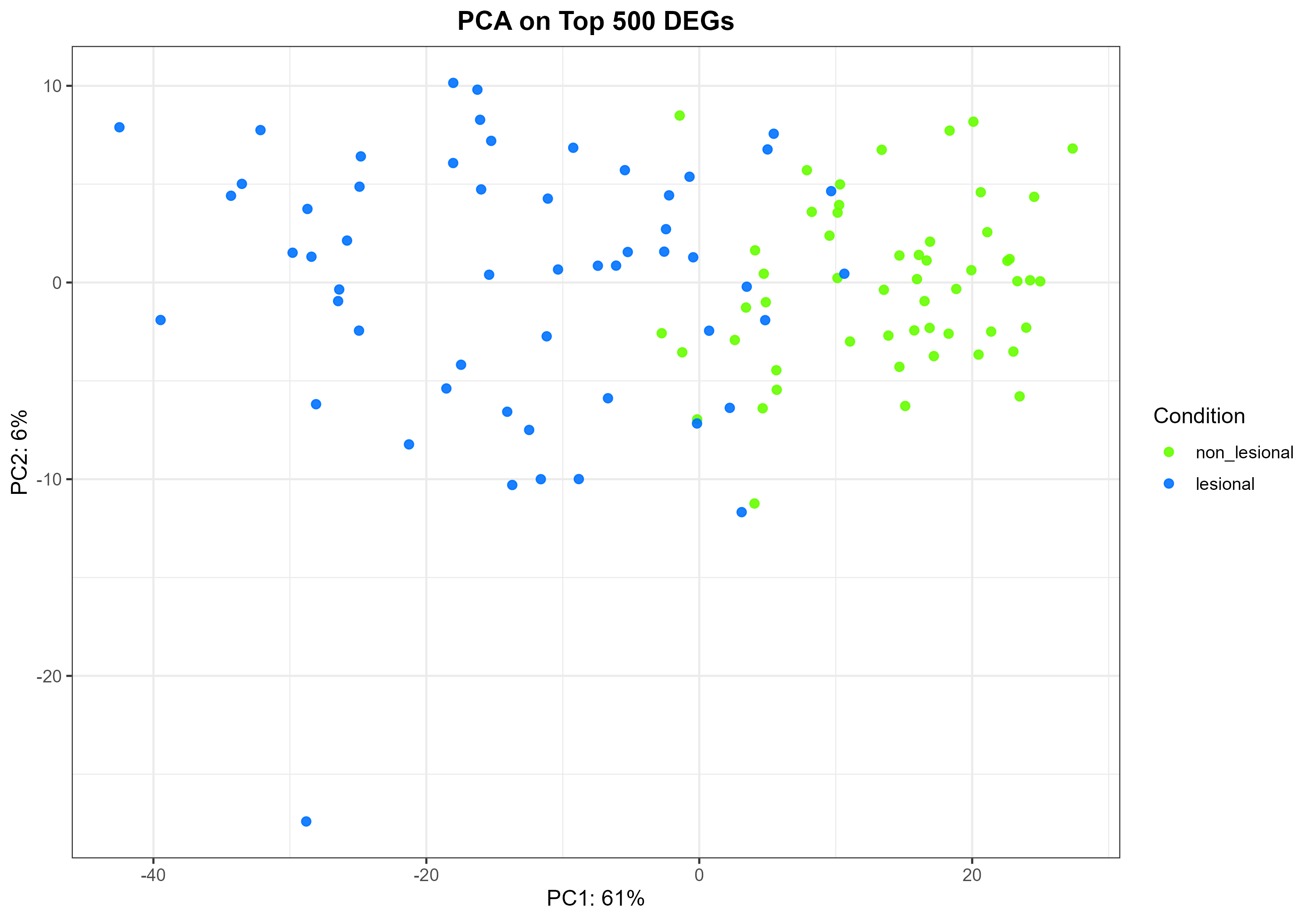
Code Block 8.2.1. PCA Plot on Top DEGs
# ============= 8.2.1 PCA on Top DEGs =============
pca <- prcomp(t(vst_top), scale. = TRUE)
var_expl <- round(100 * (pca$sdev^2 / sum(pca$sdev^2)))[1:2]

pca_df2 <- data.frame(
  PC1 = pca$x[, 1],
  PC2 = pca$x[, 2],
  Sample = colnames(vst_top),
  condition = colData(vsd)$condition[match(colnames(vst_top), rownames(colData(vsd)))]
)

p_pca_deg <- ggplot(pca_df2, aes(PC1, PC2, colour = condition)) +
  geom_point(size = 2, alpha = 0.9) +
  scale_colour_manual(values = cond_cols) +
  xlab(paste0("PC1: ", var_expl[1], "%")) +
  ylab(paste0("PC2: ", var_expl[2], "%")) +
  theme_bw(base_size = 12) +
  labs(title = paste0("PCA on Top ", length(top_deg_ids), " DEGs"),
       colour = "Condition") +
  theme(plot.title = element_text(hjust = 0.5, face = "bold"))
ggsave(file.path(out_dir, "Figure_8.2.1_PCA_TopDEGs.png"),
       p_pca_deg, width = 10, height = 7, dpi = 300)
prcomp(t(vst_top), scale.=TRUE). The PC1 loadings are extracted from the rotation matrix (pca$rotation[, 1]), and a tidy data frame is created containing Ensembl IDs, corresponding gene symbols, and both the raw and absolute loading values. The genes are then sorted by the magnitude of their loadings, so that the most influential contributors to PC1 appear at the top. The resulting table provides a comprehensive, ranked overview of all genes contributing to PC1 and is saved as a CSV file for downstream analysis. This dataset serves as the foundation for distinguishing between lesional- and non-lesional-enriched subsets and for conducting subsequent functional or pathway analyses focused on the most biologically impactful genes.| Gene Symbol | PC1 Loading | |PC1 Loading| |
|---|---|---|
| IL4R | -0.053845 | 0.053845 |
| KRT16 | -0.053590 | 0.053590 |
| SH2D2A | -0.052701 | 0.052701 |
| USB1 | -0.051762 | 0.051762 |
| KRT6A | -0.051754 | 0.051754 |
| ID4 | 0.051708 | 0.051708 |
| KRT6C | -0.051664 | 0.051664 |
| TPM3 | -0.051535 | 0.051535 |
| SHC1 | -0.051374 | 0.051374 |
| KPNA2 | -0.051296 | 0.051296 |
| TUBB6 | -0.051036 | 0.051036 |
| BOC | 0.050900 | 0.050900 |
| GJB2 | -0.050875 | 0.050875 |
| GPR68 | -0.050738 | 0.050738 |
| FSCN1 | -0.050728 | 0.050728 |
| LRRC59 | -0.050587 | 0.050587 |
| SERPINB4 | -0.050450 | 0.050450 |
| S100A8 | -0.050425 | 0.050425 |
| COBL | 0.050397 | 0.050397 |
| CDH3 | -0.050357 | 0.050357 |
This table presents all genes contributing to the first principal component (PC1) — the dominant axis of variation (≈61%) that separates lesional and non-lesional atopic dermatitis (AD) samples. Genes are ranked by absolute PC1 loadings, which quantify how strongly each gene influences this separation, regardless of direction. Negative loadings correspond to lesional-enriched genes (e.g., KRT6A, S100A8, IL4R), while positive loadings represent non-lesional-enriched genes (e.g., CLDN1, ID4, COBL). This combined list captures both sides of the disease spectrum and can serve as a quantitative importance map for identifying genes most responsible for the transcriptional differences between lesional and non-lesional states. Intersecting these top-ranked genes with DESeq2 results helps confirm robust differential expression and highlight stable biomarkers that remain influential across analytical approaches. Functionally, these genes span key pathways in keratinocyte activation, cytokine signaling, metabolic regulation, and barrier maintenance — offering a systems-level view of how inflammation and repair processes define AD pathology.
Code Block 8.2.2.1. Identifying and Exporting All Genes with PC1 Loadings
# ==================================================================
# Save All PC1-Contributing Genes from DEG-Focused PCA (Standalone)
# ==================================================================

# ============= Select Top DEGs by padj =============
top_k <- 500
top_deg_ids <- as.data.frame(res_shrunk) %>%
  mutate(gene = rownames(res_shrunk)) %>%
  filter(!is.na(padj)) %>%
  arrange(padj) %>%
  slice(1:min(top_k, n())) %>%
  pull(gene)

# VST expression restricted to top DEGs
vst_top <- vsd_mat[top_deg_ids, , drop = FALSE]

# ============= PCA on Top DEGs =============
pca <- prcomp(t(vst_top), scale. = TRUE)

# ============= Save All PC1-Contributing Genes =============
loadings <- pca$rotation[, 1]  # PC1 loadings for each gene

pc1_gene_df <- data.frame(
  Ensembl_ID = names(loadings),
  Gene_Symbol = ens_to_symbol(names(loadings)),
  PC1_Loading = loadings,
  abs_PC1_Loading = abs(loadings)
) %>%
  arrange(desc(abs_PC1_Loading))

write_csv(pc1_gene_df, file.path(out_dir, "PC1_Gene_Loadings_All.csv"))

cat("\nAll PC1-contributing genes saved to:",
    file.path(out_dir, "500_PC1_Gene_Loadings_All.csv"), "\n")
| Gene Symbol | PC1 Loading | |PC1 Loading| |
|---|---|---|
| IL4R | -0.053845 | 0.053845 |
| KRT16 | -0.053590 | 0.053590 |
| SH2D2A | -0.052701 | 0.052701 |
| USB1 | -0.051762 | 0.051762 |
| KRT6A | -0.051754 | 0.051754 |
| KRT6C | -0.051664 | 0.051664 |
| TPM3 | -0.051535 | 0.051535 |
| SHC1 | -0.051374 | 0.051374 |
| KPNA2 | -0.051296 | 0.051296 |
| TUBB6 | -0.051036 | 0.051036 |
| GJB2 | -0.050875 | 0.050875 |
| GPR68 | -0.050738 | 0.050738 |
| FSCN1 | -0.050728 | 0.050728 |
| LRRC59 | -0.050587 | 0.050587 |
| SERPINB4 | -0.050450 | 0.050450 |
| S100A8 | -0.050425 | 0.050425 |
| CDH3 | -0.050357 | 0.050357 |
| S100A9 | -0.050262 | 0.050262 |
| TYMP | -0.050234 | 0.050234 |
| SRGN | -0.050182 | 0.050182 |
These genes show negative PC1 loadings, indicating higher expression in lesional AD skin prior to treatment. Many belong to pathways involved in epidermal barrier disruption, keratinocyte hyperproliferation, and inflammatory signaling — hallmarks of atopic dermatitis lesions. Among the strongest contributors are KRT6A, KRT6C, KRT16, S100A8/S100A9, SERPINB4, FSCN1, and IL4R, reflecting barrier dysfunction and Th2/Th17-driven immune activation. The keratin genes KRT6A, KRT6C, and KRT16 are significantly upregulated in lesional atopic dermatitis (AD) skin compared to non-lesional or healthy skin. These keratins are often referred to as "stress keratins" or "barrier alarmins" because their expression is rapidly induced in keratinocytes in response to epidermal injury, inflammation, and cellular stress. S100A8/S100A9, known alarmins of the calprotectin complex, are central players in the IL-17/IL-22-driven inflammatory axis, further highlighting the immune–epidermal crosstalk. SERPINB4 and FSCN1 also align with stress and remodeling responses in the lesional epidermis. Collectively, these genes emphasize IL4/IL13, IL17, and keratinocyte proliferation pathways characteristic of lesional AD.
Code Block 8.2.2.2. Identifying and Exporting Lesional-Enriched Genes (Negative PC1 Loadings)
# Sort by most negative PC1 loadings (lesional-enriched)
lesional_pc1_genes <- pc1_gene_df %>%
  arrange(PC1_Loading) %>%        # ascending order (most negative first)
  filter(PC1_Loading < 0)         # keep only genes with negative loadings

# Save all lesional-enriched genes
write_csv(lesional_pc1_genes,
          file.path(out_dir, "All_Negative_PC1_Genes_Lesional.csv"))
| Gene Symbol | PC1 Loading | |PC1 Loading| |
|---|---|---|
| ID4 | 0.051708 | 0.051708 |
| BOC | 0.050900 | 0.050900 |
| COBL | 0.050397 | 0.050397 |
| RORC | 0.050285 | 0.050285 |
| GAN | 0.050009 | 0.050009 |
| CLDN1 | 0.049803 | 0.049803 |
| CYP2W1 | 0.049738 | 0.049738 |
| BTC | 0.049736 | 0.049736 |
| MTURN | 0.049322 | 0.049322 |
| CBX7 | 0.049303 | 0.049303 |
| LINC02747 | 0.048998 | 0.048998 |
| ZNF34 | 0.048827 | 0.048827 |
| CRBN | 0.048778 | 0.048778 |
| PHYHIP | 0.048732 | 0.048732 |
| THRA | 0.048648 | 0.048648 |
| ARHGEF26 | 0.048042 | 0.048042 |
| IRS2 | 0.047941 | 0.047941 |
| RGMB | 0.047799 | 0.047799 |
| ENSG00000204789 | 0.047754 | 0.047754 |
| USP30 | 0.047606 | 0.047606 |
These genes exhibit positive PC1 loadings, indicating higher expression in non-lesional AD skin prior to treatment, which maintains an apparently normal structure but retains subtle molecular differences. Many of these genes are associated with barrier preservation, metabolic activity, and immune homeostasis. For example, CLDN1 (Claudin-1) is a critical tight junction protein that maintains epidermal integrity, while ARHGEF26 and COBL are involved in cytoskeletal organization and cellular signaling that sustain epithelial stability. ID4, a transcription factor linked to epithelial renewal, marks ongoing regeneration and balanced differentiation in unaffected areas. Other genes, such as BTC and IRS2, participate in growth factor and insulin signaling pathways that support keratinocyte proliferation and tissue repair under non-inflammatory conditions. In contrast, genes like RORC and CYP2W1 reflect basal metabolic and immunoregulatory activity characteristic of healthy skin. Collectively, these non-lesional-enriched genes represent a transcriptional signature of structural resilience and immunological balance, distinguishing protected skin regions from the inflammatory stress found in lesional AD areas.
Code Block 8.2.2.3. Identifying and Exporting Non-Lesional-Enriched Genes (Positive PC1 Loadings)
# Sort by most positive PC1 loadings (non-lesional-enriched)
nonlesional_pc1_genes <- pc1_gene_df %>%
  arrange(desc(PC1_Loading)) %>%   # descending order (most positive first)
  filter(PC1_Loading > 0)          # keep only genes with positive loadings

# Save all non-lesional-enriched genes
write_csv(nonlesional_pc1_genes,
          file.path(out_dir, "All_Positive_PC1_Genes_NonLesional.csv"))
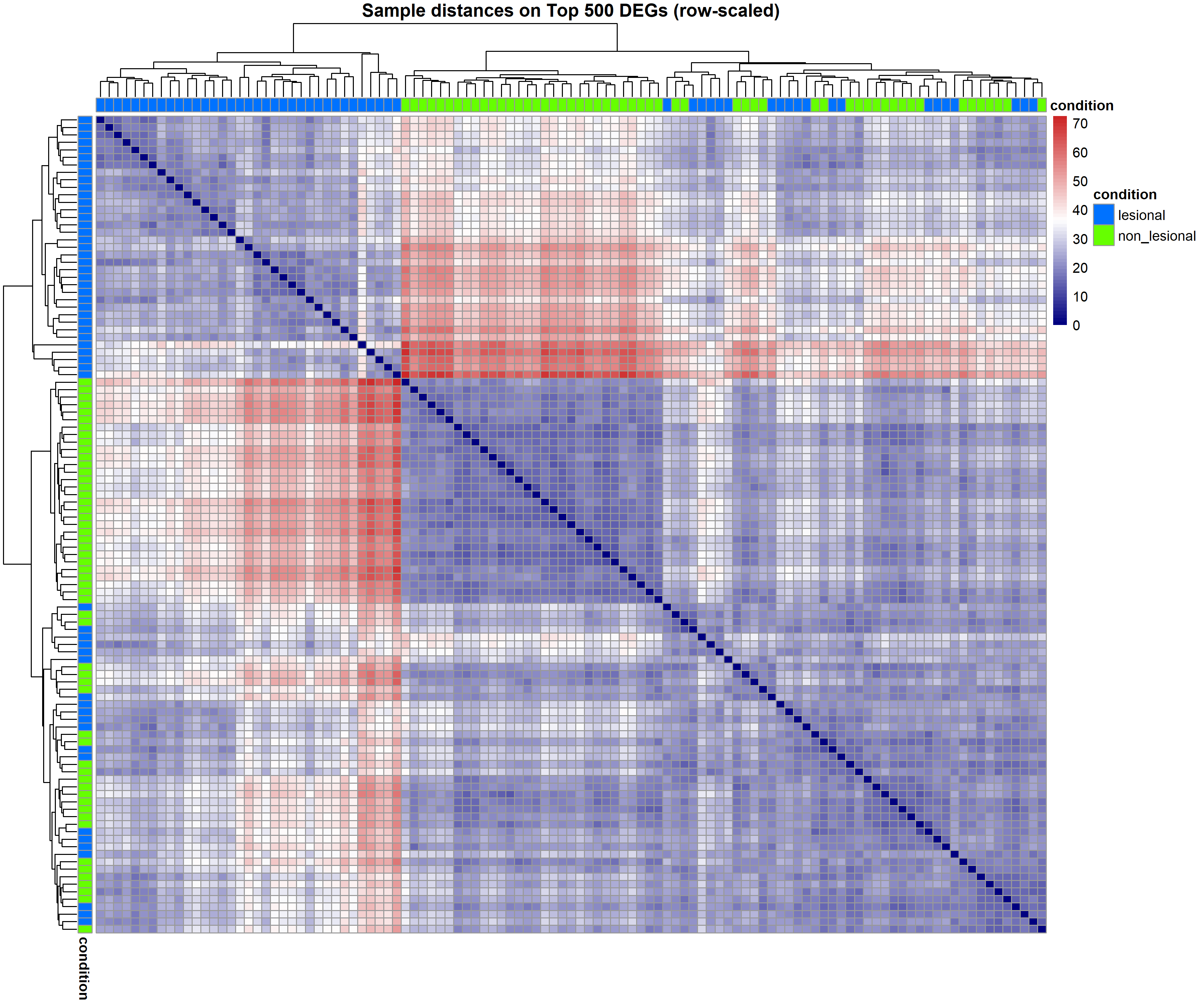
Code Block 8.2.3. Sample-to-Sample Distance Heatmap on Top DEGs
# ============= 8.2.3 Sample–Sample Distance Heatmap (Top DEGs) =============
# Row-scale (z-score per gene) BEFORE computing distances
mat_top <- t(scale(t(vst_top)))     # center/scale each gene (row)
d_top   <- dist(t(mat_top))         # distances across samples

ann_col <- data.frame(condition = colData(vsd)$condition,
                      row.names = rownames(colData(vsd)))

pheatmap(as.matrix(d_top),
         clustering_distance_rows = d_top,
         clustering_distance_cols = d_top,
         annotation_col = ann_col,
         annotation_row = ann_col,
         annotation_colors = list(condition = cond_cols),
         color = colorRampPalette(c("navy","white","firebrick3"))(60),
         show_rownames = FALSE, show_colnames = FALSE,
         fontsize = 10,
         main = paste0("Sample distances on Top ", length(top_deg_ids), " DEGs (row-scaled)"),
         filename = file.path(out_dir, "Figure_8.2.2_Distance_TopDEGs.png"),
         width = 12, height = 10)
Code Block 8.3.1. Volcano Plot of DEGs
# ============= 8.3.1 Volcano Plot =============
p_volcano <- ggplot(res_df,
                    aes(x = log2FoldChange, y = -log10(padj), colour = sig)) +
  geom_point(alpha = 0.7, size = 1.4, stroke = 0) +
  scale_colour_manual(values = c("Up" = "#EF476F", "Down" = "#118AB2", "NS" = "grey70")) +
  geom_hline(yintercept = -log10(alpha), linetype = "dashed", linewidth = 0.4) +
  geom_vline(xintercept = c(-lfc_cut, lfc_cut), linetype = "dashed", linewidth = 0.4) +
  theme_bw(base_size = 12) +
  labs(title = "Volcano Plot (shrinkage applied)",
       x = "Log2 fold change (lesional vs non_lesional)",
       y = expression(-log[10]("(adjusted p-value)")), colour = "Status") +
  theme(plot.title = element_text(hjust = 0.5, face = "bold"))
ggsave(file.path(out_dir, "Figure_8.3.1_Volcano.png"),
       p_volcano, width = 9, height = 6.5, dpi = 300)
apeglm) has stabilized these fold-change estimates, especially for low-count genes, resulting in a smoother and more reliable representation of overall gene expression trends.Code Block 8.3.2. MA Plot
# ============= 8.3.2 MA Plot =============
png(file.path(out_dir, "Figure_8.3.2_MAplot_Shrunk.png"),
    width = 1200, height = 700, res = 150)
plotMA(res_shrunk, ylim = c(-5, 5), main = "MA Plot (Shrinkage Applied)")
abline(h = c(-lfc_cut, 0, lfc_cut), col = c("grey60", "black", "grey60"),
       lty = c(3, 1, 3))
dev.off()
Code Block 8.3.3 Heatmap of Top DEGs
# ============= 8.3.3 Heatmap of Top DEGs (row-scaled, gene symbols) =============
top_n <- 50
top_genes <- res_df %>%
  arrange(padj) %>%
  slice(1:min(top_n, n())) %>%
  pull(gene)

hm_mat <- vsd_mat[top_genes, , drop = FALSE]
hm_mat_z <- t(scale(t(hm_mat)))
rownames(hm_mat_z) <- ens_to_symbol(rownames(hm_mat_z))

annotation_col <- data.frame(condition = colData(vsd)$condition)
rownames(annotation_col) <- colnames(hm_mat_z)

pheatmap(hm_mat_z,
         color = colorRampPalette(brewer.pal(9, "RdBu"))(101),
         clustering_method = "complete",
         show_rownames = TRUE, show_colnames = FALSE,
         annotation_col = annotation_col,
         annotation_colors = list(condition = cond_cols),
         main = paste0("Top ", nrow(hm_mat_z), " DEGs (row-scaled)"),
         filename = file.path(out_dir, "Figure_8.3.3_Heatmap_TopDEGs.png"),
         width = 10, height = 12)
Code Block 8.3.4. Expression Density
# ============= 8.3.4 Expression Density (faceted, gene symbols) =============
dens_n <- 12
dens_genes <- res_df %>% arrange(padj) %>% slice(1:dens_n) %>% pull(gene)

vst_sub <- vsd_mat[dens_genes, , drop = FALSE]
rownames(vst_sub) <- ens_to_symbol(rownames(vst_sub))

vst_long <- melt(vst_sub, varnames = c("Gene", "Sample"), value.name = "VST")
vst_long$Condition <- colData(vsd)$condition[match(vst_long$Sample, rownames(colData(vsd)))]

p_dens <- ggplot(vst_long, aes(VST, colour = Condition, fill = Condition)) +
  geom_density(alpha = 0.25) +
  scale_colour_manual(values = cond_cols) +
  scale_fill_manual(values = cond_cols) +
  facet_wrap(~ Gene, scales = "free", ncol = 4) +
  theme_bw(base_size = 11) +
  labs(title = paste0("VST expression densities (Top ", dens_n, " DEGs)"),
       x = "VST (log2-like units)", y = "Density", colour = "Condition", fill = "Condition") +
  theme(plot.title = element_text(hjust = 0.5, face = "bold"))
ggsave(file.path(out_dir, "Figure_8.3.4_Density_TopDEGs.png"),
       p_dens, width = 12, height = 9, dpi = 300)
Code Block 8.3.5 Enhanced Heatmap
# ============= 8.3.5 Enhanced Heatmap (alt palette) =============
pheatmap(hm_mat_z,
         color = colorRampPalette(brewer.pal(9, "PRGn"))(101),
         clustering_method = "complete",
         show_rownames = TRUE, show_colnames = FALSE,
         annotation_col = annotation_col,
         annotation_colors = list(condition = cond_cols),
         main = paste0("Enhanced Heatmap (Top ", nrow(hm_mat_z), " DEGs)"),
         filename = file.path(out_dir, "Figure_8.3.5_Heatmap_TopDEGs_Annotated.png"),
         width = 10, height = 12)
Code Block 8.4 Exporting DEG Tables
# ==================================================================
# 8.4 Exporting DEG Tables (with symbols)
# ==================================================================

# ============= Full shrunk results =============
full_tbl_path <- file.path(out_dir, "DESeq2_results_shrunk_FULL.csv")
res_out <- as.data.frame(res_shrunk) %>%
  mutate(gene = rownames(res_shrunk),
         gene_symbol = ens_to_symbol(gene)) %>%
  relocate(gene_symbol, gene)
write_csv(res_out, full_tbl_path)

# ============= Filtered significant DEGs (padj & |LFC|) =============
sig_tbl_path <- file.path(out_dir, "DESeq2_results_shrunk_SIGNIFICANT.csv")
res_out_sig <- res_out %>%
  filter(!is.na(padj),
         padj < alpha,
         abs(log2FoldChange) >= lfc_cut) %>%
  arrange(padj)
write_csv(res_out_sig, sig_tbl_path)

# ============= Up/Down lists =============
write_csv(filter(res_out_sig, log2FoldChange >  0),
          file.path(out_dir, "DEGs_UP.csv"))
write_csv(filter(res_out_sig, log2FoldChange <  0),
          file.path(out_dir, "DEGs_DOWN.csv"))

cat("\nFiles written to:\n", normalizePath(out_dir), "\n")
Code Block 10.1.1. Common Setup & Configuration — Packages, parameters, paths, and input checks
############################################################
## STRING PPI + Modules (Louvain) + Enrichment-driven figures
##
## Context:
## Differential expression between lesional (AL) vs non-lesional (AN) skin,
## followed here by PPI construction (STRING), module detection (Louvain),
## GO-based functional panels, and centrality exports.
##
## Requirements in your R session:
## - 'res'        : DESeq2 results (rownames = ENSEMBL IDs, possibly with version)
## - 'res_shrunk' : shrinked results with 'log2FoldChange' aligned to 'res'
############################################################


# ==========================================================
# [Section 1/9] Common setup & configuration
#    Thresholds, output folder, filenames, enrichment options, input checks
# ==========================================================


# 1.1 Load packages
suppressPackageStartupMessages({          # keep console clean when loading libraries
  library(STRINGdb)                       # STRING API for mapping + interaction retrieval
  library(clusterProfiler)                # functional enrichment (e.g., GO)
  library(org.Hs.eg.db)                   # gene ID mapping for Homo sapiens
  library(igraph)                         # network construction + centralities
  library(ggraph)                         # grammar-of-graphics plotting for graphs
  library(tidygraph)                      # tidy interface around igraph
  library(ggplot2)                        # general plotting
  library(scales)                         # palettes, transformations
  library(ggrepel)                        # non-overlapping labels
  library(grid)                           # units for padding/spacing (unit())
})


# 1.2 User knobs (analysis thresholds and plotting controls)
min_score <- 700        # STRING combined_score threshold
top_k     <- 400        # top N DEGs to start with (after sorting by |LFC|)
padj_thr  <- 0.05       # adjusted p-value threshold
lfc_thr   <- 0.5        # absolute log2 fold-change threshold


# 1.3 Output location
fig_dir <- "C:/Users/Desktop/RNA_Seq_Task1/PPI"
dir.create(fig_dir, showWarnings = FALSE, recursive = TRUE)


# 1.4 Output filenames (node table, module lists, and module summaries)
out_nodes_csv  <- file.path(fig_dir, "ppi_modules_louvain_nodes.csv")
out_lists_csv  <- file.path(fig_dir, "ppi_modules_louvain_gene_lists.csv")
out_summary_csv <- file.path(fig_dir, "ppi_module_summary_full.csv")
out_summary_preview_csv <- file.path(fig_dir, "ppi_module_summary_preview.csv")


# 1.5 Enrichment figure settings
ontol             <- "BP"  # BP, MF, CC: Biological Process (BP), Molecular Function (MF), and Cellular Component (CC)
top_terms_show    <- 10
min_genes_module  <- 5
top_n_enriched    <- 3
n_labels_per_net  <- 20


# 1.6 Input checks
# Ensure DESeq2 result objects exist in the environment
if (!exists("res") || !exists("res_shrunk")) {
  stop("Objects 'res' and 'res_shrunk' must exist in the environment.")
}
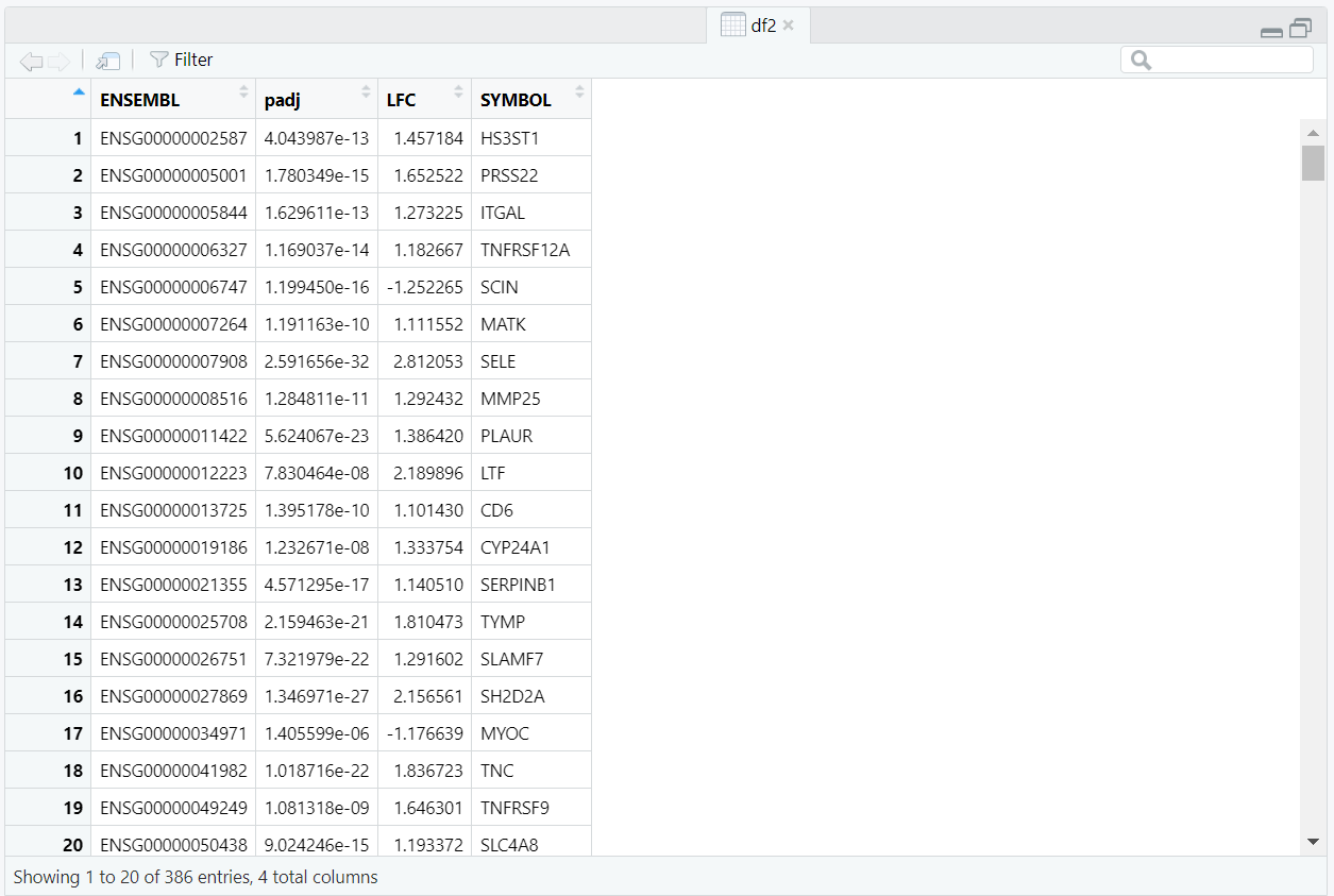
Code Block 10.1.2. DEG Selection & ENSEMBL → SYMBOL Mapping
# ==========================================================
# [Section 2/9] DEG selection & ENSEMBL → SYMBOL mapping
#    Filter DEGs, rank by |LFC|, keep top_k; 1:1 map to HGNC symbols
# ==========================================================


# 2.1 Pick DEGs and prepare IDs
# -  - - - - - - - -
#    Pipeline:
#      a) strip ENSEMBL version
#      b) collect padj and LFC from DESeq2 results
#      c) filter by padj and |LFC|
#      d) sort by |LFC| desc and keep top_k
# -  - - - - - - - -

# Collect all gene rownames (ENSEMBL IDs, possibly with version suffix).
ens_all  <- rownames(res)

# Strip Ensembl version suffix if present (e.g., ENSG000001234.12 → ENSG000001234) to match mapping keys.
ens_base <- sub("\\.\\d+$", "", ens_all)
# - - - - - -
# The above regex  removes a trailing "." (e.g., ".12"); otherwise no change:

#   \\.   -> literal dot
#   \\d+  -> one or more digits
#   $     -> end of string
# - - - - - -

# Build a compact table of IDs and DE statistics that will feed the PPI steps.
stats_df <- data.frame(
  ENSEMBL = ens_base,
  padj    = res[ens_all, "padj"],
  LFC     = res_shrunk[ens_all, "log2FoldChange"],
  stringsAsFactors = FALSE
)

# Filter DEGs by combining significance (padj) and effect size (|LFC|)
stats_df <- subset(stats_df, !is.na(padj) & !is.na(LFC) & padj <= padj_thr & abs(LFC) >= lfc_thr)
if (nrow(stats_df) < 10) stop("Too few DEGs after filtering; adjust thresholds.")

# Rank by absolute effect size (|LFC|) and keep top_k to control network size/complexity.
stats_df <- stats_df[order(-abs(stats_df$LFC)), ]
stats_df <- head(stats_df, top_k)


# 2.2 Map ENSEMBL → SYMBOL using org.Hs.eg.db (via clusterProfiler::bitr).
# Expect occasional one-to-many mappings; we collapse to a simple 1:1 in the next line.
map <- suppressWarnings(
  bitr(stats_df$ENSEMBL, fromType = "ENSEMBL", toType = "SYMBOL", OrgDb = org.Hs.eg.db)
)
# Enforce one SYMBOL per ENSEMBL to keep node identifiers clean and unique.
map <- map[!duplicated(map$ENSEMBL), c("ENSEMBL","SYMBOL")]

# Merge DE stats with symbols; this table (df2) is the input to STRING mapping.
df2 <- merge(stats_df, map, by = "ENSEMBL")
if (nrow(df2) < 10) stop("Too few SYMBOLs after mapping; increase top_k or check IDs.")
removeUnmappedRows = TRUE. Because some biological identifiers can collapse onto the same protein record, the script imposes a deterministic choice among duplicates by ordering rows by adjusted p-value with mapped <- mapped[order(mapped$padj), ] and then keeping one row per protein via mapped <- mapped[!duplicated(mapped$STRING_id), ]. With this ordering, the kept row is the one with the smallest padj for that protein, which favors the most statistically compelling representative when multiple symbols would otherwise create duplicate nodes in the graph (Figure 10.1.3.1).
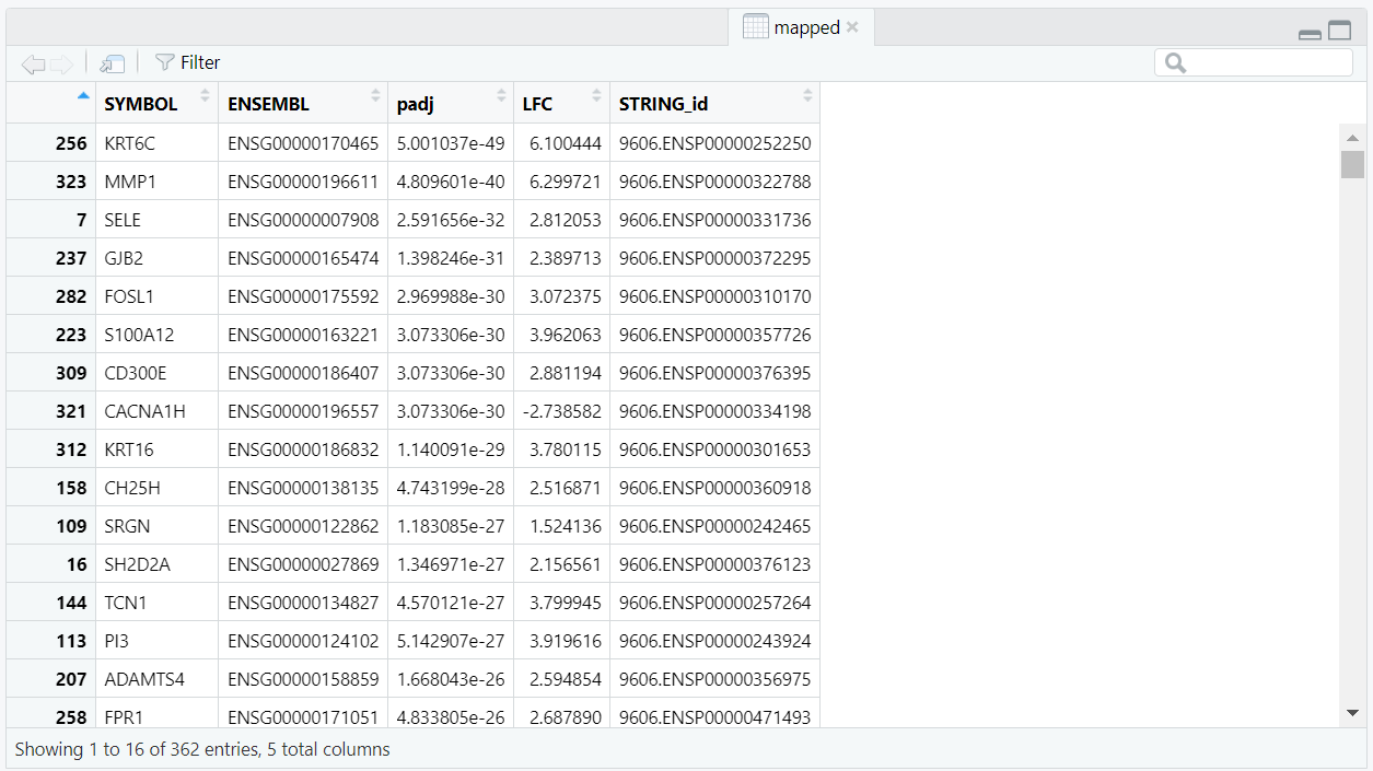
mapped object created with
string_db$map(df2, "SYMBOL", removeUnmappedRows = TRUE), ordered by
padj, then filtered with !duplicated(STRING_id) to keep one unique
STRING protein per gene.
edges <- string_db$get_interactions(mapped$STRING_id). This produces an edge list containing protein–protein pairs including three columns from, to, and combined_score (Figure 10.1.3.2). The combined_score column is not computed in the script—it comes precomputed from the STRING database. It summarizes confidence by combining multiple evidence channels (experiments, curated databases, co-expression, text mining, genomic neighborhood, gene fusion, and co-occurrence) and, in STRING v12, is typically scaled from 0 to 1000 (higher means stronger support). Then, using subset() function, we filter this list to keep only interactions above the chosen score threshold (min_score > 700), and only those where both proteins are part of our mapped set. At this stage, the table may still contain duplicated interactions written in opposite directions (e.g., A→B and B→A), which are later removed, reducing the total number of edges from 1,552 (Figure 10.1.3.2) to 776 (Figure 10.1.3.3).
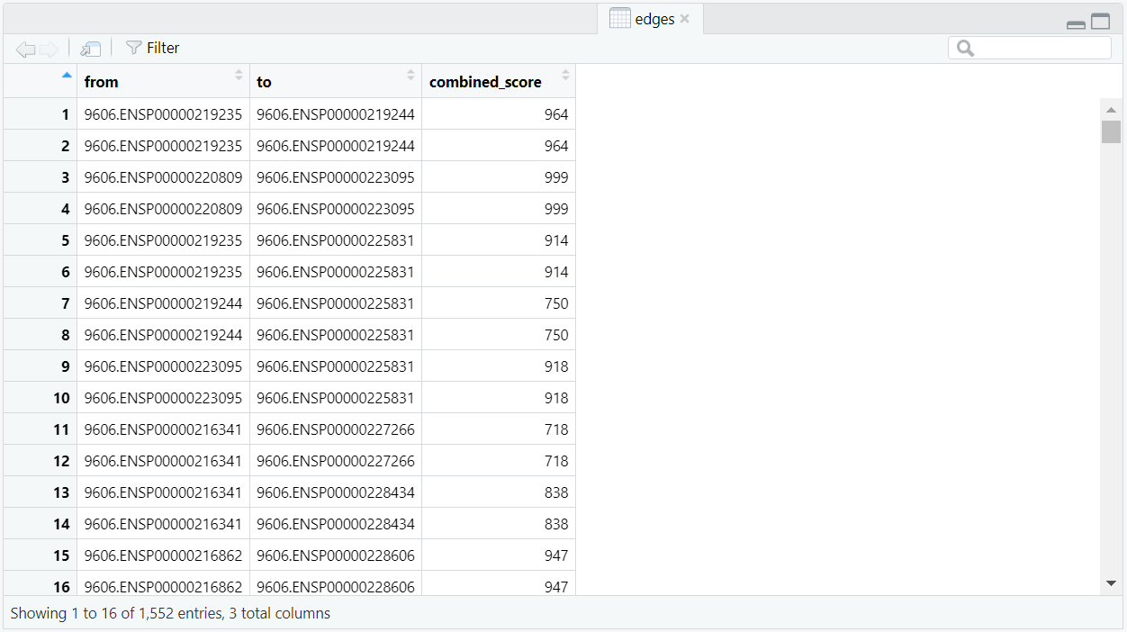
edges) generated with
string_db$get_interactions(mapped$STRING_id); each row lists a protein pair
(from, to) and its combined_score before duplicate removal.
key <- ifelse(edges$from < edges$to, paste(edges$from, edges$to), paste(edges$to, edges$from)), and then removes repeated pairs with edges <- edges[!duplicated(key), ]. The cleaned edges list (Figure 10.1.3.3)—now limited to high-confidence, non-self, unique undirected interactions with an attached combined_score—is ready for the next section, where it’s passed to igraph to build the weighted PPI network.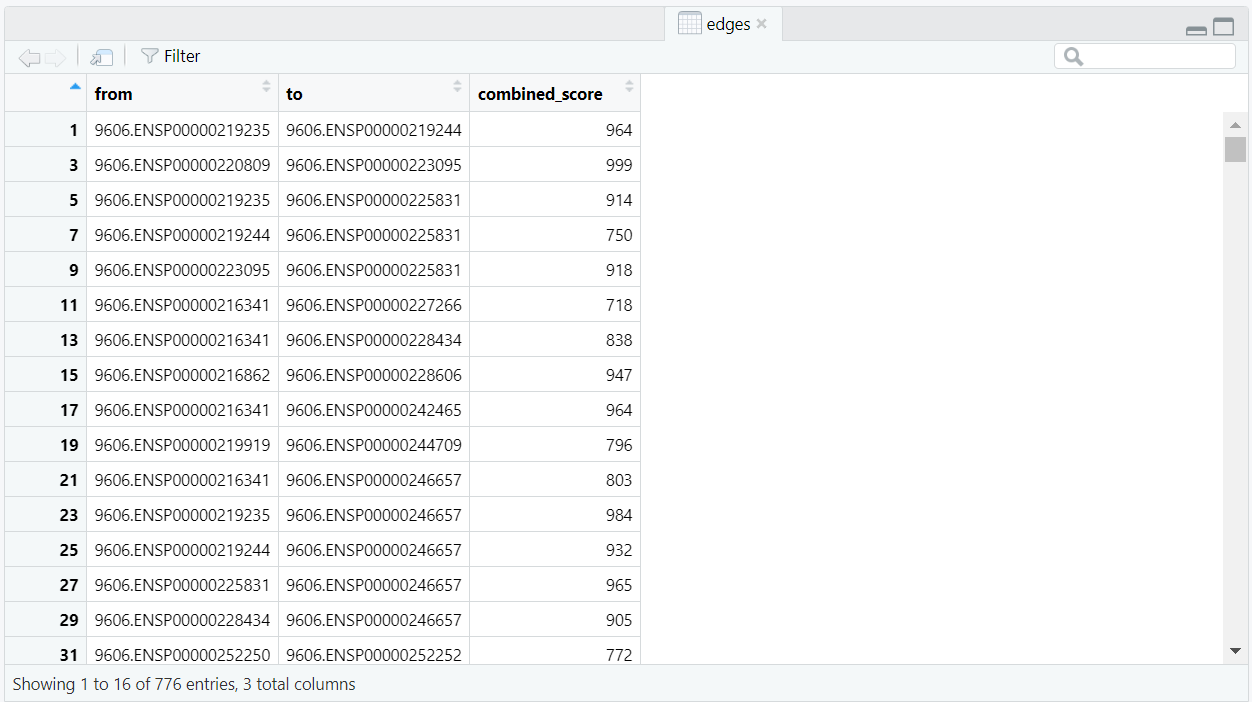
edges after creating a canonical pair
key with ifelse(from < to, paste(from,to), paste(to,from)) and dropping
reverse duplicates via !duplicated(key); each interaction appears once (undirected).
Code Block 10.1.3. STRING Mapping & Interaction Retrieval — Map symbols to STRING IDs and fetch high-confidence edges
# ==========================================================
# [Section 3/9] STRING mapping & interaction retrieval
#    Map symbols to STRING IDs; fetch high-confidence edges; deduplicate pairs
# ==========================================================


# 3.1 Map to STRING identifiers
# -  - - - - - - - -
# SYMBOL -> STRING IDs and INTERACTIONS
# -  - - - - - - - -
# Initialize STRING for human (9606), requesting only edges at or above min_score.
# This setting pre-filters returned interactions by confidence.
string_db <- STRINGdb$new(
  version = "12", species = 9606,
  score_threshold = min_score, input_directory = ""
)

# map symbols to STRING IDs; remove proteins with no mapping
mapped <- string_db$map(df2, "SYMBOL", removeUnmappedRows = TRUE)


# Set a deterministic priority for many-to-one mappings (multiple SYMBOLs → same STRING_id).
# Here we prioritise the smallest padj (most significant). This only affects which duplicate is kept.
mapped <- mapped[order(mapped$padj), ]
# Keep a single row per STRING protein to avoid duplicate nodes in the graph.
# Because of the sort above, the retained row is the one with the smallest padj for that STRING_id.
mapped <- mapped[!duplicated(mapped$STRING_id), ]


if (nrow(mapped) < 10) stop("Too few mapped STRING IDs; adjust thresholds.")


# 3.2 Fetch high-confidence interactions among mapped proteins and deduplicate
edges <- string_db$get_interactions(mapped$STRING_id)
# Retain only the minimal columns needed downstream.
edges <- subset(
  edges,
  combined_score >= min_score &
    from %in% mapped$STRING_id &
    to   %in% mapped$STRING_id &
    from != to,
  select = c("from","to","combined_score")
)

# Build an undirected key and drop duplicates (keep one edge per pair)
key <- ifelse(edges$from < edges$to,
              paste(edges$from, edges$to),
              paste(edges$to, edges$from))

edges <- edges[!duplicated(key), ]
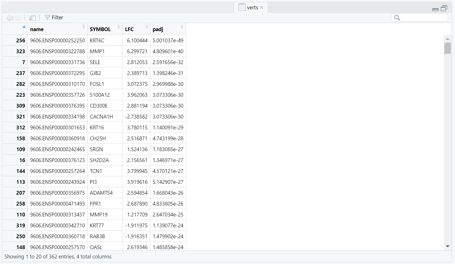
verts object created from the mapped data,
containing unique STRING protein IDs (name) along with SYMBOL, LFC,
and padj. This table defines the node attributes used when constructing the igraph network.
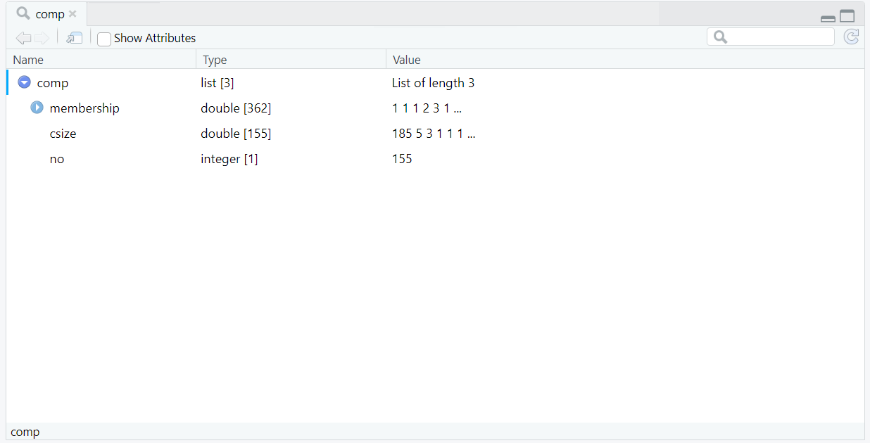
comp object returned by components(g),
showing connected component membership for each protein, the component sizes (csize),
and the total number of detected components (no).
Code Block 10.1.4. PPI Graph Construction & Component Filtering — Build igraph and retain components ≥ 3 nodes
# ==========================================================
# [Section 4/9] Graph build & component filtering
#    Build igraph with attributes; simplify; keep components ≥ 3 nodes
# ==========================================================


# ==========================================================
# 4.1 BUILD IGRAPH OBJECT with attributes (nodes: proteins; edges: STRING interactions)

# Assemble a vertex (node or protein) table with the attributes we’ll carry through (labels and DE stats).
verts <- unique(mapped[, c("STRING_id","SYMBOL","LFC","padj")])
# Rename STRING_id → name to meet igraph expectations.
colnames(verts)[1] <- "name"

# Build an undirected igraph from edges and vertices;
# Attach gene label, LFC, and padj as node attributes
g <- graph_from_data_frame(
  d = edges, directed = FALSE,
  vertices = data.frame(
    name  = verts$name,
    label = verts$SYMBOL,
    lfc   = verts$LFC,
    padj  = verts$padj
  )
)


# 4.2  Simplify graph to remove multiedges and loops (average score if needed)
g <- simplify(
  g,
  remove.multiple = TRUE,
  remove.loops = TRUE,
  edge.attr.comb = list(combined_score = "mean", "ignore")
)


# 4.3  Identify connected components and keep meaningful components (≥ 3 nodes)
comp <- components(g)
keep <- which(comp$csize[comp$membership] >= 3)
g <- induced_subgraph(g, vids = keep)
if (vcount(g) == 0) stop("No components >= 3 nodes; lower score or increase top_k.")
module assignments and statistics) (out_nodes_csv) that includes STRING ID, gene symbol, module, degree, log2FC, and padj.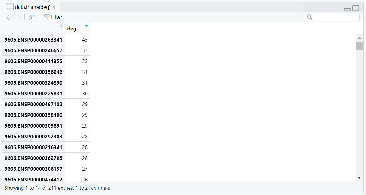
deg object created by
degree(g) and displayed using View(data.frame(deg)).
Each row represents a protein node and its unweighted degree, showing the range of
connectivity (from 45 to 1) across 211 nodes in the PPI network.
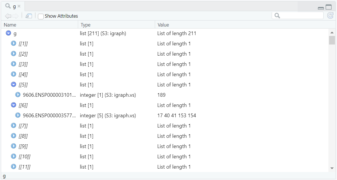
igraph object g
in RStudio, showing each of its 211 elements (nodes) and their direct connections.
For example, g[[6]] lists five linked vertices, while g[[5]]
lists only one, illustrating how the number of connected vertices corresponds to the
node’s degree in the protein–protein interaction network.
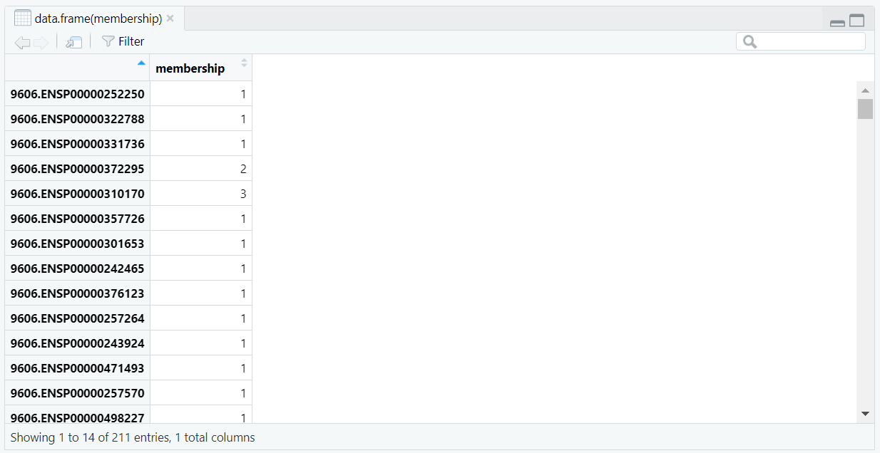
comp2$membership showing the component ID assigned to each
protein in the filtered graph. Each entry corresponds to one of the eight detected connected components.
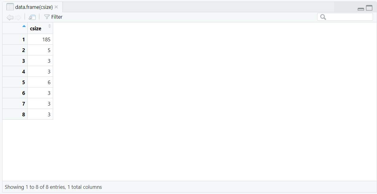
comp2$csize listing the sizes of all eight connected
components detected in comp2. The largest component (size = 185) dominates the network,
followed by smaller clusters containing 3–6 nodes.
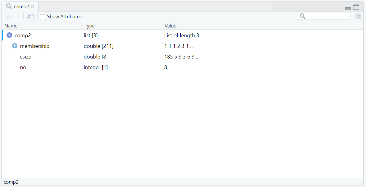
comp2 object generated by
components(g), summarizing the connected components of the updated graph.
Similar to comp from Section 4, it includes membership (component ID per node),
csize (size of each component), and no (total number of components).
Here, the number of components has been reduced from 155 to 8 after filtering, reflecting
the refined connectivity of the network once degree and sign attributes were incorporated.
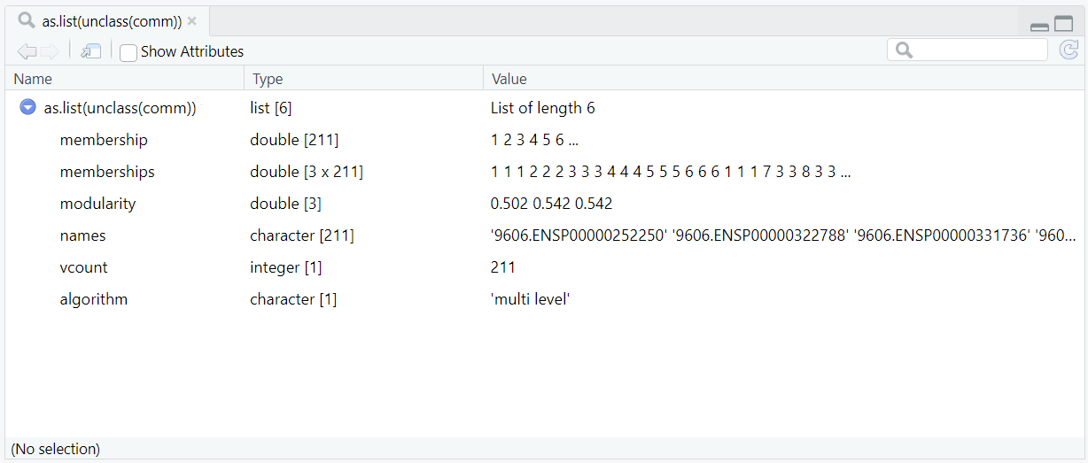
comm object generated by
cluster_louvain(g, weights = E(g)$combined_score). The comm object
is an igraph communities object (an S3 “hidden list”) created through Louvain community detection.
Because View() cannot directly open such objects, it was converted using
View(as.list(unclass(comm))) to display its internal structure.
The object contains six key elements: membership (final module assignments for 211 proteins),
memberships (a 3×211 matrix showing clustering across three optimization levels),
modularity (modularity scores for each level, with the final ≈ 0.542),
names (STRING IDs of vertices), vcount (vertex count),
and algorithm (“multi level”). Together, these describe the hierarchical modular structure
of the weighted PPI network following Louvain clustering.
split(V(g)$label, V(g)$module), we’re grouping the gene symbols by their module ID. So, the output modules_list becomes a list of modules, where each list element corresponds to one module. Only modules with at least three genes are retained (modules_list[sapply(modules_list, length) >= 3]), and the list is sorted by decreasing size (modules_list[order(sapply(modules_list, length), decreasing = TRUE)]) for easier interpretation. 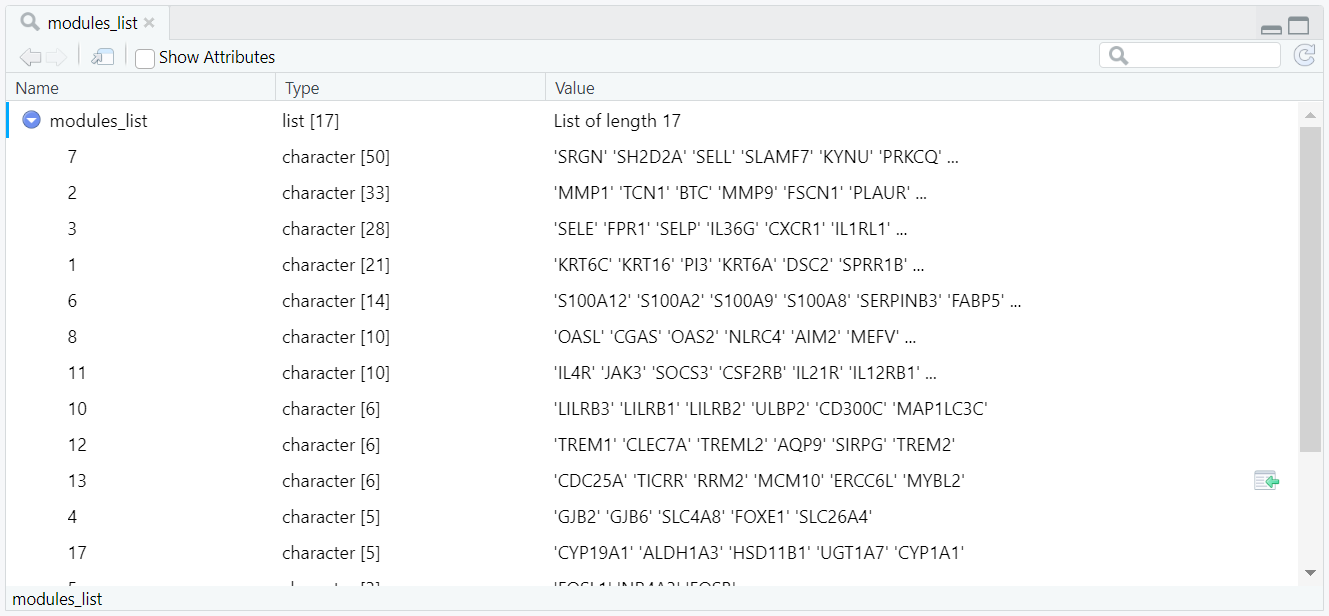
modules_list object created using
split(V(g)$label, V(g)$module). Each element of the list represents a Louvain module
(identified by module ID) and contains the corresponding genes assigned to that module.
The list shows a total of 17 retained modules after filtering those with fewer than three genes,
sorted in decreasing order of module size.
keep_mods <- names(modules_list), ensuring that only the modules meeting the size threshold are carried forward. A new data frame named vdf is then constructed, containing one row per protein and summarising key node-level information, including its STRING identifier (V(g)$name), gene symbol (V(g)$label), module assignment (V(g)$module), degree (V(g)$deg), log2 fold change (V(g)$lfc), and adjusted p-value (V(g)$padj) (Figure 10.1.5.8). To ensure that the table includes only relevant proteins, it is filtered to retain rows corresponding to the selected modules using vdf <- subset(vdf, module %in% keep_mods) (Figure 10.1.5.9), and finally sorted by module and decreasing degree so that the most connected hub proteins appear first. The resulting node table is exported as a CSV file node attribute CSV for documentation, visualisation, and downstream analysis.
vdf immediately after construction with
vdf <- data.frame(STRING_id, gene, module, deg, lfc, padj).
It lists 211 proteins, each represented by one row summarising its STRING ID, symbol, module, degree, log2FC, and adjusted p-value.
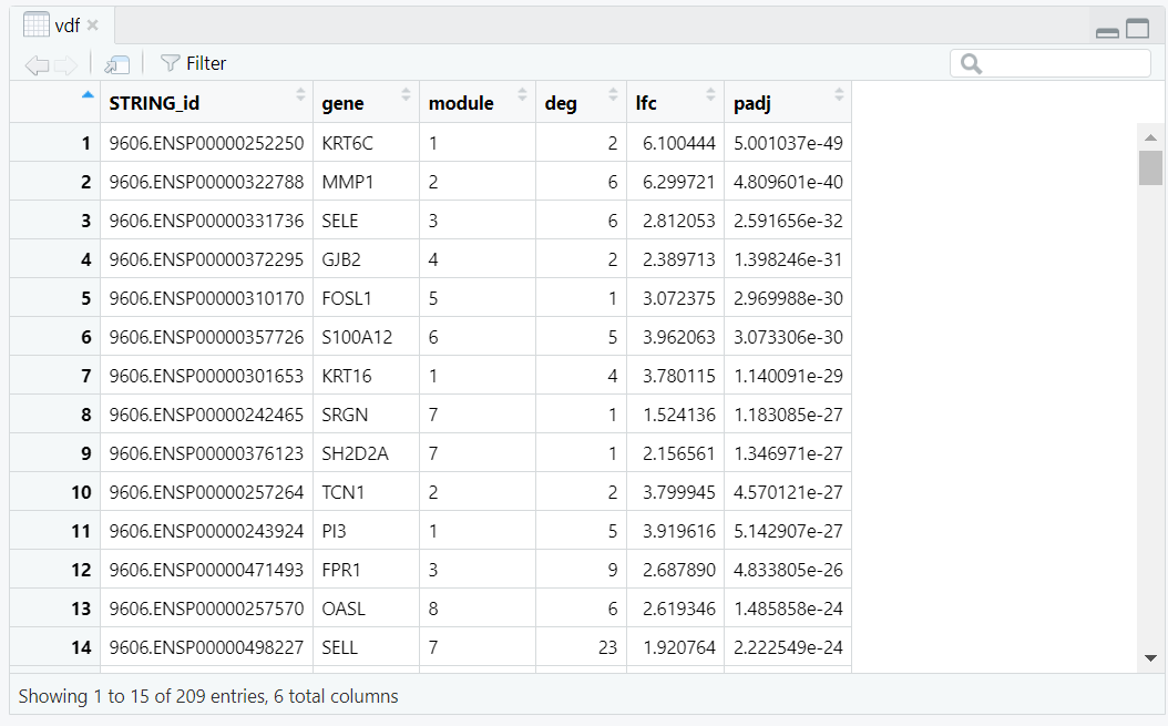
vdf after filtering to retained modules with
vdf <- subset(vdf, module %in% keep_mods).
The number of rows decreases from 211 to 209, retaining only proteins from modules with at least three genes.
mod_map (Figure 10.1.5.10), with module IDs and gene names. This file is also exported as a CSV and is particularly useful for pathway-enrichment analysis or supplementary reporting.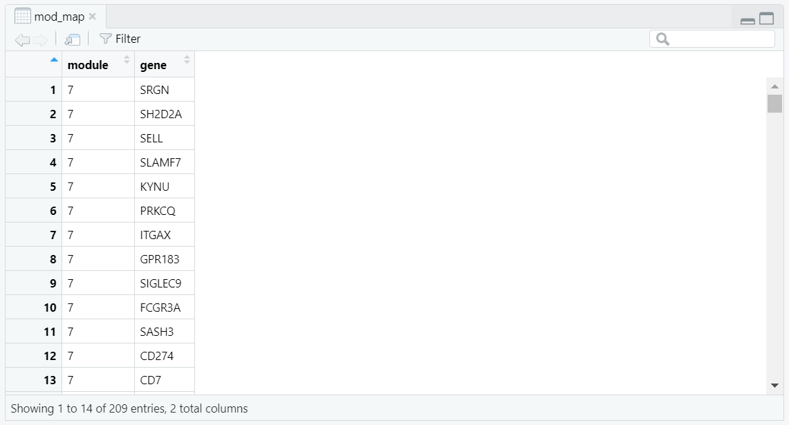
mod_map data frame, created using
do.call(rbind, lapply(...)), provides a long-format mapping between module IDs and their corresponding genes.
Each row represents a single module–gene pair, forming a concise two-column structure used for downstream enrichment
and supplementary analyses.
Code Block 10.1.5. Node Metrics & Louvain Modules — Degree/sign, community detection, and CSV exports
# ==========================================================
# [Section 5/9] Node metrics & Louvain modules (CSV exports)
#    Degree/sign; Louvain modules; node table and module list
# ==========================================================


# ==========================================================
# 5.1 NODE METRICS (degree, sign) + network stats for figure subtitle
# ==========================================================
# Compute unweighted degree per node (vertex); store as attribute for plotting and tables.
deg <- degree(g)

# ----------------------------------------------------------
# Creating two vertex attributes on g:
# 1.deg (numeric): degree of each node
# 2. sign (character): "Upregulated" or "Downregulated" from V(g)$lfc
# ----------------------------------------------------------


# Store the degree vector as a vertex attribute named "deg".
# After this, we can access it as V(g)$deg and use it for plotting/tables.
V(g)$deg  <- deg


# Create a categorical vertex (node) attribute "sign" from log2 fold-change (V(g)$lfc).
# Nodes with lfc >= 0 are labeled "Upregulated", others "Downregulated".
# (Assumes V(g)$lfc was set earlier when the graph was built.)
V(g)$sign <- ifelse(V(g)$lfc >= 0, "Upregulated", "Downregulated")


# ----------------------------------------------------------
# Summary counts for subtitle/context: size of largest component, total nodes, total edges.
# ----------------------------------------------------------
comp2   <- components(g) # connected-components summary: $membership, $csize (sizes), $no (count)
LCC     <- max(comp2$csize) # size of the Largest Connected Component (number of nodes in biggest component)
nodes   <- vcount(g) # total number of nodes in the current graph
edges_n <- ecount(g) # total number of edges in the current graph


# - - - - - - -
# comp2$membership → component ID for each node

# comp2$csize → sizes of each component

# comp2$no → total count of components
# - - - - - - -


# 5.2 COMMUNITY DETECTION (modules via Louvain)
# - - - - - -  - - -
#    - Assign module labels per node
#    - Build a "module -> genes" list and keep modules with >= 3 genes
#    - Prepare tidy per-node table (vdf) and save CSVs
# - - - - - -  - - -

# detect Louvain communities using STRING scores as edge weights
comm <- cluster_louvain(g, weights = E(g)$combined_score)

# store each vertex's community ID as factor attribute "module"
V(g)$module <- factor(membership(comm))

# vector of community sizes (number of vertices in each)
sizes_comm  <- sizes(comm)


# 5.3 Exports: node table and module→gene mapping
# ----------------------------------------------------------

# group gene symbols by their module ID
# split gene symbols (V(g)$label) into a list grouped by each vertex’s module ID (V(g)$module); one element per module
modules_list <- split(V(g)$label, V(g)$module)


# keep only modules with ≥ 3 genes
modules_list <- modules_list[sapply(modules_list, length) >= 3]

# sort modules by size (descending)
modules_list <- modules_list[order(sapply(modules_list, length), decreasing = TRUE)]

# vector of retained module IDs
keep_mods <- names(modules_list)


# ----------------------------------------------------------
# Build a tidy node table (one row per gene) for export/inspection and downstream linking.
# ----------------------------------------------------------

vdf <- data.frame(
  STRING_id = V(g)$name,
  gene      = V(g)$label,
  module    = V(g)$module,
  deg       = V(g)$deg,
  lfc       = V(g)$lfc,
  padj      = V(g)$padj,
  stringsAsFactors = FALSE
)


# Keep only nodes in retained modules;
vdf <- subset(vdf, module %in% keep_mods)


# sort by module then by degree to surface hubs first.
## Save node table and module gene lists
write.csv(vdf[order(as.numeric(vdf$module), -vdf$deg), ], out_nodes_csv, row.names = FALSE)


# Long-format module→gene map (useful for enrichment, reporting, and reproducibility).
# Save module -> gene mapping (long format)
mod_map <- do.call(rbind, lapply(names(modules_list), function(m) {
  data.frame(module = m, gene = modules_list[[m]], stringsAsFactors = FALSE)
}))

write.csv(mod_map, out_lists_csv, row.names = FALSE)
mod_map$module <- as.character(mod_map$module) and mod_map$gene <- as.character(mod_map$gene) prevents factor-level issues when splitting and pasting strings. We then count how many genes fall into each module using mod_counts <- sort(table(mod_map$module), decreasing = TRUE), which yields a size-ordered list of module counts so the largest modules appear first throughout the summaries (Figure 10.1.6.1).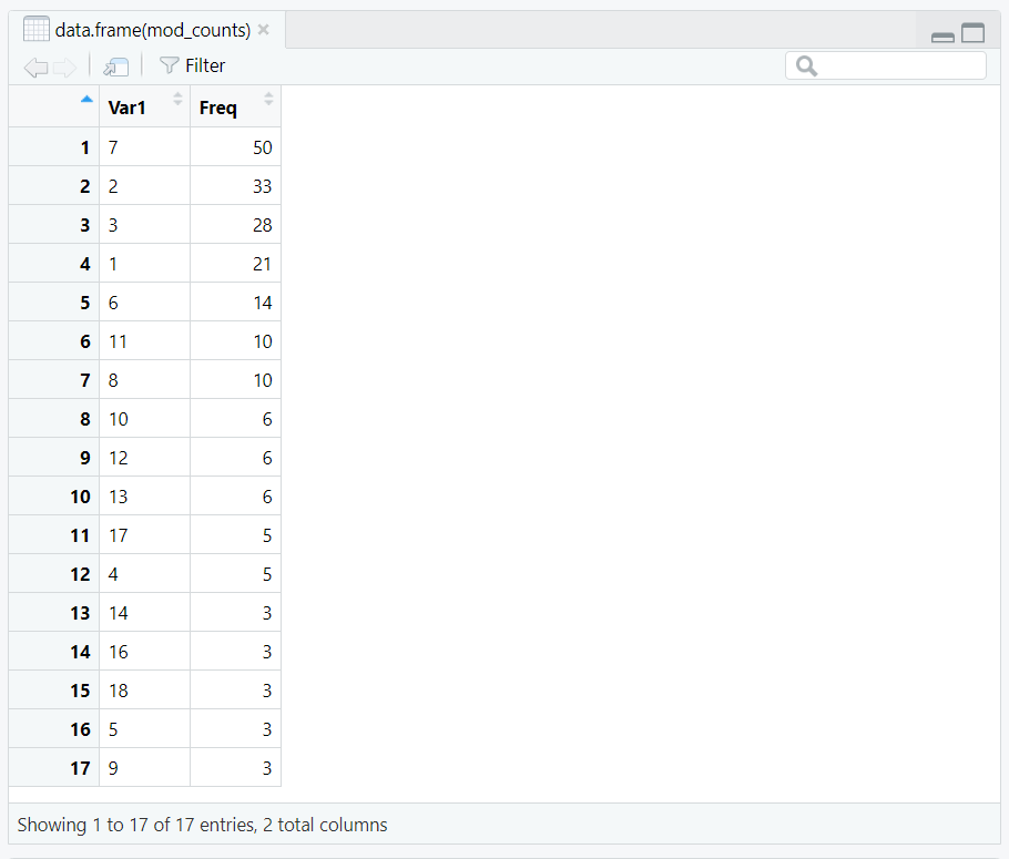
mod_counts) computed from table(mod_map$module) and sorted in decreasing order.
split(mod_map$gene, mod_map$module) groups genes by module; Within each group, we use lapply(..., function(x) { ux <- unique(x); paste(ux, collapse = ", ") }) to create a single comma-separated string of unique gene names. The lapply() function applies the small function function(x) to every element of the list created by split(). Inside it, unique(x) removes any repeated gene names, and paste(..., collapse = ", ") joins them together into one line separated by commas (Figure 10.1.6.2). The list examples_full is reordered to follow the same module order as mod_counts, which was already sorted from the largest to smallest module (Figure 10.1.6.3). 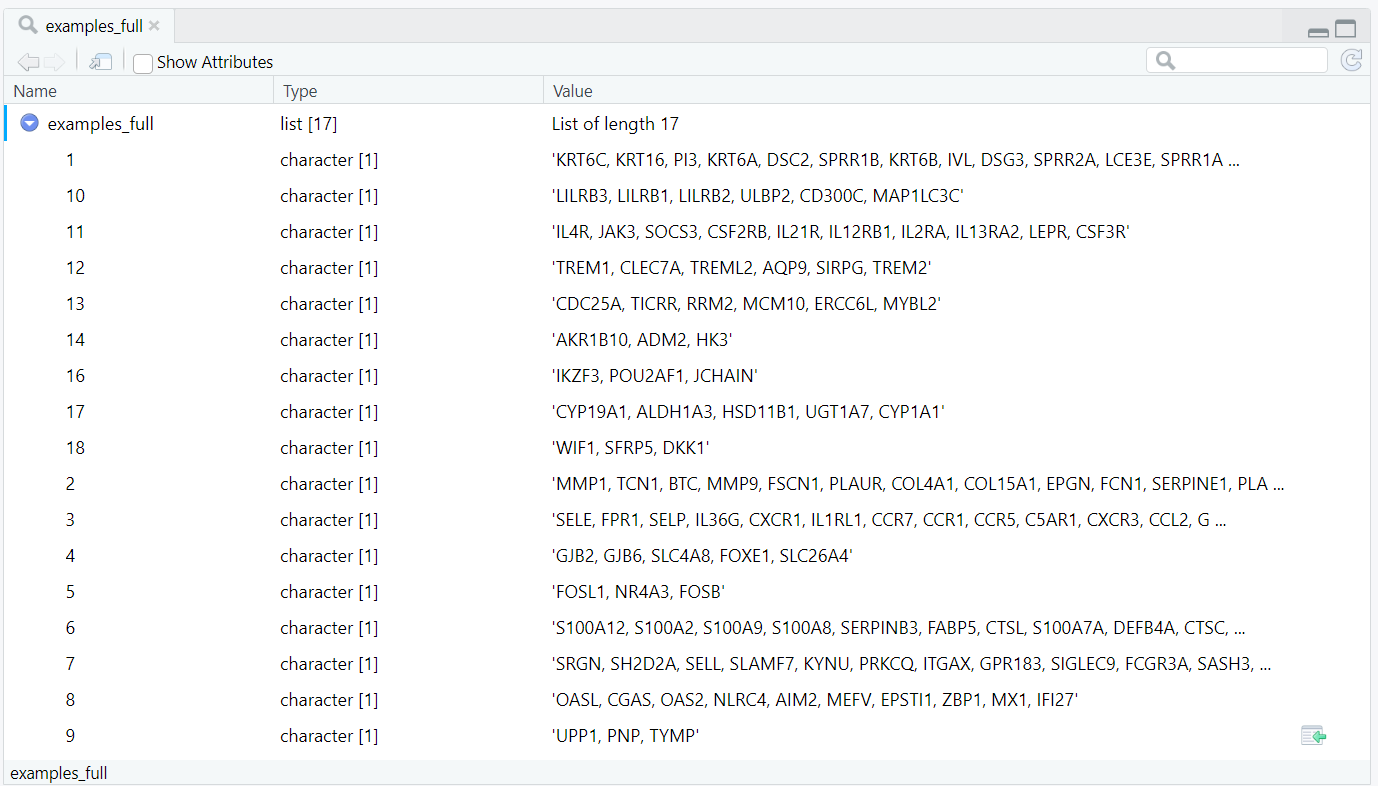
examples_full immediately after
lapply(split(mod_map$gene, mod_map$module), function(x){ux <- unique(x); paste(ux, collapse=", ")}), showing comma-separated unique genes per module in the split list’s native order.

examples_full after reordering with
examples_full[names(mod_counts)] so list elements align with modules ranked by size in mod_counts.
module_summary_full (Figure 10.1.6.4), the rows appear in descending order of module size, with the largest modules listed first. The result is written to disk with write.csv(module_summary_full, out_summary_csv, row.names = FALSE) and exposed on our site as a browsable “full” CSV; ⬇️ Download CSV (PPI module full summary).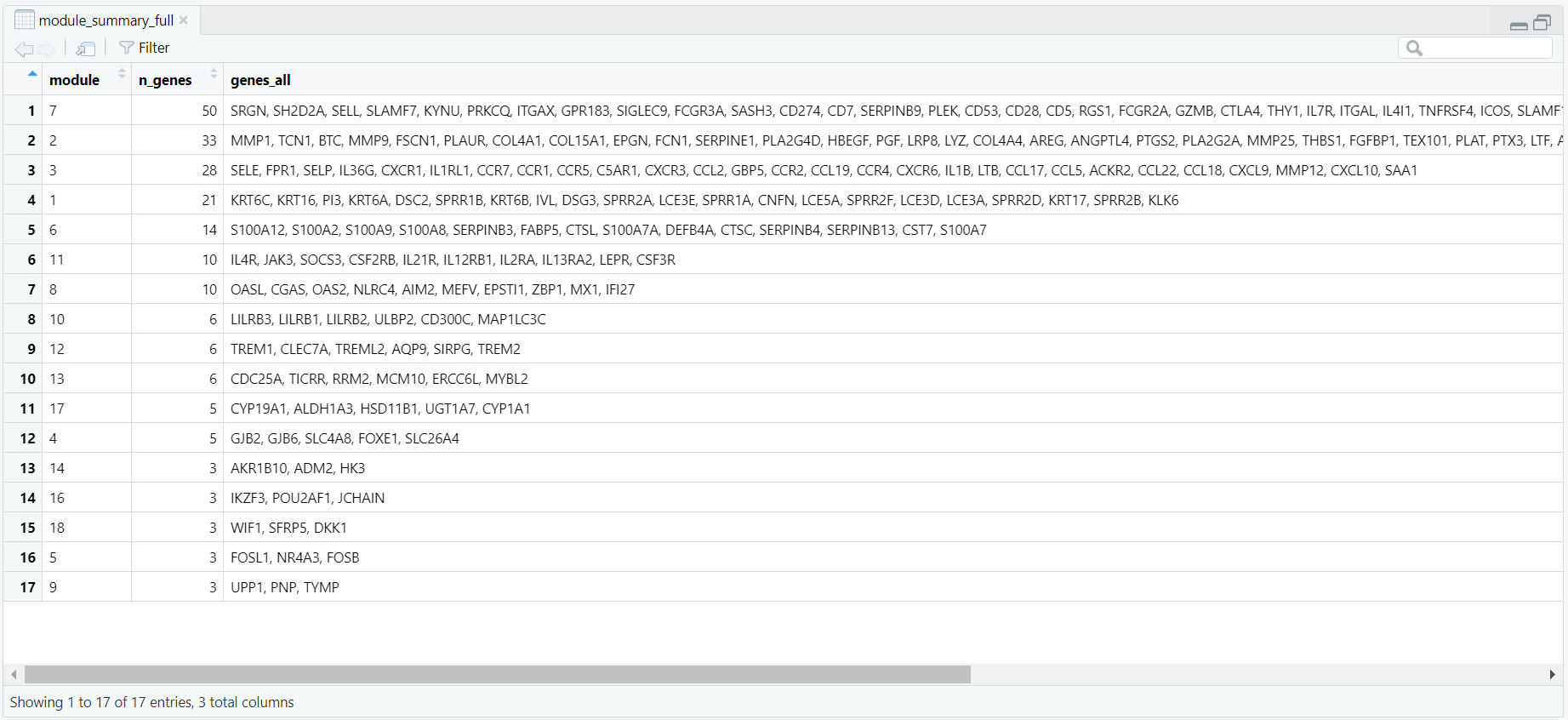
module_summary_full: one row per module with
module, n_genes, and the collapsed list of all member genes (genes_all), ordered by decreasing module size.
examples_preview (Figure 10.1.6.5) keeps only the first 10 unique symbols per module: ux[seq_len(min(10, length(ux)))]. These snippets become the example_genes column in module_summary_preview, paired with the ordered module and n_genes. It is saved via write.csv(module_summary_preview, out_summary_preview_csv, row.names = FALSE) and published as a browsable “preview” CSV; ⬇️ Download CSV (PPI module preview summary).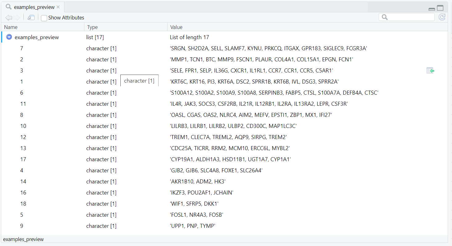
examples_preview list, generated using
lapply(split(mod_map$gene, mod_map$module), function(x) { ux <- unique(x); paste(ux[seq_len(min(10, length(ux)))], collapse = ", ") }),
retains only the first ten unique genes per module for quick inspection. These shortened examples are later added as
the example_genes column in module_summary_preview,
forming the basis of the compact preview table exported as a CSV file.
module_summary_preview using ggplot2: ggplot(..., aes(x = reorder(module, -n_genes), y = n_genes, fill = factor(module))) draws one column per module, labels the bars with counts via geom_text, and applies a readable theme and viridis palette. The figure is saved as a high-resolution PNG with ggsave(file.path(fig_dir, "ppi_module_sizes_barplot_colored.png"), p_sizes, width = 8, height = 4.5, dpi = 320, bg = "white"). This produces a clear size overview suitable for reports (Figure 10.1.6.6).Code Block 10.1.6. Module Summaries & Overview Figure — Full/preview CSVs and module size bar plot
# ==========================================================
# [Section 6/9] Module summaries & overview figure
#    - Full/preview CSVs; module size barplot (PNG)
# ==========================================================


# 6.1 MODULE SUMMARIES
# - - - -  - - -
#     - Full list (all genes in a single cell)
#     - Preview (first 10 genes) + size bar plot
# - - - -  - - -
# Make sure types are plain character before tabulating to avoid factor pitfalls.
mod_map$module <- as.character(mod_map$module)
mod_map$gene   <- as.character(mod_map$gene)

# Count genes per module and order modules by size (largest first).
mod_counts <- sort(table(mod_map$module), decreasing = TRUE)

# Build a “full” summary: one row per module with all its genes collapsed to a single string.
examples_full <- lapply(split(mod_map$gene, mod_map$module), function(x) {
  ux <- unique(x); paste(ux, collapse = ", ")
})

# Reorder the list so its module names follow the same order as mod_counts
# (largest modules first, ensuring consistency in later tables and plots)
examples_full <- examples_full[names(mod_counts)]


module_summary_full <- data.frame(
  module        = names(mod_counts),
  n_genes       = as.integer(mod_counts),
  genes_all     = unname(unlist(examples_full)),
  stringsAsFactors = FALSE
)

write.csv(module_summary_full, out_summary_csv, row.names = FALSE)

# Build a short “preview” summary: first 8 genes per module for quick scanning.
examples_preview <- lapply(split(mod_map$gene, mod_map$module), function(x) {
  ux <- unique(x); paste(ux[seq_len(min(10, length(ux)))], collapse = ", ")
})
examples_preview <- examples_preview[names(mod_counts)]
module_summary_preview <- data.frame(
  module        = names(mod_counts),
  n_genes       = as.integer(mod_counts),
  example_genes = unname(unlist(examples_preview)),
  stringsAsFactors = FALSE
)

write.csv(module_summary_preview, out_summary_preview_csv, row.names = FALSE)


# 6.2 Quick bar plot of module sizes (for overview)
library(ggplot2)

p_sizes <- ggplot(module_summary_preview,
                  aes(x = reorder(module, -n_genes), y = n_genes, fill = factor(module))) +
  geom_col(width = 0.8, color = "grey60") +
  geom_text(aes(label = n_genes), vjust = -0.35, size = 3) +
  scale_fill_viridis_d(option = "C", end = 0.95) +  # rich, non-white colors
  labs(x = "Module ID", y = "Number of genes", title = "PPI module sizes") +
  theme_minimal(base_size = 12) +
  theme(legend.position = "none",
        panel.grid.major.x = element_blank(),
        plot.title = element_text(face = "bold", size = 16),
        axis.title = element_text(face = "bold")) +
  expand_limits(y = max(module_summary_preview$n_genes) * 1.12)

# saved as PNG for documentation.
ggsave(file.path(fig_dir, "ppi_module_sizes_barplot_colored.png"),
       p_sizes, width = 8, height = 4.5, dpi = 320, bg = "white")

repel = TRUE in geom_node_text() to space them apart) to avoid overlap. Titles and subtitles provide key statistics such as the number of nodes, edges, and largest connected component (LCC). Code Block 10.1.7. Full-Network Visualizations — FR layout colored by LFC sign and by module
# ==========================================================
# [Section 7/9] Full-network visualizations (PNGs)
#    - FR layout, (a) colored by LFC sign, (b) colored by module
# ==========================================================

# 7.1 Plot: full network colored by LFC sign
# Convert to a tidygraph object for ggraph plotting.
tg <- as_tbl_graph(g)
n_labels_target <- 25
# Choose which nodes to label in the plot: top-degree hubs to reduce text clutter.
label_nodes <- names(sort(deg, decreasing = TRUE))[seq_len(min(n_labels_target, length(deg)))]

edge_col <- "black"
# Main title and subtitle showing key network stats for context.
title_main <- sprintf("PPI subnetwork of top DEGs (STRING score >= %d)", min_score)
subtitle_main <- sprintf(
  "Full network (components >= 3). LCC = %d | nodes = %d | edges = %d. labels = top %d hubs.",
  LCC, nodes, edges_n, n_labels_target
)

# Fix the force-directed layout seed for reproducible node placement across runs.
set.seed(42)
p_lfc <- ggraph(tg, layout = "fr") +
  geom_edge_link0(edge_width = 0.10, edge_alpha = 0.18, lineend = "round", colour = edge_col) +
  geom_node_point(aes(size = deg, color = sign)) +
  ggraph::geom_node_text(
    aes(label = ifelse(name %in% label_nodes, label, "")),
    repel = TRUE, max.overlaps = Inf, force = 2,
    box.padding = unit(0.35, "lines"), point.padding = unit(0.30, "lines"),
    segment.size = 0.12, size = 3.0
  ) +
  coord_cartesian(clip = "off") +
  scale_size(range = c(2.2, 6.0), name = "Degree") +
  scale_color_manual(values = c("Upregulated" = "firebrick", "Downregulated" = "steelblue"), name = "LFC sign") +
  ggtitle(title_main, subtitle = subtitle_main) +
  theme_void() +
  theme(plot.title = element_text(hjust = 0.5, face = "bold", size = 16),
        plot.subtitle = element_text(hjust = 0.5, size = 10),
        legend.position = "right",
        plot.margin = margin(20, 60, 20, 20))

ggsave(file.path(fig_dir, "7.1.ppi_full_network_lfc.png"), p_lfc, width = 8, height = 6, dpi = 300, bg = "white")


# 7.2 Plot: full network colored by module (categorical palette per Louvain community)
# Ensure module is a factor (so colors are discrete and stable).
V(g)$module <- as.factor(V(g)$module)
module_levels <- levels(V(g)$module)


# Distinct categorical palette for modules; one color per Louvain community.
# Here we use RColorBrewer 'Set2' and extend it with colorRampPalette
# to provide clearer separation when many modules are present.
n_mod <- length(module_levels)
pal_mod <- colorRampPalette(RColorBrewer::brewer.pal(8, "Set2"))(n_mod)
names(pal_mod) <- module_levels

set.seed(42)
p_mod <- ggraph(tg, layout = "fr") +
  geom_edge_link0(edge_width = 0.10, edge_alpha = 0.18, lineend = "round", colour = "black") +
  geom_node_point(aes(size = deg, color = module)) +
  ggraph::geom_node_text(
    aes(label = ifelse(name %in% label_nodes, label, "")),
    repel = TRUE, max.overlaps = Inf, force = 2,
    box.padding = unit(0.35, "lines"), point.padding = unit(0.30, "lines"),
    segment.size = 0.12, size = 3.0
  ) +
  scale_size(range = c(2.2, 6.0), name = "Degree") +
  scale_color_manual(values = pal_mod, breaks = module_levels, name = "Module") +
  ggtitle(sprintf("PPI modules (Louvain). %d modules (>= 3 genes)", length(keep_mods))) +
  theme_void() +
  theme(plot.title = element_text(hjust = 0.5, face = "bold", size = 16),
        legend.position = "right",
        plot.margin = margin(20, 60, 20, 20))

ggsave(file.path(fig_dir, "7.2.ppi_full_network_modules.png"), p_mod, width = 8, height = 6, dpi = 300, bg = "white")
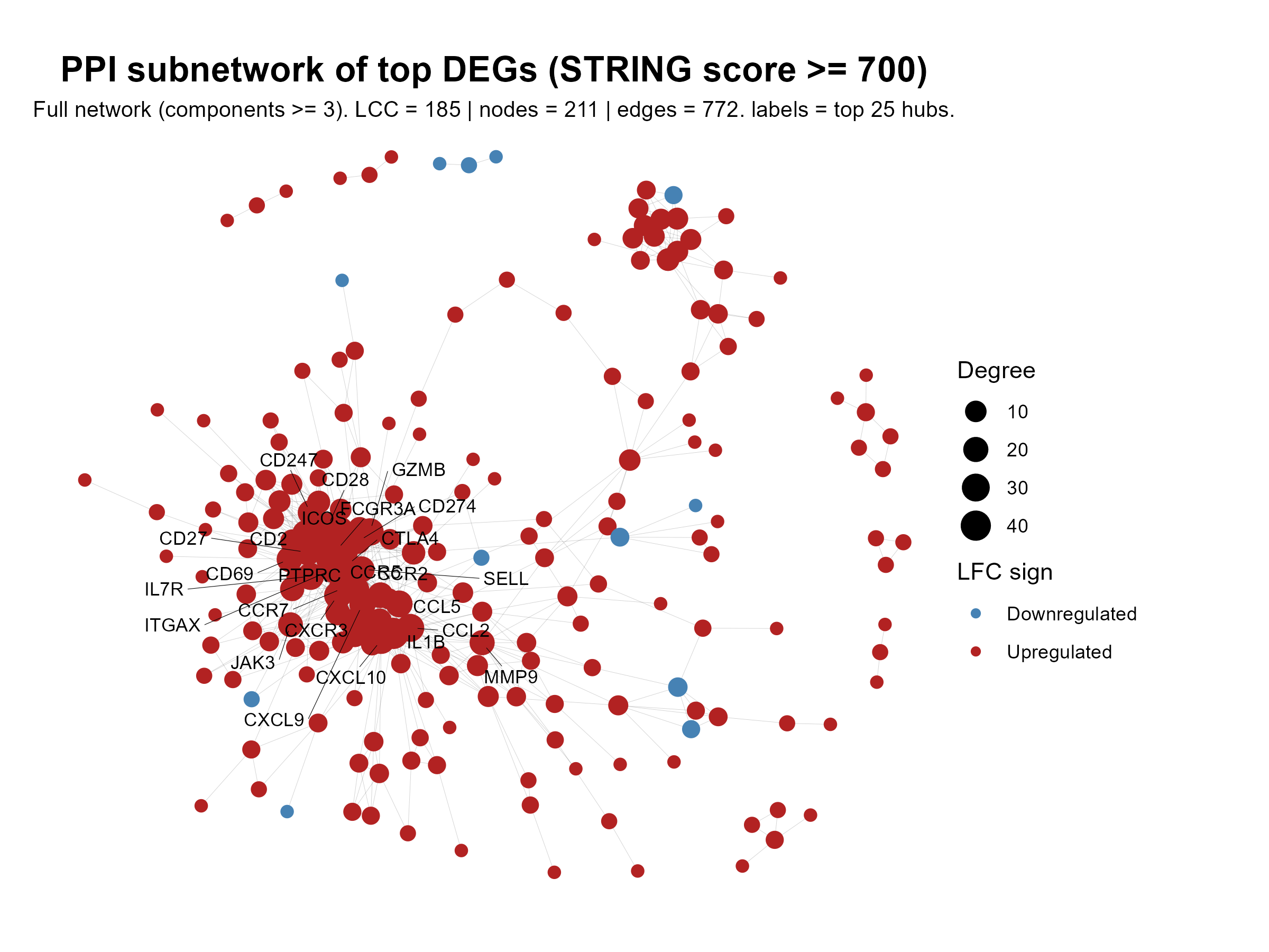
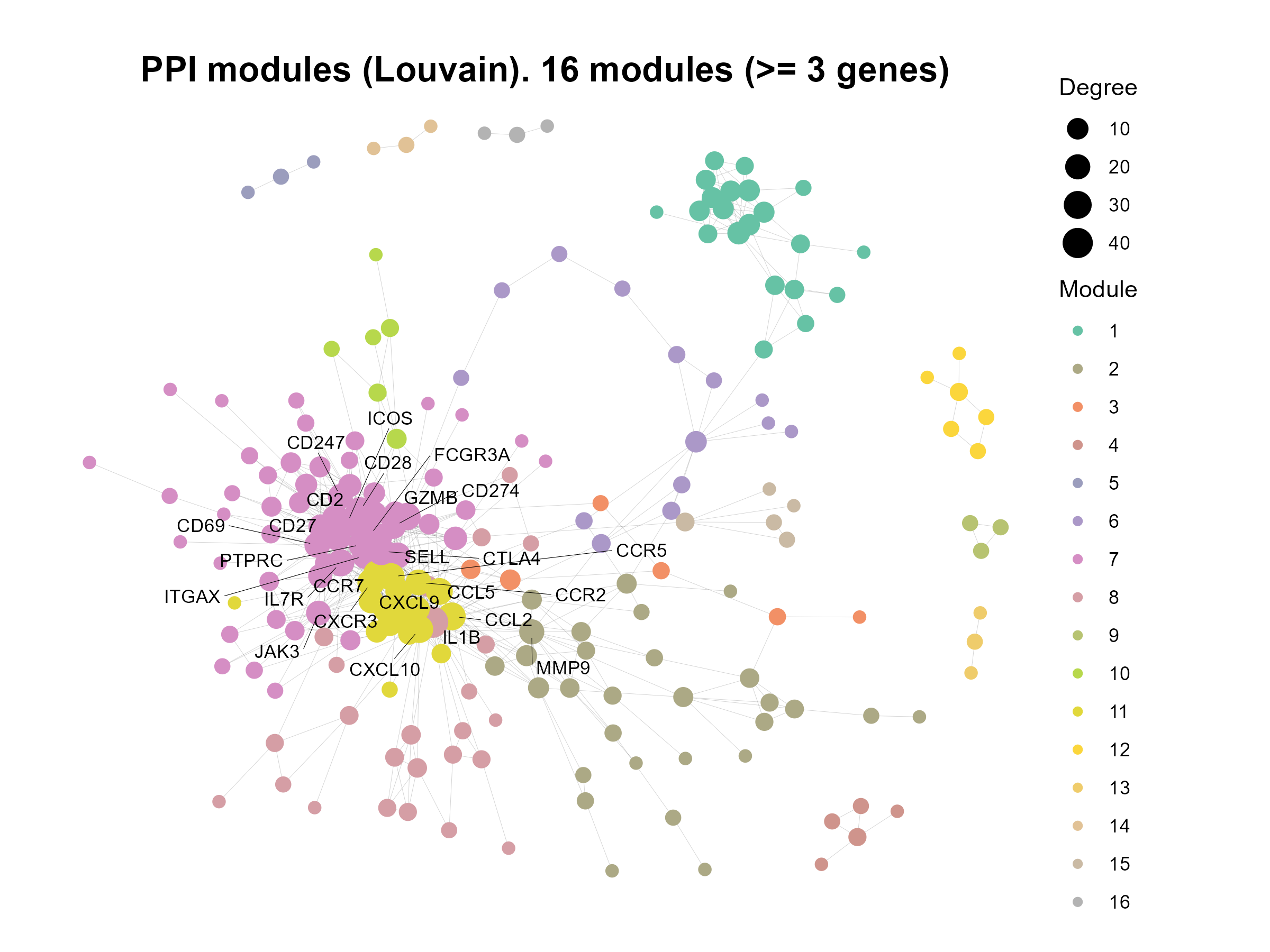
Code Block 10.1.8. GO Enrichment per Module — Rank modules and plot network + GO dotplot panels
# enrich_summary
# ==========================================================
# [Section 8/9] Enrichment-driven module panels (PNGs + CSVs)
#    - Rank modules by best adj.P (GO); per-module network + GO dotplot
# ==========================================================

 # 8.1 Rank modules by enrichment and write overview CSV
# -----------------------------------------------------
# Helper function: Create GO dotplot for a module
make_enrich_plot <- function(eg, mod_id, top_n = 10) {
  # Convert enrichGO result to a data frame (returns NULL if error)
  df <- tryCatch(as.data.frame(eg), error = function(e) NULL)

  # If no enrichment results, return a placeholder empty plot
  if (is.null(df) || nrow(df) == 0) {
    return(ggplot() + theme_void() +
             ggtitle(paste("No significant GO terms for module", mod_id)))
  }

  # Add –log10 adjusted p-values for ranking/plotting
  df$neglog10padj <- -log10(df$p.adjust)

  # Convert GeneRatio from "5/20" to numeric (0.25)
  df$GeneRatioNum <- vapply(strsplit(df$GeneRatio, "/"),
                            function(x) as.numeric(x[1]) / as.numeric(x[2]),
                            numeric(1))

  # Rank terms by adjusted p-value (smallest first), then by gene ratio
  df <- df[order(df$p.adjust, -df$GeneRatioNum), ]

  # Keep only the top N terms (default 10)
  df <- head(df, top_n)

  # Create dot plot:
  #   x = –log10(adj P), y = GO terms, dot size = gene count
  ggplot(df, aes(x = neglog10padj,
                 y = reorder(Description, neglog10padj),
                 size = Count)) +
    geom_point() +
    labs(x = "-log10(adj P)", y = NULL,
         title = paste0("GO ", ontol, " enrichment • module ", mod_id)) +
    theme_minimal(base_size = 11)
}


# 8.1.1 Run enrichment per module and extract one-line summaries:
#   - Start with modules_list, which contains all detected modules (module ID → vector of genes).
#   - Very small modules (fewer than min_genes_module genes) usually cannot produce reliable GO enrichment.
#   - Therefore, we filter modules_list to keep only those with at least min_genes_module genes (e.g., ≥5 genes).
#   - The result, modules_list_f, is the filtered list of modules used for all downstream enrichment analysis.
modules_list_f <- modules_list[sapply(modules_list, length) >= min_genes_module]

# For each module, run enrichGO and extract a one-line summary (best term and its adjusted p-value).
# tryCatch ensures a single module failure doesn't stop the whole panel generation.
enrich_per_module <- lapply(names(modules_list_f), function(m) {
  gsym <- unique(modules_list_f[[m]])
  eg <- tryCatch(
    enrichGO(gene = gsym, OrgDb = org.Hs.eg.db, keyType = "SYMBOL",
             ont = ontol, pAdjustMethod = "BH", pvalueCutoff = 0.05, readable = TRUE),
    error = function(e) NULL
  )
  df <- tryCatch(as.data.frame(eg), error = function(e) NULL)
  if (!is.null(df) && nrow(df) > 0) {
    best <- df[order(df$p.adjust, df$pvalue), ][1, ]
    data.frame(module = m, n_genes = length(gsym),
               best_term = best$Description, best_padj = best$p.adjust,
               n_sig_terms = sum(df$p.adjust <= 0.05),
               score = -log10(best$p.adjust), stringsAsFactors = FALSE)
  } else {
    data.frame(module = m, n_genes = length(gsym),
               best_term = NA_character_, best_padj = NA_real_,
               n_sig_terms = 0, score = 0, stringsAsFactors = FALSE)
  }
})

# 8.1.2 Generate enrichment summary table (sortable CSV):
#  - Overview of enrichment across modules (sortable CSV used to pick top modules for plotting).
enrich_summary <- do.call(rbind, enrich_per_module)
enrich_summary <- enrich_summary[order(-enrich_summary$score, -enrich_summary$n_genes), ]
write.csv(enrich_summary, file.path(fig_dir, "module_enrichment_overview.csv"), row.names = FALSE)


# 8.1.3 Create overview plots from enrich_summary
library(ggplot2)
library(stringr)

# keep modules that were tested and have a score (score = -log10(best_padj))
enrich_plot_df <- subset(enrich_summary, is.finite(score) & score > 0)

# order modules by score (desc), then by size to keep ties stable
enrich_plot_df$module <- factor(
  enrich_plot_df$module,
  levels = enrich_plot_df$module[order(-enrich_plot_df$score, -enrich_plot_df$n_genes)]
)

# 8.1.3 (A) Bar chart of enrichment scores per module
p_scores <- ggplot(enrich_plot_df,
                   aes(x = module, y = score, fill = module)) +
  geom_col(width = 0.8, color = "grey60") +
  geom_text(aes(label = round(score, 1)), vjust = -0.35, size = 3) +
  scale_fill_viridis_d(option = "C", end = 0.95, guide = "none") +
  labs(x = "Module ID", y = "-log10(best adj P)",
       title = "Module enrichment scores") +
  theme_minimal(base_size = 12) +
  theme(legend.position = "none",
        panel.grid.major.x = element_blank(),
        plot.title = element_text(face = "bold", size = 16),
        axis.title = element_text(face = "bold")) +
  expand_limits(y = max(enrich_plot_df$score, na.rm = TRUE) * 1.12)

ggsave(file.path(fig_dir, "module_enrichment_scores_barplot.png"),
       p_scores, width = 8, height = 4.5, dpi = 320, bg = "white")


# 8.1.3 (B) Best term per module (dot + label), positioned by score
# Wrap long term names so labels don’t run off the page
enrich_plot_df$best_term_wrapped <- stringr::str_wrap(enrich_plot_df$best_term, width = 40)

p_best <- ggplot(enrich_plot_df,
                 aes(x = score, y = reorder(module, score))) +
  geom_point(size = 2.8) +
  geom_text(aes(label = best_term_wrapped),
            hjust = 0, nudge_x = 0.25, size = 3) +
  labs(x = "-log10(best adj P)", y = "Module ID",
       title = "Top GO BP term per module") +
  theme_minimal(base_size = 12) +
  theme(plot.title = element_text(face = "bold", size = 16)) +
  # leave space on the right for labels
  coord_cartesian(xlim = c(0, max(enrich_plot_df$score, na.rm = TRUE) * 1.35))

ggsave(file.path(fig_dir, "module_enrichment_best_terms.png"),
       p_best, width = 10, height = 5.5, dpi = 320, bg = "white")
# ============================================================================


# 8.1.4 Pick the top N modules by enrichment score, -log10(best adjusted p-value),  for detailed panels
mods_to_plot <- head(enrich_summary$module, top_n_enriched)


# 8.2 Per-module network + GO dotplot (+ optional combined)
# Loop over selected modules: save network + GO dotplot (+ combined)
for (m in mods_to_plot) {
  # 8.2.1 Write full enrichment table for this module
  gsym <- unique(modules_list_f[[m]])
  eg <- tryCatch(
    enrichGO(gene = gsym, OrgDb = org.Hs.eg.db, keyType = "SYMBOL",
             ont = ontol, pAdjustMethod = "BH", pvalueCutoff = 0.05, readable = TRUE),
    error = function(e) NULL
  )

  # Inside the loop: write full enrichment table for transparency and later interpretation.
  df_full <- tryCatch(as.data.frame(eg), error = function(e) NULL)
  if (!is.null(df_full) && nrow(df_full) > 0) {
    write.csv(df_full, file.path(fig_dir, paste0("module_", m, "_GO_", ontol, ".csv")), row.names = FALSE)
  }

  # 8.2.2 Build and plot network for this module, sized by within-module degree.
  g_sub <- induced_subgraph(g, vids = V(g)[module == m])
  deg_sub <- degree(g_sub)
  V(g_sub)$deg_sub <- deg_sub

  # Label only the highest-degree nodes within this module to keep the network legible.
  label_ids <- names(sort(deg_sub, decreasing = TRUE))[seq_len(min(n_labels_per_net, length(deg_sub)))]
  label_flag <- ifelse(V(g_sub)$name %in% label_ids, V(g_sub)$label, "")

  # Network plot for this module (FR layout, sized by degree, colored by LFC)
  tg_sub <- as_tbl_graph(g_sub)
  set.seed(42)
  p_net <- ggraph(tg_sub, layout = "fr") +
    geom_edge_link0(edge_width = 0.25, edge_alpha = 0.25, colour = "gray40") +
    geom_node_point(aes(size = deg_sub, color = lfc)) +
    ggraph::geom_node_text(aes(label = label_flag), repel = TRUE, size = 3) +
    scale_size(range = c(2.5, 7), name = "Degree") +
    scale_color_gradient2(low = "steelblue", mid = "grey85", high = "firebrick",
                          midpoint = 0, name = "log2FC") +
    ggtitle(paste0("Module ", m, " network (n=", vcount(g_sub), ")")) +
    theme_void() +
  theme(
    plot.title       = element_text(hjust = 0.5, face = "bold", size = 14),
    plot.background  = element_rect(fill = "white", colour = NA),
    panel.background = element_rect(fill = "white", colour = NA)
  )


  # 8.2.3 GO dotplot for this module (top terms)
  p_enr <- make_enrich_plot(eg, m, top_n = top_terms_show) +
    theme(
    plot.background  = element_rect(fill = "white", colour = NA),
    panel.background = element_rect(fill = "white", colour = NA)
  )

  # 8.2.4 Save outputs:
  # Save per-module network and GO dotplot figures.
  ggsave(file.path(fig_dir, paste0("module_", m, "_network.png")), p_net, width = 7, height = 5, dpi = 300, bg = "white")
  ggsave(file.path(fig_dir, paste0("module_", m, "_GO_", ontol, "_dotplot.png")), p_enr, width = 6, height = 5, dpi = 300, bg = "white")

    # 8.2.5 combined panel (network + enrichment)
  # If patchwork is available, also save a side-by-side composite (network + enrichment) for quick review.
  if (requireNamespace("patchwork", quietly = TRUE)) {
    combined <- p_net + p_enr + patchwork::plot_layout(widths = c(1.6, 1))
    ggsave(file.path(fig_dir, paste0("module_", m, "_combo.png")), combined, width = 12, height = 5, dpi = 300, bg = "white")
  }
}
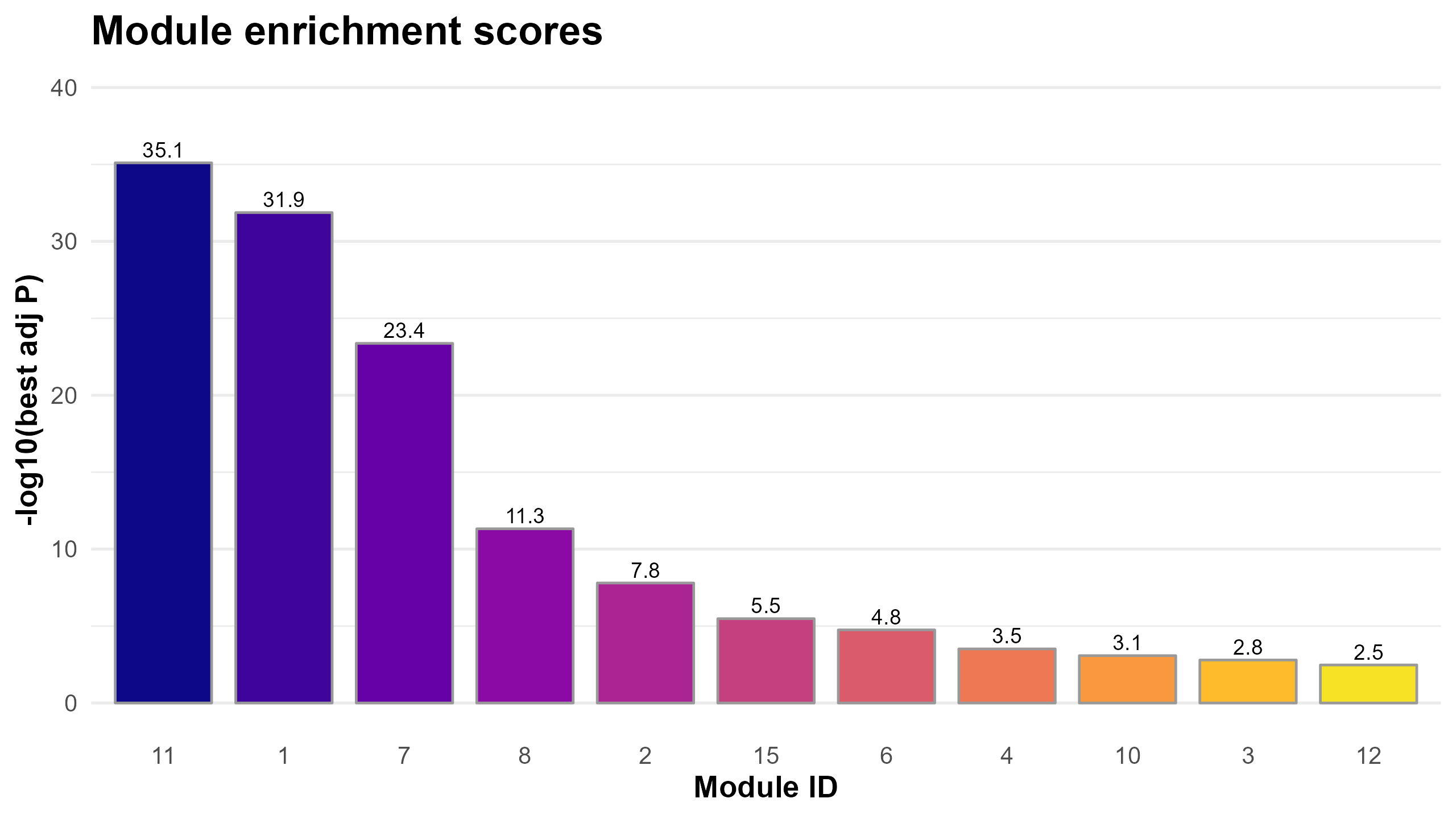
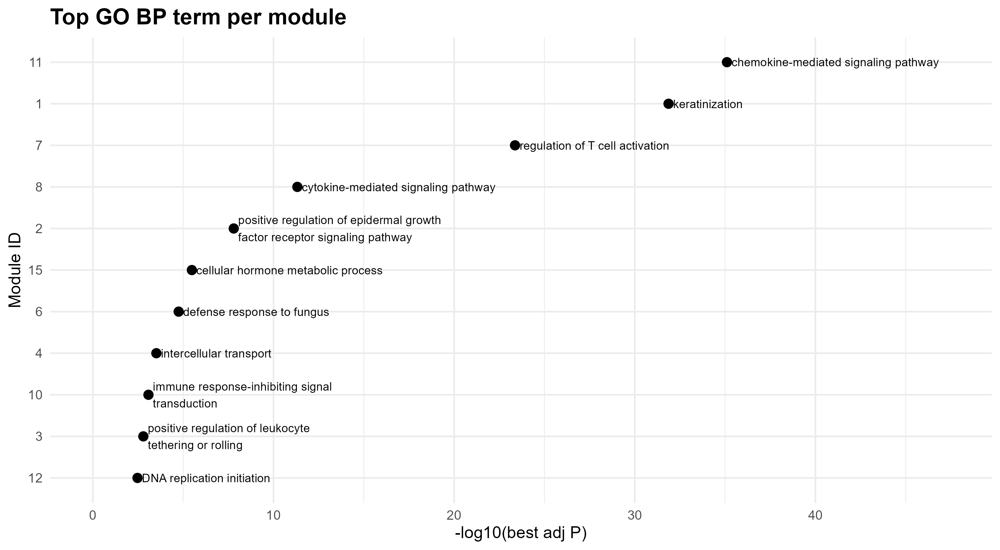
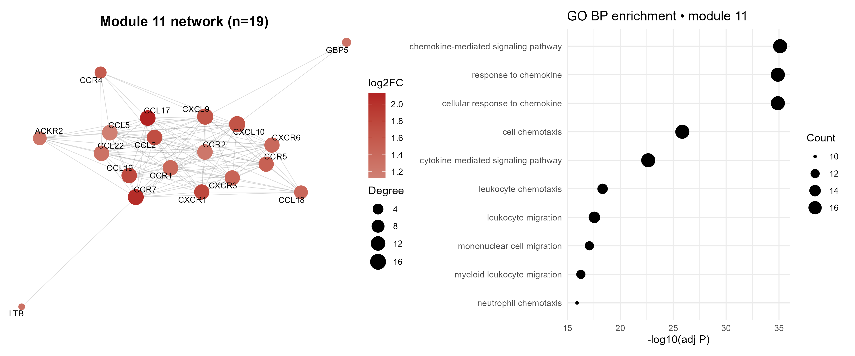
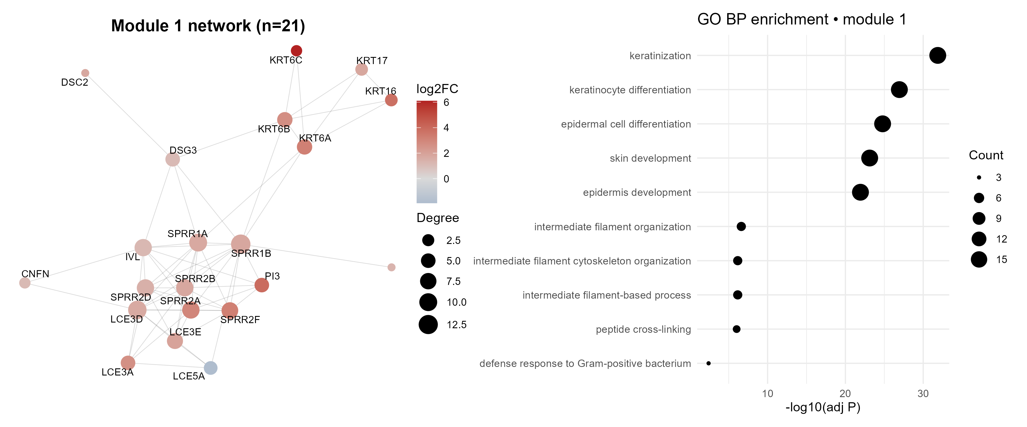
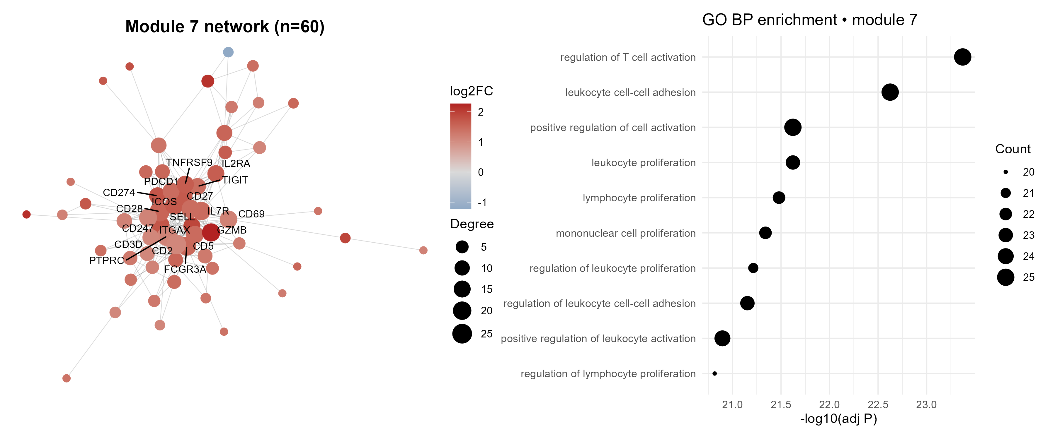
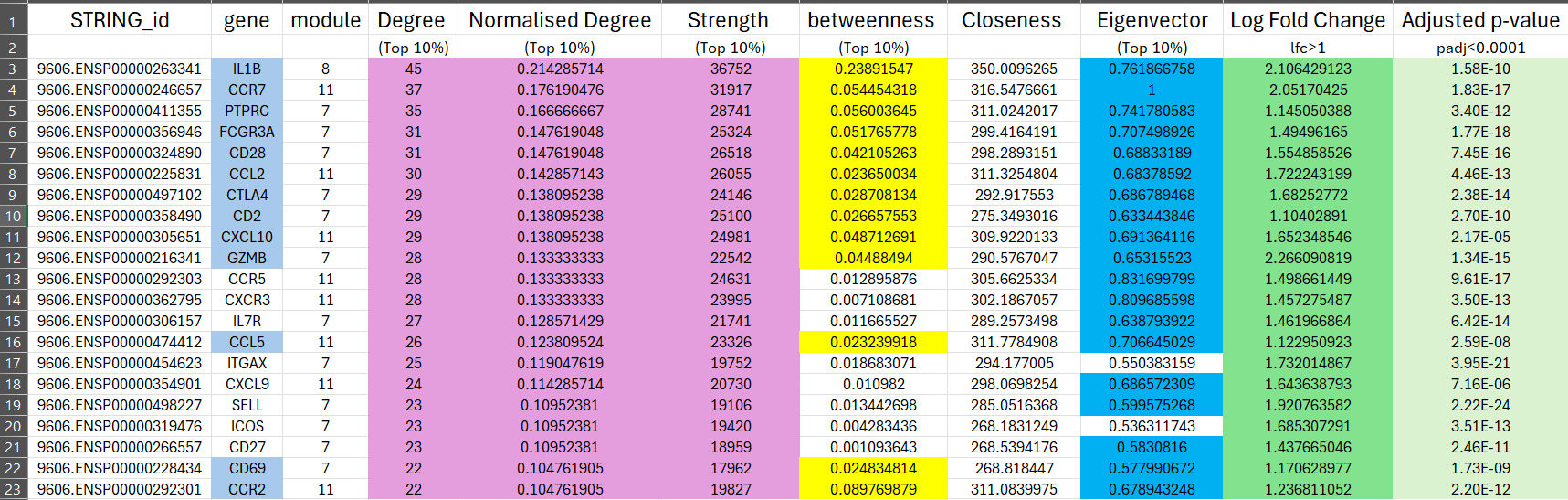
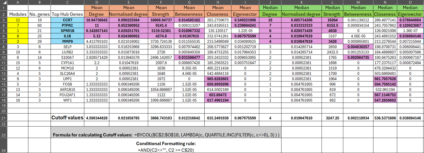
=BYCOL($C$2:$O$18, LAMBDA(c, QUARTILE.INC(FILTER(c, c<>0), 3))), which returns the 75th percentile (Q3) while excluding zeros.
Conditional formatting (=AND(C2<>"", C2 >= C$20)) was applied to highlight all module values above these thresholds,
corresponding to the top 25% for each measure. Modules 11, 7, 1, and 8 consistently exceeded multiple cutoffs,
designating them as robust hubs, while module 2 showed near-threshold values and was considered a borderline hub.
The associated top hub genes (CCR7, PTPRC, SPRR1B, IL1B, MMP9) are functionally linked to immune regulation,
inflammation, and barrier dysfunction in atopic dermatitis, reinforcing their biological importance.
Code Block 10.1.9. Centrality Metrics & Module-Level Summaries — Degree/strength, betweenness/closeness/eigenvector, CSV exports
# ==========================================================
# [Section 9/9] Centrality metrics & module-level summaries (CSVs)
#    - Degree/strength; betweenness/closeness on 1/score; eigenvector
# ==========================================================
#

# 9.1 Define edge distance for shortest paths
# Higher STRING score = stronger/closer connection, so use 1/score as distance.
E(g)$dist <- 1 / pmax(E(g)$combined_score, .Machine$double.eps)

# 9.2 Compute a small panel of standard centralities:
# - Degree (unweighted) and normalized degree
# - degree (local connectivity)
deg_unw   <- degree(g)                       # already in V(g)$deg, recompute for clarity
# degree_norm (scaled 0–1)
deg_norm  <- if (vcount(g) > 1) deg_unw / (vcount(g) - 1) else deg_unw

# - Strength (weighted degree by STRING score)
strength_w <- strength(g, weights = E(g)$combined_score)

# - Betweenness (weighted by distance)
btw_w <- betweenness(g, weights = E(g)$dist, directed = FALSE, normalized = TRUE)

# - Closeness (weighted by distance)
clo_w <- closeness(g, weights = E(g)$dist, normalized = TRUE)
clo_w[!is.finite(clo_w)] <- NA  # guard against Inf/NaN in disconnected cases

# - Eigenvector centrality (use score as weight, not distance/ influence via well-connected neighbors)
eig_w <- eigen_centrality(g, weights = E(g)$combined_score,
                          directed = FALSE, scale = TRUE)$vector


# 9.3 Export node-level centrality table
# Assemble a tidy per-node centrality table for export and ranking/plotting in downstream tools.
cent_df <- data.frame(
  STRING_id     = V(g)$name,
  gene          = V(g)$label,
  module        = as.character(V(g)$module),
  degree        = deg_unw,
  degree_norm   = deg_norm,
  strength_w    = strength_w,
  betweenness_w = btw_w,
  closeness_w   = clo_w,
  eigenvector   = eig_w,
  lfc           = V(g)$lfc,
  padj          = V(g)$padj,
  stringsAsFactors = FALSE
)

# Sort within each module by degree so the top hubs float to the top of each group in the CSV.
cent_df <- cent_df[order(as.numeric(cent_df$module), -cent_df$degree), ]

# Save node-level centralities
write.csv(cent_df, file.path(fig_dir, "ppi_node_centrality.csv"), row.names = FALSE)


# 9.4 Export module-level summary (size, means, medians, top hub (by degree)
# Module size
mod_sizes <- as.data.frame(table(cent_df$module), stringsAsFactors = FALSE)
names(mod_sizes) <- c("module", "n_genes")


# Means across nodes in each module
mod_means <- aggregate(
  cent_df[, c("degree","degree_norm","strength_w","betweenness_w","closeness_w","eigenvector")],
  by = list(module = cent_df$module),
  FUN = function(x) mean(x, na.rm = TRUE)
)
names(mod_means)[-1] <- paste0(names(mod_means)[-1], "_mean")

# Medians across nodes in each module
mod_meds <- aggregate(
  cent_df[, c("degree","degree_norm","strength_w","betweenness_w","closeness_w","eigenvector")],
  by = list(module = cent_df$module),
  FUN = function(x) median(x, na.rm = TRUE)
)
names(mod_meds)[-1] <- paste0(names(mod_meds)[-1], "_median")

# Identify a simple top hub per module (by highest degree). Other choices (e.g., strength) are possible.
top_hub <- tapply(seq_len(nrow(cent_df)), cent_df$module, function(idx) {
  i <- idx[which.max(cent_df$degree[idx])]
  cent_df$gene[i]
})
top_hub_df <- data.frame(module = names(top_hub), top_hub_gene = unname(unlist(top_hub)),
                         stringsAsFactors = FALSE)

# Merge all summaries
module_centrality_summary <- Reduce(function(x, y) merge(x, y, by = "module", all = TRUE),
                                    list(mod_sizes, mod_means, mod_meds, top_hub_df))

# Order modules by descending size (then numeric id) in the final summary for quick, consistent browsing.
module_centrality_summary$module_num <- as.numeric(module_centrality_summary$module)
module_centrality_summary <- module_centrality_summary[order(-module_centrality_summary$n_genes,
                                                             module_centrality_summary$module_num), ]
module_centrality_summary$module_num <- NULL

# Save per-module summaryLondon Luton Airport
write.csv(module_centrality_summary,
          file.path(fig_dir, "ppi_module_centrality_summary.csv"), row.names = FALSE)
Code Block 9.1.1. CODDDDDE BLLLOOOOOK TITLEEEEE
		# CODE HHHHEEERRRRR
		# CODE HHHHEEERRRRR
We create a DESeqDataSet object, normalize the data, and run the differential expression analysis using DESeq2. This model tests for differences in gene expression between the Lesional and Non-Lesional groups.
# Create DESeqDataSet and run DESeq2
ds <- DESeqDataSetFromMatrix(countData=tbl, colData=sample_info, design= ~Group)
ds <- DESeq(ds, test="Wald", sfType="poscount")
We extract the results from DESeq2, separating the differentially expressed genes (DEGs) into upregulated and downregulated categories, and prepare the top genes for further analysis.
# Extract results for top genes
r <- results(ds, contrast = c("Group", groups[1], groups[2]), alpha = 0.01, pAdjustMethod = "fdr")

# Separate downregulated and upregulated DEGs
downregulated <- r[r$log2FoldChange < 0 & r$padj < 0.01, ]
upregulated <- r[r$log2FoldChange > 0 & r$padj < 0.01, ]

# Take the top 10 genes for downregulated and upregulated
top_downregulated <- downregulated[order(downregulated$log2FoldChange)[1:10], ]
top_upregulated <- upregulated[order(upregulated$log2FoldChange, decreasing = TRUE)[1:10], ]

# Merge with gene annotations
top_downregulated <- merge(as.data.frame(top_downregulated), annot, by = 0, sort = FALSE)
top_upregulated <- merge(as.data.frame(top_upregulated), annot, by = 0, sort = FALSE)

# Round "padj" and "log2FoldChange" columns for readability
top_downregulated <- within(top_downregulated, {
  padj <- sprintf("%.4f", round(padj, 2))
  log2FoldChange <- sprintf("%.4f", round(log2FoldChange, 2))
})

top_upregulated <- within(top_upregulated, {
  padj <- sprintf("%.4f", round(padj, 2))
  log2FoldChange <- sprintf("%.4f", round(log2FoldChange, 2))
})

# Print the top_downregulated table using kable
kable(top_downregulated, format = "markdown")
kable(top_upregulated, format = "markdown")
We generate various plots to visualize the data and the results of the differential expression analysis.
# Box-and-whisker plot
dat <- log10(counts(ds, normalized = T) + 1)
ord <- order(gs)
palette(c("#1B9E77", "#7570B3"))
par(mar=c(7,4,2,1))
boxplot(dat[,ord], boxwex=0.6, notch=T, main="GSE157194", ylab="lg(norm.counts)", outline=F, las=2, col=gs[ord])
legend("topleft", groups, fill=palette(), bty="n")
# Dispersion estimates plot
plotDispEsts(ds, main="GSE157194 Dispersion Estimates")
# UMAP plot
dat <- dat[!duplicated(dat), ]
par(mar=c(3,3,2,6), xpd=TRUE, cex.main=1.5)
ump <- umap(t(dat), n_neighbors = 15, random_state = 123)
plot(ump$layout, main="UMAP plot, nbrs=15", xlab="", ylab="", col=gs, pch=20, cex=1.5)
legend("topright", inset=c(-0.15,0), legend=groups, pch=20, col=1:length(groups), title="Group", pt.cex=1.5)
# Histogram of adjusted p-values
hist(r$padj, breaks=seq(0, 1, length = 21), col = "grey", border = "white",
     xlab = "", ylab = "", main = "GSE157194 Frequencies of padj-values")
# Volcano plot
old.pal <- palette(c("#00BFFF", "#FF3030"))
par(mar=c(4,4,2,1), cex.main=1.5)
plot(r$log2FoldChange, -log10(r$padj), main=paste(groups[1], "vs", groups[2]),
     xlab="log2FC", ylab="-log10(Padj)", pch=20, cex=0.5)
with(subset(r, padj<0.01 & abs(log2FoldChange) >= 1.5),
     points(log2FoldChange, -log10(padj), pch=20, col=(sign(log2FoldChange) + 3)/2, cex=1))
legend("bottomleft", title=paste("Padj<", 0.01, sep=""), legend=c("down", "up"), pch=20,col=1:2)
# MA plot
par(mar=c(4,4,2,1), cex.main=1.5)
plot(log10(r$baseMean), r$log2FoldChange, main=paste(groups[1], "vs", groups[2]),
     xlab="log10(mean of normalized counts)", ylab="log2FoldChange", pch=20, cex=0.5)
with(subset(r, padj<0.01 & abs(log2FoldChange) >= 1.5),
     points(log10(baseMean), log2FoldChange, pch=20, col=(sign(log2FoldChange) + 3)/2, cex=1))
legend("bottomleft", title=paste("Padj<", 0.01, sep=""), legend=c("down", "up"), pch=20,col=1:2)
abline(h=0)
palette(old.pal)
After identifying DEGs, we perform GO and KEGG pathway enrichment analyses to understand the biological significance of the results.
# GO enrichment analysis for upregulated and downregulated genes
up_genes <- top_upregulated$GeneID
down_genes <- top_downregulated$GeneID

# GO enrichment for upregulated genes
ego_up <- enrichGO(gene = up_genes, OrgDb = org.Hs.eg.db, keyType = "ENSEMBL",
                   ont = "BP", pAdjustMethod = "fdr", qvalueCutoff = 0.05)

# GO enrichment for downregulated genes
ego_down <- enrichGO(gene = down_genes, OrgDb = org.Hs.eg.db, keyType = "ENSEMBL",
                     ont = "BP", pAdjustMethod = "fdr", qvalueCutoff = 0.05)

# Plotting the top GO terms
barplot(ego_up, showCategory=10, title="Top GO terms for Upregulated Genes", drop=TRUE)
barplot(ego_down, showCategory=10, title="Top GO terms for Downregulated Genes", drop=TRUE)
# KEGG pathway enrichment analysis for upregulated and downregulated genes
kegg_up <- enrichKEGG(gene = up_genes, organism = "hsa", pAdjustMethod = "fdr", qvalueCutoff = 0.05)
kegg_down <- enrichKEGG(gene = down_genes, organism = "hsa", pAdjustMethod = "fdr", qvalueCutoff = 0.05)

# Plotting the top KEGG pathways
barplot(kegg_up, showCategory=10, title="Top KEGG Pathways for Upregulated Genes")
barplot(kegg_down, showCategory=10, title="Top KEGG Pathways for Downregulated Genes")
We visualize the overlap between different gene sets (total, upregulated, downregulated) using a Venn diagram.
# Venn diagram for gene sets
total_genes <- rownames(tbl)
upregulated_genes <- rownames(top_upregulated)
downregulated_genes <- rownames(top_downregulated)

venn_data <- list(
  Total = total_genes,
  Upregulated = upregulated_genes,
  Downregulated = downregulated_genes
)

venn_plot <- venn.diagram(
  x = venn_data,
  category.names = c("Total", "Upregulated", "Downregulated"),
  filename = NULL,
  margin = 0,
  cex.prop = 0.8,
  offset.prop = 0.2
)

grid.draw(venn_plot)
Finally, we extract the top 20 differentially expressed genes from both categories and print the results.
# Extract results for top genes table (rounded)
r <- results(ds, contrast = c("Group", groups[1], groups[2]), alpha = 0.01, pAdjustMethod = "fdr")

# Separate downregulated and upregulated DEGs
downregulated <- r[r$log2FoldChange < 0 & r$padj < 0.01, ]
upregulated <- r[r$log2FoldChange > 0 & r$padj < 0.01, ]

# Take the top 20 genes for downregulated and upregulated
top_downregulated <- downregulated[order(downregulated$log2FoldChange)[1:20], ]
top_upregulated <- upregulated[order(upregulated$log2FoldChange, decreasing = TRUE)[1:20], ]

# Merge with gene annotations
top_downregulated <- merge(as.data.frame(top_downregulated), annot, by = 0, sort = FALSE)
top_upregulated <- merge(as.data.frame(top_upregulated), annot, by = 0, sort = FALSE)

# Round "padj" and "log2FoldChange" columns
top_downregulated <- within(top_downregulated, {
  padj <- sprintf("%.4f", round(padj, 4))
  log2FoldChange <- sprintf("%.4f", round(log2FoldChange, 4))
 })

top_upregulated <- within(top_upregulated, {
  padj <- sprintf("%.4f", round(padj, 4))
  log2FoldChange <- sprintf("%.4f", round(log2FoldChange, 4))
})

# Print the top_downregulated table using kable
kable(top_downregulated, format = "markdown")
kable(top_upregulated, format = "markdown")
This complete pipeline guides you through performing differential gene expression analysis on the GSE157194 dataset using DESeq2. The analysis identifies significant gene expression changes between lesional and non-lesional skin samples from Atopic Dermatitis patients, and includes essential data visualizations and enrichment analyses to interpret the results biologically.
Code Block 3.1.1. CODDDDDE BLLLOOOOOK TITLEEEEE
		# CODE HHHHEEERRRRR
		# CODE HHHHEEERRRRR